

2009 has been a great year for Brand New, with a bottomless source of new and redesigned identities from around the world, and we've all had good fun critiquing them in sickness and in health. But it all comes down to this: The Best and Worst. I have gone through all the archives and selected the top 12 in each category. There were some dead-ringers for each category and some that required a little more self-deliberation acknowledging that some identities were left off the list. And just as well, I know my selections may incite some disagreements, which are more than welcome as we bring this year to a close. Each identity comes with some basic details like release date and design credits, highlights from our polls for those identities that came after July when we introduced the feature, and I have selected one or two reader comments to accompany a brief summary from me. Enjoy! Brand New will take a break for the rest of the year, we may post one or two things, but set your expectations low for this Holiday season.

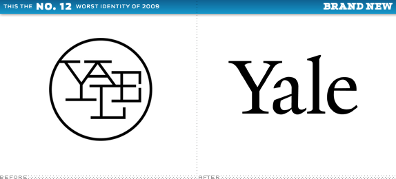
Yale University Press
Designed by: Matthew Carter (Yale Typeface)
Release Date: September, 2009
Voting Highlight: 12% (152 of 1,194) Hate Paul Rand's logo
To be perfectly fair, there is nothing formally wrong with the new logo, as it's simply the word Yale typeset in the masterful work of Matthew Carter. But it is definitely sad to see one of Paul Rand's most recognizable logos go away.
While it's sad to see Rand's logo go, I'm glad they ditched it entirely rather than try to update his logo.
— G*
Branding the Press with the same identity as the university pushes the notion that all of these titles are in some way tied to the academic institution. It blurs the line and creates an assumption for customers that isn't necessarily true.
— Jeff Stevens
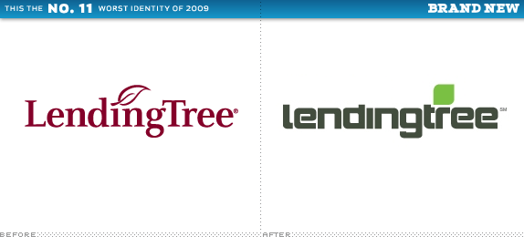
LendingTree
Designed by: Mullen
Release Date: July 2009
Voting Highlight: 87% (605 of 694) Voted it a Futuristic and Trendy logo
The old logo wasn't much to get excited about but if fit the service and the audience, while the new one is awfully misguided to Terminators. Nice TV ads though.If you hadn't told me this was a 2009 redesign, I'd have pegged this for an 1998 'cutting edge' logo designed by a firm that was doing a lot of tech work at the time.
— Rachel Cary
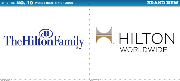
Hilton Worldwide
Designed by: Landor
Release Date: September, 2009
Voting Highlight: 62% (795 of 1,274) Thought the Icon was Better without Bevels
This could have been a solid corporate redesign, but then they had to go mess it up by adding unnecessary bevels, and all the elements are a little too disparately placed, sized and aligned.
There is no logic to the light source 'shining' on the bevels. Upper right? Upper left? The reflections on the bevels seem arbitrary. With a consistent light source, the left edges of the top and bottom elements would appear to line up properly.
— Griche
Why do so many wannabe upscale brands have such bad taste?
— couchidea
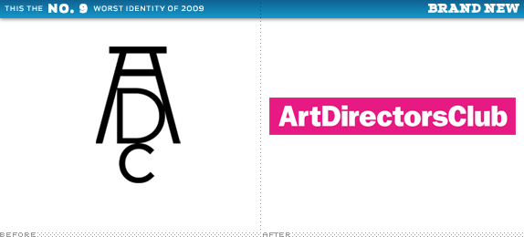
Art Directors Club
Designed by: Trollbäck + Company
Release Date: November, 2009
Voting Highlight: 73% (895 of 1,226) Voted it A Step Backward
Everyone pretty much agreed: Been there, done that. For an organization catering to the creative industry this was neither creative nor, um, industrious. And the follow-up showing the logo in action didn't help much.
Yes, the previous logo spoke to the history of ADC, rather than it's future, but I don't think this is all that progressive either. It smacks of 2002.
— Denny
I'm normally willing to have an open mind about the new logos presented here on Brand New, and if I can't say something nice, I don't say anything at all. But this logo makes me wonder why the rest of us are busting our asses trying to craft logos with meaning and depth while this kind of thing is being perpetrated.
— Drew Davies

Burnley
Designed by: N/A
Release Date: October, 2009
Voting Highlight: 70% (835 of 1,178) said Wow… with Sarcasm
I was actually surprised at some of the positive comments for this one, which I still think is a sorry excuse of a logo. My cat has turned out hairballs with better execution and strategy than that. Also noteworthy: some clients competed for the privilege of using this logo.
At first glance, I thought it was really cool. On second glance, it's REALLY cool. Burnley +1, cognoscenti fail!
— Marcello
I know this isn't a popular opinion, but I absolutely love it. Why not try something different? Why not try to use this object and animation to represent the interconnectedness of the community? This Burnley object as logo is different from the boring shit and aesthetic nightmares we've been seeing lately. In my opinion, this is a win.
— Matt
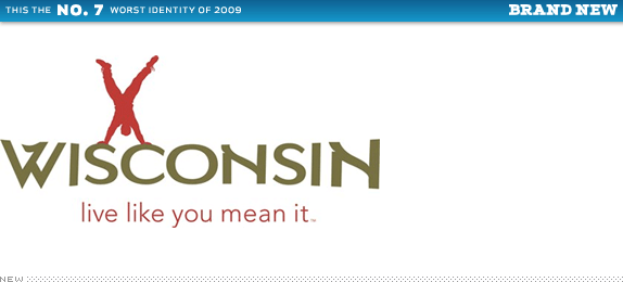
Wisconsin Department of Tourism
Designed by: Red Brown Klé
Release Date: March, 2009
Poor choices in color and typography and even poorer decisions in configuration and scale make this one of the strangest logos of the year. Live like you mean it, but design like you mean it too.I don't like the type, the slogan, or the dude doing the handstand. It's all just so corny… and it actually makes me never, ever, ever want to go to Wisconsin.
— TheMaster
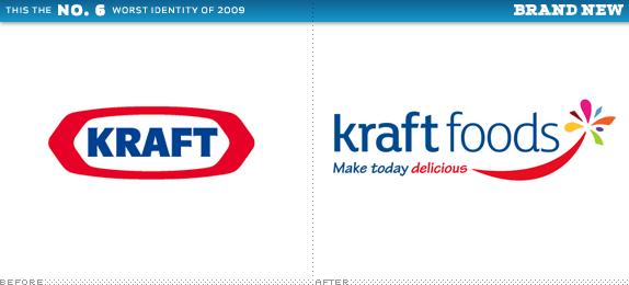
Kraft Foods
Designed by: N/A
Release Date: February, 2009
While the well-known 'race track' Kraft logo will remain on consumer product packaging, the parent company decided that it was too cool for them and instead opted for a crappy carnival of typefaces and random shapes.
1 swoosh, 1 capitalized word, 2 fonts, 3 weights, 4 lower-case words, and 9 colors for 1 LOGO.
— Sean
Smiles are an apparently irresistible contemporary 'me too' brand identity trend. Although there is an attempt at a flower, the combination is poorly executed and just looks naive. The missed opportunity for some tasty type is further confirmation that the identity was in the hands of novices.
— Andrew Sabatier
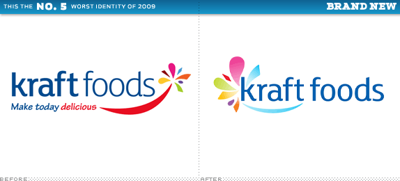
Kraft Foods, Redux
Designed by: N/A
Release Date: July, 2009
Only five months later Kraft Foods unveiled a revised logo that was supposed to be an improvement. You know the expression 'Putting lipstick on a pig'? This is like switching the lipstick from the pig's mouth to the pig's you-know-what.
I disagree, I think when comparing the two logos side by side, there is a difference for the better with the new icon. There is an improvement. And this new and fairly recent logo will NOT change a consumer's opinion of the brand. Taste and price will.
— Peter O'Connell
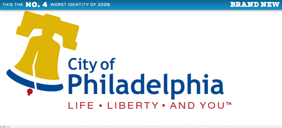
City of Philadelphia
Designed by: The Star Group
Release Date: December, 2009
Voting Highlight: 60% (942 of 1,547) deemed it cliché
One thing you don't want to do is upset Philadelphians — and judging by the amount of traffic we got to this story, there were many — by branding them with a web font (Trebuchet) and a terribly rendered Liberty Bell
As a Philadelphian it is surprising that most people even in the city gravitate towards the bell when approaching a branding project. Rarely in my life when mentioning that I am from Philadelphia has anyone said 'oooh, have you seen the Liberty Bell?!' The question is usually 'what's your favorite cheese steak place?'
— Chad Kaufman
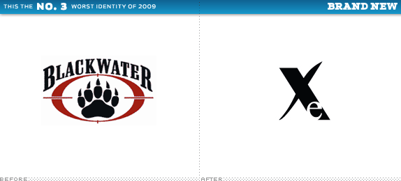
Xe
Designed by: N/A
Release Date: May, 2009
Step 1 in the Bad Corporation Protection Program: Rename the corporation. Step 2: Redesign the logo. Step 3: Hope that people forget about your old brand in a couple of years. Oh, and regarding the logo, I have no idea what is going on.
Here's another company that I wouldn't design for, and I won't critique the logo or marketing strategy on the off-chance such comments might be even a little helpful to them.
— BJN
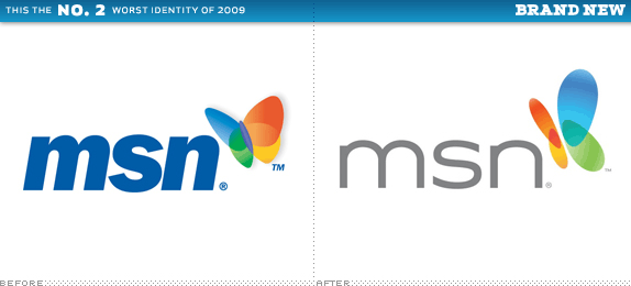
MSN
Designed by: N/A
Release Date: November, 2009
Voting Highlight: 15% (165 of 1,073) thought the butterfly was great
The butterfly icon might get a passing grade, if I were extra generous, but the typography is simply ridiculous. I stand by my original quote, that I will also use as a segue to the very worst of 2009, '[The typography] suffers from Bing syndrome: It wants to be cool and modern but it suffers from complete lack of typographic decency. (This post is also worth revisiting if you want to read a pissing match between Futurebrand designers claiming credit for the original butterfly in the comments).
Why do designers think that they can improve an existing typeface by cutting pieces off, adding arbitrary bits to it or generally messing with details? Would you walk better if you cut your toes off? If a typeface doesn't work for a specific word, look for another one that does, There are more than 100k fonts out there, most of them carefully made and in themselves perfect.
— Erik Spiekermann

Bing
Designed by: Razorfish
Release Date: June, 2009
When I first posted the new logo for Microsoft's search engine I blasted it for using scaled typography then 'Bob,' who designed the logo at Razorfish, informed us that 'All the letter forms were made from scratch.' I think I preferred to think this nastiness was done unknowingly than fully premeditated. Congratulations, Bing!
If that is true, it is sad. Couldn't you hire someone who can actually design type? It wouldn't take more than an hour to do. It would still be a boring logo, but at least it wouldn't look like a free font drawn by a 15-year old in Corel Draw, in 1987. It was made from scratch and it still looks like scratch.
— Erik Spiekermann
Seriously, you people need to chill. While this logo is definitely not excellent, it's also nowhere near as bad as some of you are suggesting. Get off your high horses and quit being such snobs. And you wonder why designers are perceived as such pompous a**holes.
— Anonymous

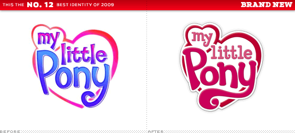
My Little Pony
Designed by: N/A
Release Date: Summer, 2009
Voting Highlight: 4% (43 of 921) thought this was bad
I am sure many of you will think I am crazy for including My Little Pony here and, in all honesty, there were more technically impressive and stylistically appealing logos in 2009. Yet context plays a large role in identity design and within the market and audience that My Little Pony resides in, this was a superb update that could have turned out real ugly, real fast.
Seriously?
—JonSel
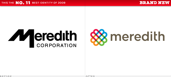
Meredith Corporation
Designed by: Lippincott
Release Date: August, 2009
Voting Highlight: 2% (12 of 1,105) Voted on the new icon being Boring
A lively, colorful and bold update for a women-focused media enterprise, devoid of female clichés like the color pink or script typography. Thank you Lippincott!
Absolutely beautiful. I wish I had done this.
— Bill Dawson (XK9)
I hate to be the bitch here, but I think the symbol is predictable. Take the first letter of company name, rotate and repeat multiple times, until you make a floret. Then add rationale expounding said companies multidisciplinary nature. I agree it is pretty, but its looks are only skin-deep.
— Aditya
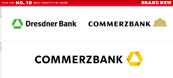
Commerzbank
Designed by: Meta Design
Release Date: November, 2009
Voting Highlight: 71% (602 of 840) Agreed this took the best from both worlds
The fact that the angle of the 'K' matches the angle of the icon is reason enough to land this logo in the Best category, but everything about it is so carefully thought out and executed that there was no way I was leaving this out, even if it had its detractors.
The logo gives me feelings of danger, hazard, a warning sign, discomfort... Using yellow as your main color only makes things worse.
— Erwin
I am not a fan of the sharp edges with such a free-flowing 'ribbon' type shape. Not only is it not accurate as to how the shape would actually flow in 3-D, but the mixture of curves inside the shape and sharp edges outside is totally un-harmonious!
— Danae
El Banco Deuno
Designed by: Saffron
Release Date: January, 2009
I was one of the lone champions of this identity and I may have doubted myself at the time, but going back through the archives, this Mexican's bank identity stood out from most of the entries.
I don't get it. It's just poofy letters.
— David H
Something else I'd like to add is the fact that I wouldn't trust my money with a bank that looks like that. I like banks to look, well, bank-like. Professional. A sense of class. I don't believe this communicates that.
— Neil
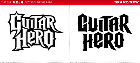
Guitar Hero
Designed by: Pentagram
Release Date: September, 2009
Voting Highlight: 55% (519 of 930) Voted this as Rockin'
While some mourned the loss of the unrefined (hence more genuine) look of the original logo, the new identity is more fitting of the billion-dollar enterprise it represents. And, a spike more or a spike less, it still rocks.
This update retains the old-school rock flavour, but just cleans it up a little bit, giving it a more professional feel and reflects its now mainstream status.
— Chris Thorpe
Yes the old logo was a bit off kilter, but that lent an air of hand rendered tattoo look to the logo that I thought was very appropriate. I'm not usually a fan of outlined text in logos either, but in this case, the non outlined redesign looks flat and boring. It's computer rendered perfection actually makes some details annoying to me...
— Nathan McKinney
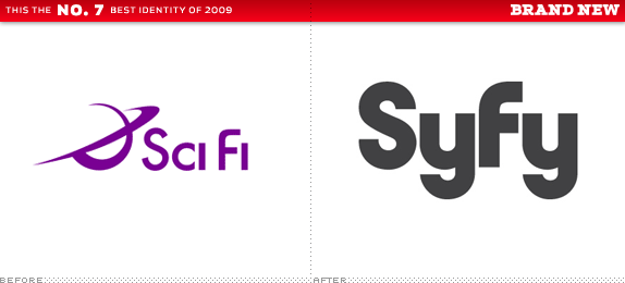
Syfy
Designed by: Proud Creative
Release Date: March, 2009
The name change got everyone in a tizzy but by now and even more so moving forward, it's not even an issue. And it sadly obscured what turned out to be a solid redesign.
I dig the new mark — liked it from the start. I'm glad they lost the clumsy icon and type and went with a concept that was more "out there."
— grubeedo
No matter how interesting and slick the type treatments are, the actual word 'Syfy' is so awkward I don't think I'll ever be fully on board. Love the new visuals, though.
— Enna
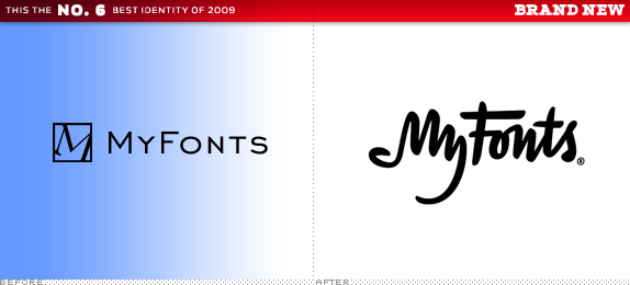
MyFonts
Designed by: UnderWare
Release Date: January, 2009
Their previous logo didn't set the bar too high, but the new custom lettering did, not just for them, but for the whole retail type industry. Some people hated that the "My" made a hand… Well, you can talk to it because the face ain't listenin'.
The MyFonts redesign was long overdue and a definite improvement.
— Darrel
Not sure if the cryptic hand was necessary, but we could all use more surprises in life I guess.
— Nate
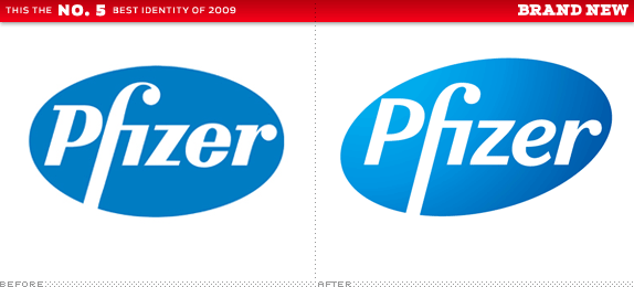
Pfizer
Designed by: Siegel+Gale
Release Date: November, 2009
Voting Highlight: 62% (910 of 1,457) Considered the Logo Evolution an Improvement
The changes to the logo were small but they helped soften up the biggest of Big Pharma. The surrounding identity however was what made Pfizer really stand out from the rest this year.
This is one of the nicest refinements I've seen in some time.
— David Airey
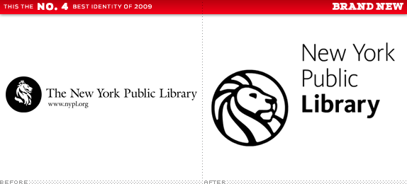
New York Public Library
Designed by: NYPL In-house Staff
Release Date: November, 2009
Voting Highlight: 70% (728 of 1,040) Thought the New Lion was Roaringly Great
A great visual exploration of possible lion heads led to a great new icon for New York's beloved institution. Works great at large and small sizes, something the old lion couldn't brag about.
It's a nice rendition, maybe a bit too 'Rasta' for my taste, but competently executed.
— Dennis Van Staalduinen
I'm impressed that this was done by their in-house team -- not that in-house designers are inferior to agencies or anything like that. I just know it can be difficult to imagine all the possibilities when you work so closely with a brand. I used to work in-house for a public library in need of re-branding, but I don't think I would've been the right person for the job. Hats off to the NYPL team.
— Matt Barnes
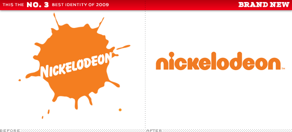
Nickelodeon
Designed by: Eric Zim (wordmark)
Release Date: September, 2009
Voting Highlight: 53% (853 of 1,609) Preferred the New vs. the Old logo
A complete overhaul of not just the Nickelodeon channel we all grew up with but of the whole enterprise that has grown into multiple channels airing in 175 countries, as well as a motion picture production company, and hundreds of Nick-branded toys and games. It's not the nostalgic splat anymore but it's not your attention they are after, so better deal with it. Like Syfy — perhaps even in a stylistic trend — this is a bold, simple wordmark that can carry Nickelodeon for another quarter of a century.
It is really hard to say that without being influenced by my own childhood memories, but I think the old one looks awfully dated. It reminds me of late 80s and early 90s stuff, a world and a visual language that obviously doesn't say much to the kids today.
— Pedro
I will definitely miss the splat logo, but this new one makes sense because Nick has had about a decade of slow reinvention. It's definitely not what it was before, with bizarre shows like Ren & Stimpy and Ahh! Real Monsters. It's "trendy" now and has to appeal to several different audiences. I think this new wordmark achieves that without offending too many people.
— Ainsley
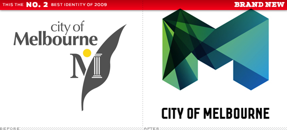
City of Melbourne
Designed by: Landor (Sydney)
Release Date: July, 2009
Voting Highlight: 67% (1,020 of 1,520) Thought this was Way Cool
This new identity gained early praise when we first announced it, and then we got a chance to see all the different 'M's and it became even cooler. In terms of visual execution and diversity, this was one of the strongest of the year.
I haven't seen an identity that I found so inspiring in a very long time. I love everything about it. The color scheme, the triangles, the implementation.
— Swifty
Even the parking tickets are exciting.
— Scott
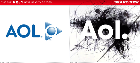
AOL
Designed by: Wolff Olins
Release Date: November, 2009
Voting Highlight: 51% (1,232 of 2,374) are Willing to Give it a Chance
Amazingly, only 28% (673) Hated It, and 19% (469) Loved It
Hold the rotten tomatoes. I agree, AOL is neither technically nor aesthetically the best logo or identity of the year. But no identity will have a bigger impact in the evolution of a brand as AOL's. Most companies brand to match their audience, AOL is branding to create a new audience. The name may conjure the 1990s but the identity is twenty-first century all the way. Wolff Olins may be the punchline for many designers but, even if you don't know it or care to admit it, they are having the last laugh.
Geez, does Wolff Olins have some sort of magic pixie dust that they sprinkle in their client's lattes to get them to buy off on their concepts? Most of them seem very disjointed and lazy in my opinion.
— Rico
Seems like another entry in the recent spat of brands whose logos rely on some bizarrely assorted array of images to convey and carry their brand instead of the actual logo itself. It's shit. And I don't get why it's now a word, like many others here. How could that possibly strengthen anything? There's no combination of sounds you can make from reading those three letters with the punctuation that is even remotely attractive, memorable, positive, or, at the very least, has anything to do with the online world.
— Cory
To be sure, mutable wordmarks (visual play, around consistent letterforms) can be fun. Certainly, MTV and Nickelodeon showed you can get away with it on television, and Google has shown it can work on the Web. But are these particular "Aol." letterforms a strong-enough visual anchor? Not clearly. Verbally, they are still a hole in the hull. And are we now expected to write not AOL but Aol? (I refuse to add the period, in text.) And thus to speak it as a-awl, or a-owl? The punctuation of the logo introduces uncertainty of the name in text applications… which is not a good a way to build a stronger brand.
— Tony Spaeth
Don't forget to cast your vote about this post online
No comments:
Post a Comment