Established in 1715 by Jean Martell in a town none other than Cognac, France, Martell is one of the oldest brands of cognac in the world. Owned by beverage giant Pernod Ricard, Martell offers seven types of cognac — with Cordon Bleu being its flagship product — and is available around the world as a staple of duty-free shops, with its main markets being China, the UK, Malaysia, and the U.S.. Recently, Martell introduced a new identity and packaging designed by Paris-based Yorgo & Co..
When redesigning the identity of Martell, we explored the luxury cognac house’s archives, bringing back details from 300 years of history. We drew a new swift, revived a timeless shield, created exclusive typefaces, and set the global corporate identity brand guidelines.

Logo.
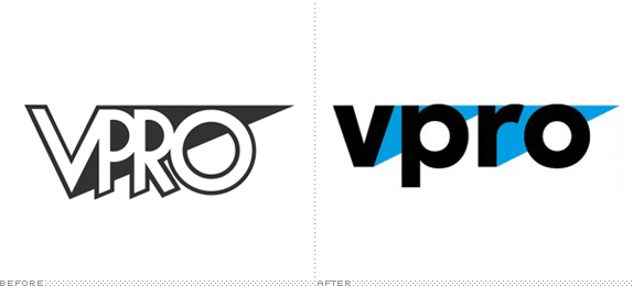
The old logo was fine and could have probably stayed the way it was for another fifty years and no one would have complained but, compared to the new one, it’s easier to see the lack of refinement or distinction it had, looking indistinguishable from many other spirit brands. While the same could be said for the new logo — it doesn’t break any conventions — the attention to detail is more evident and all the graphic gestures are more elegant and display better craft, in particular the new swift (the bird) with the textural lines and a more organic silhouette that doesn’t look like an airplane taking off. The Martell wordmark is nice and the removal of the yellow shadow is welcome. The accompanying typography and shield are also a great improvement that cleans up the fuzziness of the old ones for better reproduction and a classier aesthetic.

Custom sans typeface, designed by Production Type.
(All photos below by Louis David Najar Vasquez.)

Stationery.

Business card.

Envelope.
The stationery is super tricked out, its production cost can probably cover half a year of your salary.

Cordon Bleu packaging, before and after.
Without paying full attention, and even then, I doubt any consumer would notice the change in the packaging which is not necessarily a bad thing. I feel like this change benefits from a non-radical change on the shelf but, like the logo, all the small changes make for a better design.

Cordon Bleu new box and bottle.

Line-up.


Cordon Bleu details.


Boxes.


Blue Swift details.


Glasses.

Serving tray (I think).

Apron.

Metal icon on wood.

Flag.
Overall, this is a solid evolution that complements and builds upon 300 years’ worth of history and sets it up for continued success without unnecessarily rocking the boat.
By Armin