
The Dutch public broadcasting organization VPRO (an acronym that translates into 'Liberal Protestant Radio Broadcasting Company') started its life in 1926 as a religious radio broadcaster. Over the years it became more liberal and less religious until, in the sixties, it planted itself firmly in the avant-garde by being the first television broadcaster showing a nude woman on national television. Since then the VPRO never left its nonconformist role, with slight stubbornness purposefully choosing those programs, topics and formats that the other broadcasting companies passed over. Although not well known outside of the Netherlands, the VPRO is the real deal. It continuously airs intelligent, cultural and quirky programs, the stuff that makes TV interesting.
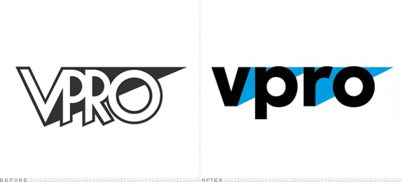
So the recent redesign of their 29-year-old logo predictably caused a stir, being one on those projects that every designer in the Netherlands will have an opinion about. Amsterdam based graphic design agency Thonik had the honor and, as far as I am concerned, they did a good job of updating the old logo with a fresh new wordmark.
That the VPRO opted for a visual continuation of the old logo, feels a bit like a missed opportunity however. Their viewers being almost by default an audience that can appreciate ground-breaking new directions.
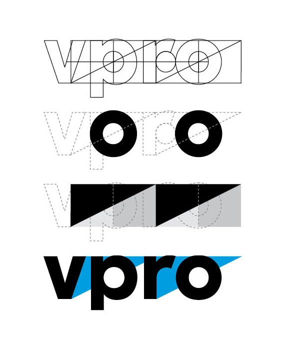
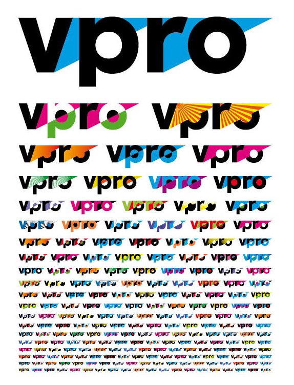
"vpro" is now set in lowercase, but some equity is maintained by keeping the triangle… heck, they even doubled it. The triangles and centers of the "p" and "o" are used to play a formalistic game of shape and color, creating a seemingly unlimited number of possible marks. With inventive use of just these few elements a playful extension of the style is possible.
Show reel with previews on program indents.
I like that the new identity is colorful and vibrant, and has enough 'weirdness' to fit with VPRO as a brand. There are some minor points like the circle of the 'p' not being the same as the 'o,' something that is shown in the explanation of the logo, but seems to have been abandoned later.
More pressing is that the idents for the programs (a sneak peak can be seen after 0:24 in the show reel above) do not seem to benefit from the outspoken flatness that works so well for the logo and printed matter. They feel a little too simplistic to do justice to the in-depth and imaginative programming of the VPRO. Although this flatness is somewhat of a statement in a media landscape of flashy, rotating 3d logos, it is not a new one after Max Kisman's iconic, 8-bit like idents for the same broadcaster in the 1990s. That being said, these are sneak peaks so a final judgement might best be saved for the future.
On its own, this new identity definitely passes muster, only question that remains is why the choice was made to update the logo instead of creating something new altogether. If there was ever a client to push the envelope, this would have been the one.
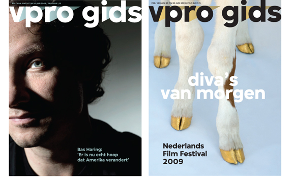
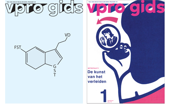
The logo in action on existing program guide covers.
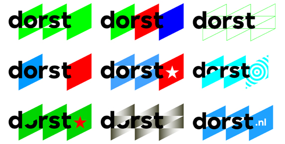
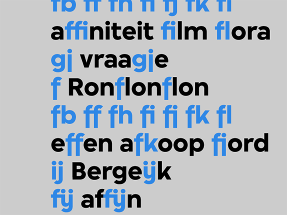
Titles for Dorst, an online youth magazine of VPRO, set in the bespoke typeface created by Bold Monday (sample below).
Images via Fontanel.
No comments:
Post a Comment