
![]()
Founded in 1987, Conservation International (CI) is an organization with 900-plus employees across more than thirty global offices. Its mission is to build 'upon a strong foundation of science, partnership and field demonstration, [to empower] societies to responsibly and sustainably care for nature, our global biodiversity, for the well-being of humanity.' CI has partnered with companies like Starbucks, Patagonia and Walmart and works with government bodies to achieve its mission. Earlier this month, as CI announced plans to expand its scope and scale of work, it introduced a new identity designed by Chermayeff & Geismar.
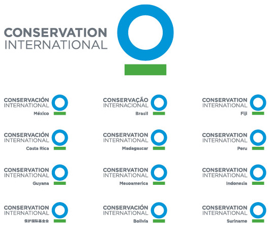
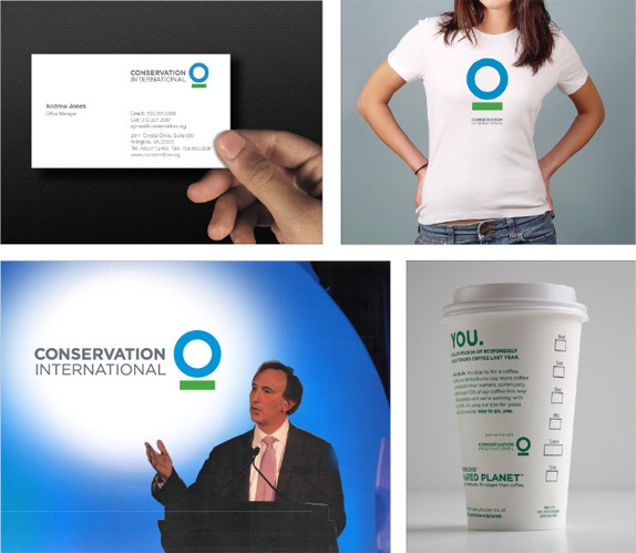
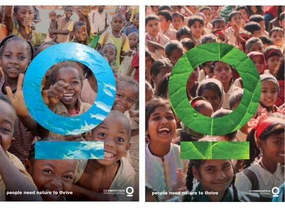
CI's new iconic logo is a modern, unmistakable graphic that represents the breadth and scale of our efforts, both on land and at sea, and the kind of international collaboration needed to help societies move toward a more sustainable economic model. It represents what we hope to achieve: a healthy blue planet supported by a green development path. The successes that have defined CI for years have resolved themselves into this great, blue circle of life; our markets, policy work and public engagement endeavors are charting a new, green path that incorporates these efforts.
— Conservation International New Logo for a New Mission
Logo animation by Thornberg & Forester. If you have problems with the video above click here.
Principal partner Sagi Haviv's solution — a blue circle underlined in green — symbolizes our blue planet, emphasized, supported, and sustained. The mark can also be seen as a unique human form. As a result, the new mark works both as a powerful brand signal for Conservation International, and a critical new mission message:
'The new symbol for Conservation International is an instance in logo design where the power is truly embedded in the simplicity,' says Haviv. 'Yet it is expressive enough to help the organization redefine itself, and therefore has the potential to become a true international icon. It was a perfect fit.'
— Chermayeff & Geismar Press Release
The previous logo reflected the nature (pun not intended) of the original scope of activities by CI — "working with communities to protect species and prevent habitat destruction in tropical countries facing the greatest threats to biodiversity." — so the tropical forest, wildlife and hut were a good representation. But as a means to carry an organization forward with more ambitious plans and gain a stronger and serious presence with businesses, governments and other organizations, it just made it look too small, as if it were a grassroots organization. The new logo is the complete opposite and, to some, this may be quite a turn off by being overtly corporate, minimalist and vague. I believe it works and that it communicates quite clearly that this organization, even if you have no idea what they do, are concerned with the planet. It's only a circled stroke and a stick under it, but it manages to look serious enough to demand attention. The typography is simple and it's quite nice to see the two words match in length without sacrificing too much or too little tracking in one or the other. For the sake of pointing it out, it's Gotham.
Overall, this identity fits very well an organization of this size and scope and it's a proper evolution that represents its growth and influence.
No comments:
Post a Comment