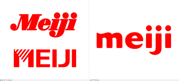
Established in 1916 and 1917 respectively — and shown top and bottom in the image above — Meiji Seika Kaisha and Meiji Dairies Corporation, have become one of the most well known brands in Japan. As the name of the latter implies, its specialty was processed milk products while the former focused on the (somewhat baffling) categories of confectionary and pharmaceuticals. This past April, the two organizations came together to form a single operation, Meiji Holdings Co., Ltd and along with it came a new logo, designed by the Tokyo office of Landor.

The beloved Meiji Milk Chocolate packaging, before and after.
Chris Palmieri of the Tokyo based AQ blog nicely summarized most of the details about the old logos: The candy and pill one designed by Yusaku Kamekura and the milk one by Takenobu Igarashi. Both logos were remarkably simple, elegant and bold, each with their own personality — Meiji Seika playful, Meiji Dairies serious. Combining both into a single wordmark was no easy task but I think they succeeded in creating one that fits in the new world of corporate identity design (i.e., friendly lowercase letters) while actually giving it a fresh personality and not just settling for basic, round, soulless letterforms like Xerox or any of the others. It reminds me a little of Emigre's Dogma. I would probably push the 'm' and 'e' a little closer but other than that the wordmark achieves a very nice rhythm.

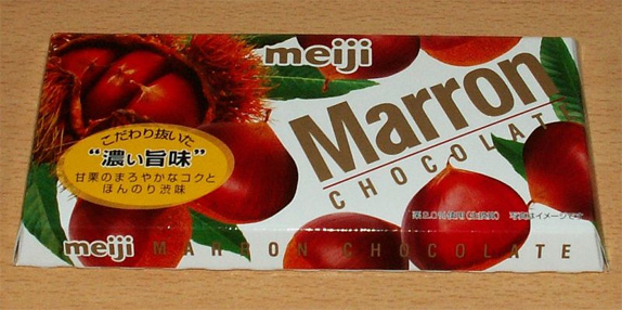
Hazelnut chocolate. Photo by Flickr user -*Sherima*-.

Yogurt, I believe. Photo by Chris Palmieri.
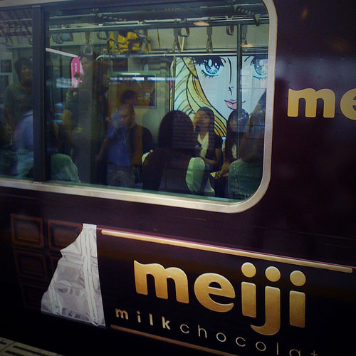
Other than the milk chocolate, the Meiji logo acts as an endorser, rarely appearing big or being the cornerstone of the packaging so in some cases it will look pretty nice like the yogurt above or rather awful like the hazelnut chocolate bar above it. But it sure looks great when used on a chocolate covered train.

Photo by Flickr user rosenbauer.
Thanks to Chris Palmieri for the tip.
Don't forget to cast your vote about this post online


No comments:
Post a Comment