

Ed.'s Note: This post strays from our typical format in various ways: It is not a new identity, it is not a before/after comparison, it is not an In Brief, and it is written by the person that designed the identity (can you imagine if we let everyone critique their own work?!). Nonetheless, this is an engaging story to post with a good lesson for everyone to learn. At least I enjoyed it and I'm happy to make an exception to the rules. End of note.
A typical identity project involves plenty of personal creative investment, hours upon hours devoted to rounds of sketching, revisions, and the pain-staking final tweaks to create a singular, perfect end result. Once the identity is complete and leaves our hands, though, we can't protect the precious qualities of what we delivered, and it's at the hands of clients to see if it remains in its intended form as time goes on. Yet, during a routine check-up call — something I do from time to time with previous clients — one of my logos definitely strayed from any branding guidelines, but, surprisingly, done so to the betterment and even salvation of populations living continents away.
![]()
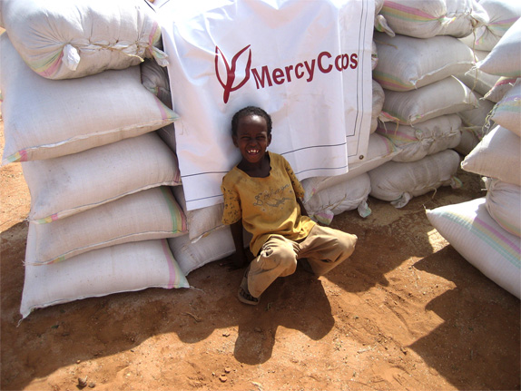
During one such call, I spoke with Jennifer Dillan, Senior Manager of Creative Services at Mercy Corps, the aid organization for which we designed a new identity several years ago. 'How is the brand identity going?' I asked, 'Is the logo working in the field?' To which she answered, 'Your logo saves lives!' That is by far the most unexpected and most profound response I have ever heard. She elaborated about how important it was for the victims to recognize the much-desired help and to differentiate it from not-so-well meaning people and the 'enemy.' Just like the Red Cross is instantly recognizable, so too does Mercy Corps have to signal their brand on vehicles of any kind, on tents and primitive structures, on clothing, flags and banners, on wells and supplies, packages, and signs.
'Mercy Corps helps people in the world's toughest places turn the crises of natural disaster, poverty and conflict into opportunities for progress. Driven by local needs and market conditions, their programs provide communities with the tools and support they need to transform their own lives. A team of 3,700 professionals is improving the lives of 16.7 million people in more than 40 countries.'
This is how Mercy Corps talks humbly about itself. In other words, floods, earthquakes, tsunamis, devastated areas by war or weather, draughts, famine, you name it, Mercy Corps is there, helping people to help themselves. Their stories are awesome and inspiring.
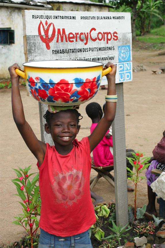
The logo we created for Mercy Corps is a brush-painted symbol alluding to a jubilant person while at the same time representing a growing plant or flower. A new brand strategy and mission statement was developed by Foote Cone & Belding, culminating in the tagline: "Be the Change," taken from a quote by Gandhi: "You must be the change you wish to see in the world." The symbol was designed to be somewhat crude and hand-made in order not to look corporate, slick, or complex, but we also realized early on that it would have to be reproduced with the simplest tools and methods possible, and applied on any kind of substrate or surface. Therefore we did only prepare the most basic final art and specifications.
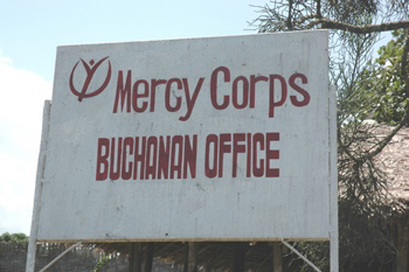
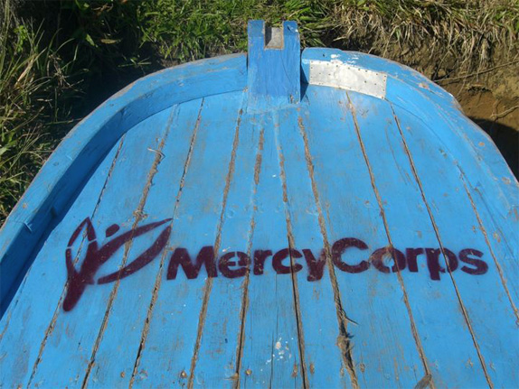
As we often warn people in graphic standards guidelines in order to protect our precious logos from being bastardized with sentences like: "Do not reset, redraw, distort in any way …always use original art from master files…Do not reproduce from photocopies, etc." Well, the good people of Mercy Corps violate all of these, and, if all you have is a brush and some black goo and no way to access or utilize digital files, you may be forced to reconstruct it based on someone's business card, crude photocopy, or from memory.
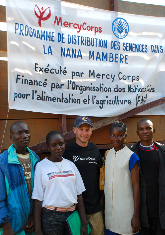
I had to laugh when I saw some of the pictures from the 'field.' It made me in a strange way happy to see obvious non-designers succeeding in copying the logo, in a different scale, on a piece of wood, cardboard, cloths or stone. Needless to say, it's more important to be out there, in a vaguely recognizable way and saving lives, than being 'correct.'
Don't forget to cast your vote about this post online

No comments:
Post a Comment