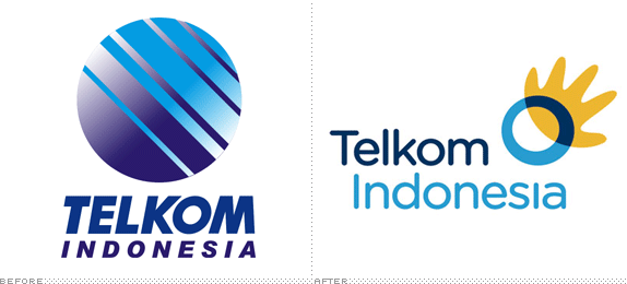
(Third telecommunication post in seven days!). PT Telekomunikasi Indonesia, or Telkom for short, is the largest phone service provider in Indonesia with about 15 million land line customers and another 50 million cell phone users. Part of that success is that the majority government-owned corporation had a monopoly on the market until a few years ago and faces stiff competition from Indosat (which has a pretty groovy logo, by the way). Looking to not only stay ahead of its competitor but move into the information, media and edutainment categories Telkom has launched a new, much needed, identity designed by the Jakarta office of The Brand Union, who had been awarded this project more than a year ago.
Working under the brand positioning of "Life Confident" Telkom has also introduced a new tag line, "The World is in Your Hand" replacing the tackier "Commited 2U" previously used. Without the tag line, the logo is just wobbly depiction of a globe and a hand and could potentially leave users confused. The tag line does not save the icon from looking like a rooster, but at least it helps ground it. The execution is actually kind of endearing, it has a certain innocence that I really like and it's definitely more friendly than the bad rendition of AT&T's old Death Star icon. The typography, Gotham Rounded, is a nice complement and does not demand much attention, letting the icon carry the weight, although I'm not sure if the globe acting as the i's dot in Indonesia is overly cloying. This identity could have some nice applications and it might be well served by Indonesia's young market.
Thanks to Michael Andreas for the tip.
Don't forget to cast your vote about this post online


No comments:
Post a Comment