
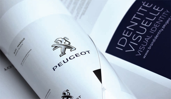
It's not everyday that we begin the critique of an identity prefaced by the accumulated equity of 200 years but… Peugeot was first established in the Montbeliard region in eastern France in 1810 by brothers Jean-Pierre and Jean-Frédérice as a steel foundry manufacturing a bevy of industrial products, from simple saw blades to coffee grinders. In 1885 another Peugeot family member first dabbled in wheeled locomotion by producing a bicycle, and four years later they introduced a steam-powered tricycle and by 1910, Peugeot was fully committed to the burgeoning automobile industry. The rest, well, is history, as Peugeot has become one of the most well known and respected names in the automobile industry (and few names roll off the tongue as fancifully). Last week, among other news like concept cars and stuff, Peugeot unveiled an evolution of its lion identity — designed by Paris-based BETC Design — along with a new tag line, "Motion & Emotion'.
Over 150 years of evolution of the logo, above and below.
The lion was adopted by the Peugeot family and business as it was the coat of arms of Franche-Comté, their birthplace and was first used on their saw blades to represent "the toughness of the teeth, the flexibility of the blade, and the speed of the cut." Since then it has changed numerous times to varying degrees of success but, undeniably, to a high degree of recognition.
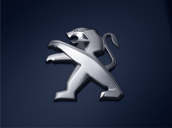
This is one of those cases where neither version, old or new, is better or worse. Structurally both are acceptable, each with its own merits: The front legs of the old one were stronger and more menacing, the stance of the new one is more forward, the tongue of the old one looked as if it belonged to a snake, the paws of the new one look as if they belong to a teddy bear. Etcetera. Stylistically, the new one is pretty awful, with very amateurish renderings of depth and shine, whereas the old one had managed to convey volume with a single change of shade. Tongue aside, the old one was a stronger icon. The typography is now slimmer and extended and neither change is for the better. The 'P' and 'O' look far too stretched with such high contrast in the thick verticals and thin horizontals. The asymmetric 'U' is not very pleasant either, and the rounding of the bottom-left corner of the 'E's is unnecessary. The only redeeming character in all of it is the 'G' if I had to force some kind of praise. The new typography, whether strategically on purpose or not, is reminiscent of Citroën, owned by the same parent company, PSA Peugeot Citroën. Overall, this new identity is just another in a long line of renditions of the same two elements and it will probably be changed in another dozen or so years.
Thanks to Pierre des Courtis for first tip.
Don't forget to cast your vote about this post online
No comments:
Post a Comment