
I gave myself a deadline of January 15 to do a recap of identity work in the 2000s, assuming that it wouldn't be an editorial faux pas to do a list of this sort well into the new year. So here it is. An admittedly incomplete — it would take months to do this exhaustively — compilation of the most relevant identities of the past decade. The choices are listed chronologically and there is no ranking system, they are simply there as records of the corporations, products and services that shaped the decade and the identities that helped (or didn't help) shape their perception in consumers' eyes and minds. The list is heavily American, so I apologize for lack of international inclusiveness to our readers around the world. Three main sources helped me compile this list and I would like to expressly thank them: 1) Tony Spaeth's Identity Works, whose archives of corporate identity changes go as far back as 1998, 2) Michael Evamy's Logo, and 3) our own Speak Up, which chronicled most of these identity changes from 2003 until 2006 when it gave way to Brand New. As it was made clear in The Best and Worst Identities of 2009 post last month, you don't have to agree with the selections below nor the associated commentary but you are cordially invited to — in honor of our first blog — speak up. Hope you enjoy this and please point out any corrections or omissions.

Cingular
Designed by VSA Partners

Just as the majority of the U.S. population transitioned into owning a cell phone by default, one of the most friendly and approachable mobile service providers turned out to be a rookie, Cingular. And actually, I have been a Cingular legacy user since 2001, seeing the brand painfully transition in 2004 and 2005 as it ping-ponged ownership with AT&T. Check out this web site from 2004 that I am guessing someone forgot to take down touting the merger. Cingular eventually disappeared in 2007 dissolving into AT&T, right around the time a certain phone made its debut.

Verizon
Designed by Landor and DeSola Group
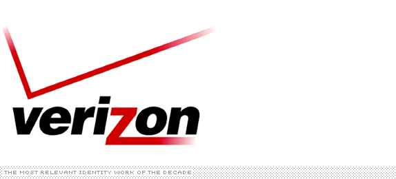
At the other end of the visual and personality spectrum was Verizon, a more aggressive and no nonsense provider and brand. Ask designers and you will find out that this is one of the most reviled logos. Poor New Yorkers too, they have to see it anytime they look south unto Verizon's headquarters.
3com
Designed by Interbrand
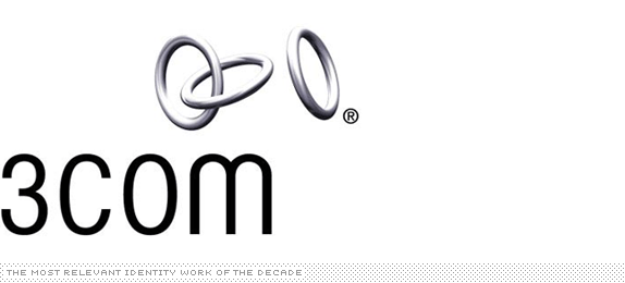
Even if you weren't to compare it to what they previously had — an uninspired blue square — the new logo conveys innovation and complexity and is elegantly executed. I can't seem to find an image online, but a 3com building near O'Hare airport in Chicago had a beautiful sculpture rendition of the logo outside.
BP
Designed by Landor
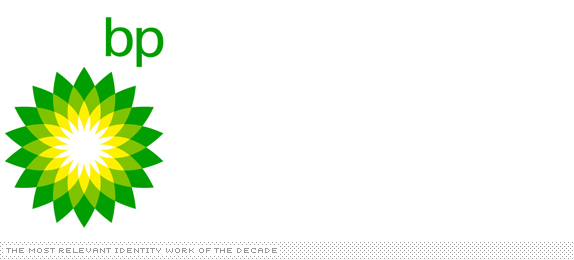
Petroleum is a word not just loaded with social, political and economical implications but also, let's face it, a kind of ugly word. When British Petroleum and Amoco merged, going full force with BP and the Helios icon did the perfect job in distancing the company from the word. Surely, fewer people today know what BP stands for — give it another decade and it will reach IBM acronym levels. This was probably one of the last really great identities by Landor's San Francisco office, who also had done the FedEx identity a few years earlier.
Amazon.com
Designed by Turner Duckworth
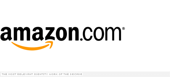
Who would have thought that the modest beginnings of Amazon would balloon into what it is today: A place where you can get everything but hookers. And unlike the rest of the dot-com logos, that were gratuitously meaningless, Amazon brought a smile (from A to Z no less) to designers' faces.
Pets.com
Created by TBWA/Chiat/Day
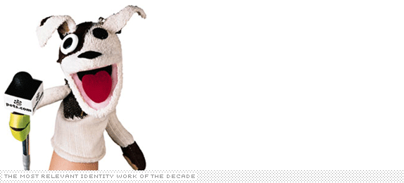
Yes, this is not necessarily a logo or identity, but as an icon for the excess of the dot-com era, none stood dumber than the Pets.com puppet. Sure, it made us laugh during the 2000 Superbowl, but the advertising campaign cost a dozen times more than the revenue the company made in its two-year existence.
Napster
Designed by Sam Hanks
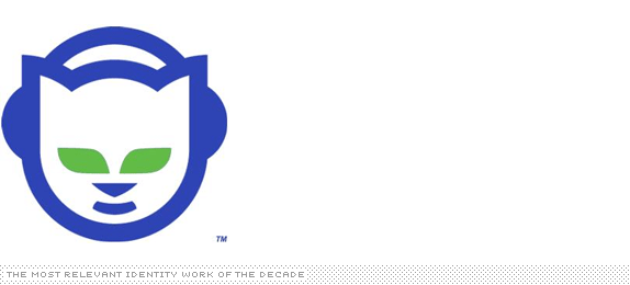
While Napster began in 1999, it wasn't until 2000 when it became not just widely used by every college student in the U.S. but embroiled in a high-profile legal battle with Metallica, among other artists who preferred people buy their music, not share it mercilessly over some nascent tube technology they didn't quite understand. When Sam Hanks first talked to Shawn Fanning and Shawn Parker, he inquired about the name, to which they replied it involved cats napping, leading to the mischievous cat with headphones. Hanks charged $5,000, and they were hard to collect — lore according to All the Rave: The Rise and Fall of Shawn Fanning's Napster.

Enron
Designed by Paul Rand
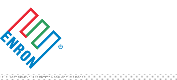
Designed five years earlier in 1996 by Paul Rand, the Enron logo became the identity of corporate evil as news of its debt-hiding schemes became known and the logo appeared on newscasts around the clock.

Monday
Designed by Wolff Olins
As a direct cause from the Enron debacle, PricewaterhouseCoopers — one of the consulting firms associated with it — decided to spin its consulting division, PwC Consulting, into its own little company and list it on the New York Stock Exchange. The new company was to be called Monday. The press release described the word as 'a real word, concise, recognizable, global, and the right fit for a company that works hard to deliver results.' Here too is a handy PDF detailing the design thinking by Wolff Olins. However, Monday was never meant to come, as IBM purchased PwC Consulting and absorbed it. This was probably one of the first high-profile non-logos.
Star Alliance
Designed by Pentagram

I really couldn't care less about what airlines do on their free time or who they associate with as long as they get me to where I want to be on time, and since they can barely do that I really, really don't care for airlines. And most airlines come together through the Star Alliance, something I have no idea what it does or stands for. But, man, that is one pretty logo.
TiVo
Designed (and named) by Cronan
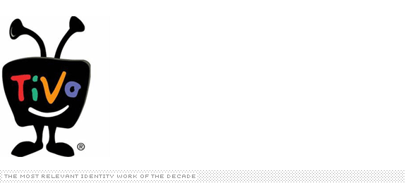
I admit that I could be off by a year or a few months on this one but, at least according to the U.S. Patent Office, this logo — the second evolution of the TiVo identity — was created in 2002. To be fairly honest, I don't quite like it, and if it were to be discussed on Brand New today it would probably get chewed up. But in introducing a whole new product category, the little TiVo thingie became an ambassador for change and the killer of the 30-second ad.
UPS
Designed by Futurebrand
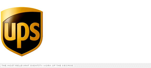
I can't imagine how designers complained about logo changes before blogs. At least it appeared they never had, given the outpour that occurred on (Brand New's older sibling) Speak Up in March when UPS announced it was ditching its landmark Paul Rand logo in favor of a worthless piece of shield. I am unfairly mean in that last description, as I have come to accept, seven years later, that this change was the right thing to do. I still think the logo, aesthetically and structurally, is irremediable but in terms of its strength to carry such a large corporation with a hefty public presence, it has been quite effective.
Abbey
Designed by Wolff Olins
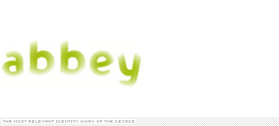
Now you see it, now you don't, now you see… That was the story, both visually and existentially, of Abbey Bank. In just over a year after it hit the market as a consumer bank, it was bought by Spain's Banco Santander, which rolled the bank under its flame identity. Perhaps, well no, surely for the better, as this was a pretty weird identity and a little too reminiscent of Wolff Olins' more successful blurry effort for Tate.
Altria
Designed by Landor
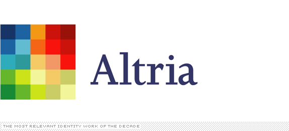
One of the greatest cases of reinvention, running away from the tainted (and smoky) name of Philip Morris into a nebulous new name with a fresh start. It didn't hurt that the logo was kind of attractive and abstract enough to mean anything anyone wanted.
NWA
Designed by TrueBrand
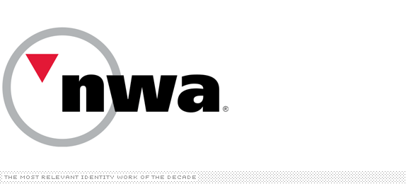
It used to be one of the greatest airline icons ever. Designed by Landor in 1988, it was an 'N,' a 'W,' a compass pointing Northwest, yet it was simple and, simply, amazing. The new one was meant to downplay the 'Northwest' aspect as the airline went other places, but was it also supposed to downplay wit and execution?
VH1
Designed by VH1 In-house Team
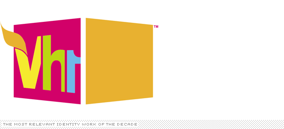
The discussion on Speak Up raged on for 229 comments and to this day I don't understand what the VH1 logo is supposed to be or why it is the way it is. Most logos that I hated years ago I have learned to cope with, but not this one. It is continually saved by the work around it, but as a structure it seems as fickle as a house of cards.
The Islands of the Bahamas
Designed by Duffy & Partners
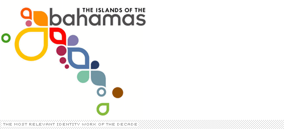
This is the kind of concept — "Just do all the islands as groovy shapes" — that could have gone horribly wrong. Yet, Duffy & Partners' execution was exuberant and warm. And it made you wish you were in the Bahamas, especially a few years ago when they bombarded New York subways with their ads, filling the visual periphery with all those groovy shapes.

Unilever
Designed by Wolff Olins
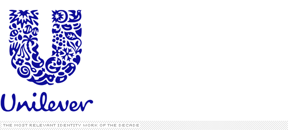
In what other logo can you find a fish, a palm tree, a bowl, particles and ice cream? That's right, nowhere but on the Unilever logo (see all the contents here). Unilever does a lot of things and its logo makes sure you don't have any doubts about it. Another concept that could have been poorly done was nicely crafted with the help of Miles Newlyn.
YWCA
Designed by Landor
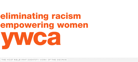
While the YMCA enjoys plenty of notoriety and recognition the YWCA (Young Women's Christian Association) did not. So why not make it perfectly clear what it does and how it does it. Not all mission statements can be turned into a logo, but this one works.
GE
Designed by Wolff Olins
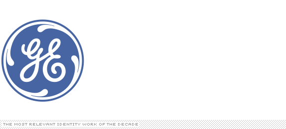
The best part about this is that it didn't change. The GE logo has remained technically the same — a spaghetti-like "GE" monogram in a circle — since the late nineteenth century, and Wolff Olins did a great job in building a whole identity around it, an identity that has given GE a vitality it probably never knew it had.

AT&T
Designed by Interbrand
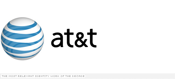
When Saul Bass originally designed this logo, he implied volume by modifying the weight of the lines as they would if they were on a sphere. I don't think he intended for those same lines to then be spherized, creating a sphere with an abstraction of a sphere painted on it. Also, lowercase? Really? But all is forgiven because AT&T has the iPhone.
The Bank of New York
Designed by Lippincott
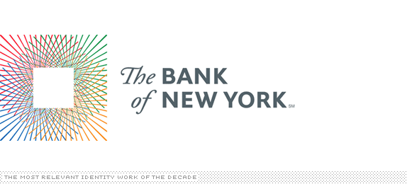
Not terribly functional but astoundingly pretty, especially for the corporate identity of a bank. Unfortunately it didn't last long as two years later it was acquired by the Mellon Financial Corporation and evolved into the weirdly named The Bank of New York Mellon — with a nice enough logo, also by Lippincott.
New School
Designed by Siegel + Gale
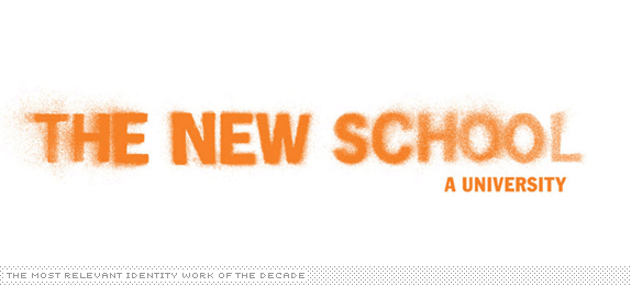
It was a pretty hard challenge, unifying eight different schools, each with their own personality under one parent brand. I don't think anyone imagined that stencil spray painting would inspire the solution, nor become a visual signifier for higher education. Siegel + Gale's work for the New School was met with some trepidation, but nothing looks more in place in the city of New York (or Project Runway) as this rough-edged aesthetic.
(RED)
Designed by Wolff Olins
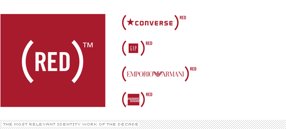
Allow me to quote ourselves from Graphic Design, Referenced on this one: For the main brand — the name was selected because red is the color of emergency, which certainly applies to AIDS — RED is rendered in a sans serif typeset within parentheses. For the license brand, (PRODUCT) RED, the logo of the partner is placed within the parentheses and RED becomes a superscript; the combination is meant to be read as, for example, "Apple to the power of RED." The simplicity of the identity barely hints at the complexity of Wolff Olins's task: finding a way to create a new, strong brand for (RED) that could be integrated with some of the best-guarded and most carefully developed brands, turning untouchable assets like Starbucks green and American Express blue to red. While consumerism and philanthropy still remain an oxymoron, (RED) demonstrates, through action and design, a possible blueprint for their convergence… well, a (RED)print for their convergence.
Quark
Designed by SicolaMartin
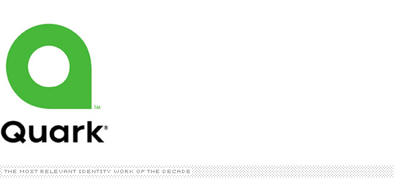
With Adobe InDesign firmly in place in the design industry, there is little reason to pay attention to Quark, makers of QuarkXPress. But when they designed a logo that looked like a dozen other logos, designers paid attention and it wasn't the good kind. To be continued…
Quark
Designed by Quark In-house Team
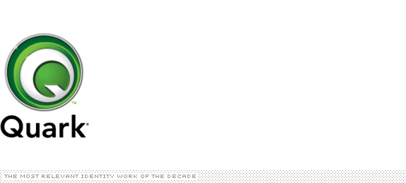
Tail between legs, a corporate rep for Quark said "Quark listened to the feedback we received from the design community in relation to our re-branding initiative in September and decided to create a new logo that is both an evolution of our visual identity and a strong representation of the new Quark… Changing the mark to avoid any perception of similarity enables us to further define our unique identity." Okay, we'll accept the apology for that first slip-up but now we will take another one for this Googly-Eye-of-Shrek logo, please.
Cisco
Designed by Jerry Kuyper and Joe Finocchiaro
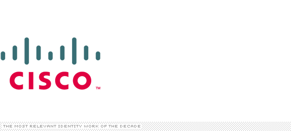
Cisco has consistently had a strong corporate identity, and it could have probably kept on for a lot more years with its last incarnation. But Kuyper and Finocchiaro's work was an excellent evolution and abstraction that maintained the equity of the bridge while creating a simpler and bolder mark.
Kodak
Designed by Ogilvy & Mather's Brand Integration Group (BIG)
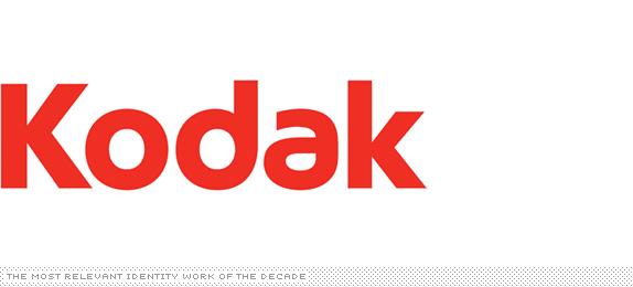
At the time it was released, it wasn't clear what was more baffling: the loss of the iconic K logo, or the 'a' in the new logo. Interestingly, at least for me, I find this to be one of the most pleasing wordmarks of the whole decade. Simple yet quirky. Bold. Looks great in the new packaging, and I easily forget what the old one used to look like.
Payless
Designed by dg* Desgrippes Gobe
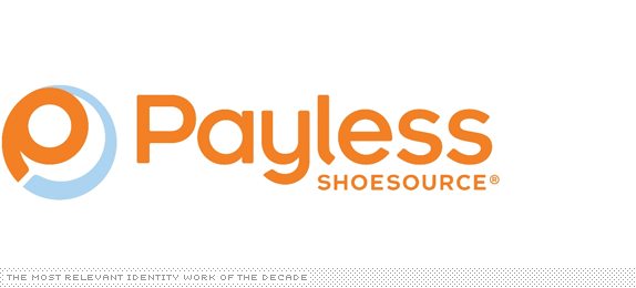
This is the only logo I have written about twice (version 1, version 2) only to get angrier with each writing. I could easily write a third with my utmost disappointment at the loss of Cooper Black and the gain of some silly swirly 'P' but I won't. Not today, at least.
Chicago 2016 Olympic Applicant City
Designed by VSA Partners
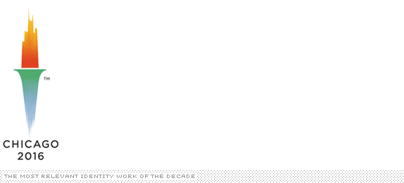
Most applicant city identities tend to be, well, half-assed. Undercooked and uninspired. For the 2016 bid by the city of Chicago, VSA Partners created a lovely icon that blended the skyline of the city and its lake to form a torch. However…

Chicago 2016 Olympic Applicant City
Designed by VSA Partners

A few months later, the International Olympic Committee decided to change the rules of the bidding process for cities, with one clause stating that city logos 'shall not contain the Olympic symbol, the Olympic motto, the Olympic flag, any other Olympic-related imagery [such as] flame, torch, medal, etc.' Chicago 2016's skyline torch was now breaking the law. So VSA Partners one-upped the IOC and created another lovely logo, this one taking the shape of the stars found in the city's flag — the stars themselves signify major milestones for the city, and hosting the Olympics could be another star added.
London 2012 Olympic Summer Games
Designed by Wolff Olins
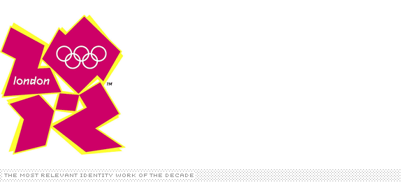
Boyohboy, was there a more hated identity last decade? I think not. It even carries into this decade and probably into the next. I think the logo is a funny aberration but the identity around it is brilliant and the launch video that some people claimed gave seizures was actually pretty darn cool. We have some screen shots on Speak Up still, if you missed it.
Wacom
Designed by Wolff Olins
I am an intrepid Wolff Olins advocate, but this was just absolutely incomprehensible. If I could just whack it away with a Wacom tablet.
NYC
Designed by Wolff Olins
Designed for NYC & Company, the official tourism organization for the city, this sturdy logo continually takes on a secondary role to the messaging found throughout the city, but more and more, it becomes quickly recognizable — not an easy feat for a city so in love with its I [Heart] NY logo. The range of applications remain to be seen but the potential is there.
Obama ’08
Designed by Sender LLC
No logo has been praised so much in many, many years as has the Obama ’08 logo designed by Chicago-based Sender LLC — get the full story of the development here. It helped that the logo stood for something that people around the world believed in or, at least, wanted to believe in, and they rallied around it with fervor. The way it morphed visually for the different segments of the population was pretty brilliant. And the fact that the campaign engendered such a creative outpour only helped cement this as one of the most iconic identities not just of the past decade, but probably ever. (Time will tell, time will tell).
Walmart
Designed by Lippincott
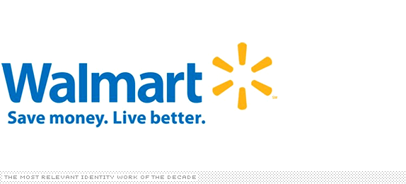
I went to a Walmart recently, due to a lapse in judgment, and found the new logo to be in complete dissonance with the environment and experience. While the logo attempts to portray a light and friendly personality, the reality is oppressive and unpleasant. It takes more than a starburst to make something luminous, and Walmart has a long way to go before it can shed its monolithic image, better represented by its previous logo.
Xerox
Designed by Interbrand
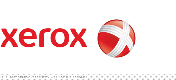
The press release explained the metallic ball as 'representing Xerox's connections to its customers, partners, industry and innovation,' epitomizing the ability for press releases to spin the reality into a fabric of idealistic concoctions that simply fall flat when read. The typography in this one is passable but the icon is sadly too inconsequential.
Pepsi
Designed by Arnell Group
Hahahahaaaa…hahahaaa. Oh, Pepsi, yes, we are laughing at you, not with you. It could have all been forgotten had it not been for this fateful PDF.
Tropicana
Designed by Arnell Group
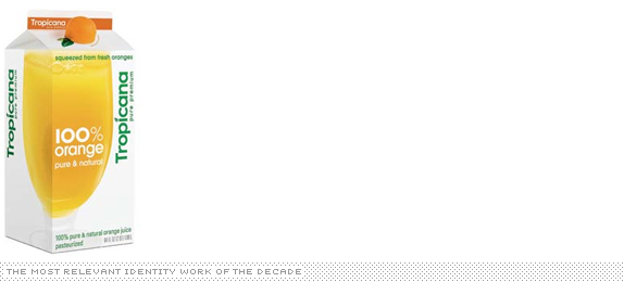
This is the only package design in the whole list and I debated whether to include it or not. But as a case of brand identity gone wrong, you can't beat the Tropicana story. First unveiled in October of 2008, along with a bulldozering by Arnell of the Pepsi beverage line-up, the Tropicana packaging was met with a resounding 'Hell no!' from consumers who complained about being unable to find their Tropicana. Four months later, Tropicana announced it would go back to its previous packaging. Most designers cheered that good design triumphed over crappy design but others actually saw doom as corporations now have a precedent in Tropicana of not trying anything new for fear of consumer revolt. As long as new things aren't so badly designed, I think we can be at rest with the latter scenario.
Nickelodeon
Designed by Nick In-house Team and others
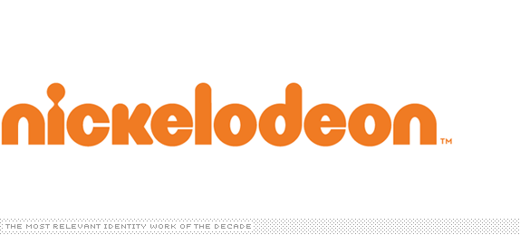
The debate on whether or not the 'splat' logo could have lived on remains a hypothetical one. We will never know. But for the time being, a whole new generation of little rascals is being bred on the new Nick identity and, from the on-air package created by Trollbäck + Company, that's not a bad thing. And that's just the main Nickelodeon channel, the rest are clicking just as right. So long splat.
Aol.
Designed by Wolff Olins
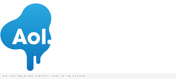
Given the heated and even angry replies I received to ranking AOL as the No. 1 Best identity of 2009 I will reserve any further commentary on why I think it succeeds and instead I will just plainly list it as one of the most relevant identities of the decade — whether it's good or bad is clearly up to you.
It's good, by the way : P
Thanks for reading or scrolling all the way through.
No comments:
Post a Comment