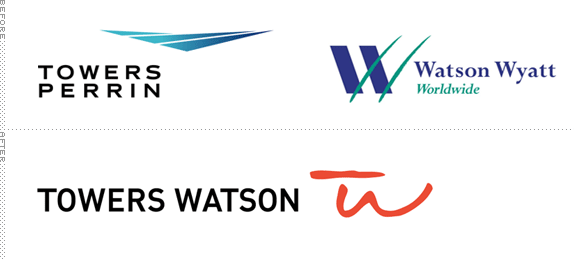
With a combined 14,000 employees in offices around the world, Towers Watson is the newly minted 'professional services' firm created by the merger of the 5-year-old Watson Wyatt Worlwide and 76-year-old Towers Perrin, officially established earlier this month. Towers Watson offers services in Benefits (retirement, health and group benefits), Risk and Financial Services (insurance consolation, investments, risk management), and Talent and Rewards (executive compensation, employee rewards), all of it a nice presented package that is actually easy to understand. With a new name that literally merges the two companies, Interbrand was given the assignment to create the new visual identity.
It became evident that Towers Watson's primary strength would be its combined attention to relationships, both with clients and employees. Through workshops and discussions about personality and brand archetypes, a strategic positioning, 'Clarity through perspective,' was developed that would guide and support the creative development.
— Interbrand Project Description

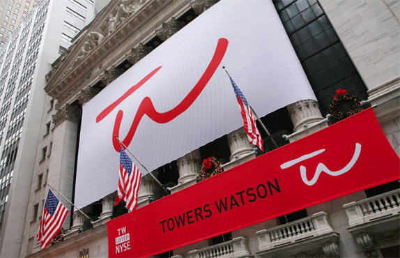
The new logo represents each Towers Watson's employees' personal commitment to its customers by 'putting their names on the line' with a personal signature of the company. The identity is a combination of a strong, pragmatic wordmark and an approachable signature symbol. The organic, hand-drawn nature of the logo and graphic system creates a personal and distinctive look amidst the impersonal, corporate, language of its competitors. To echo the hand-drawn nature of the logo, a customized, scripted typeface was created along with a library of illustrations.
— Interbrand Project Description
The new logo strikes a pretty good balance between seriousness and friendliness. The wordmark is as buttoned-up as it gets, all uppercase and black as a CEO suit, and it's so refreshing to not get another all lowercase rounded wordmark. Meanwhile the TW monogram is loose and dynamic and makes a nice complement in shape and color to the name. I typically don't like to say "This logo looks like…" but I was reminded of the Wynn brand. First, formally, as it's a signature. But, second, philosophically, as a way to humanize an out-of-scale organization.
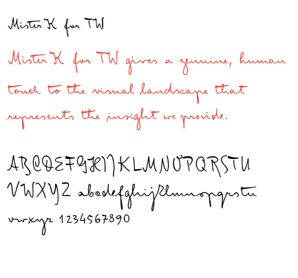
Clarity, a proprietary handwritten font for Towers Watson. Image removed by request. Official name of the font, 'Mister K for TW,' provided by Interbrand.
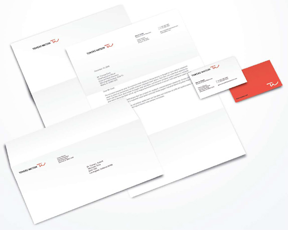
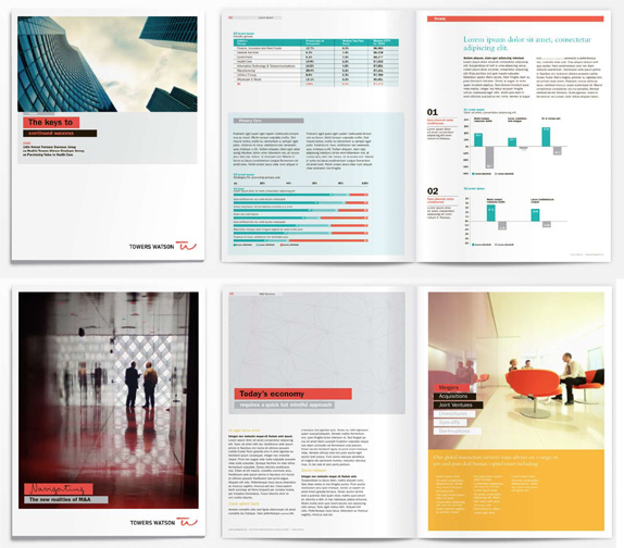
The applications succeed similarly in appearing fresh yet not alienating towards a business-minded audience. The thick boxes behind text is nothing new, and Franklin Gothic is fairly conventional choice, but in conjunction with the handwritten font, it all manages to feel contemporary enough. Overall, a solid introduction for this new company.
Thanks to Yotam Hadar for the tip.

No comments:
Post a Comment