
This will be a fairly short introduction and light in informative design background because the little information there is about this is in Korean — but, as always, the universal language of identity design will get us through this together. Korea Post is the mail carrier of Korea in charge of all postal services and the financial services offered by the post offices. A new identity, exhaustively covered in this brand manual, is now being implemented.
![]()
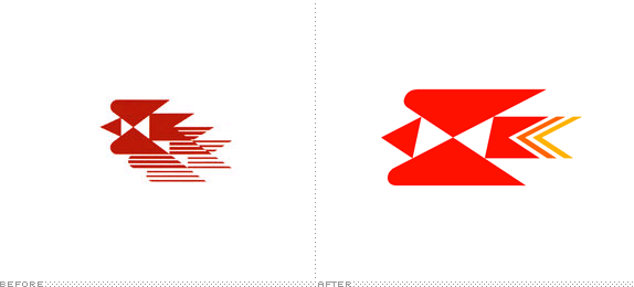
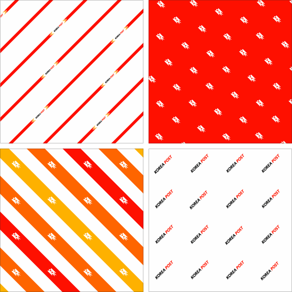
I'm going to go out on a limb and say that the icon represents a Magpie, the national bird of Korea. The old icon had a very defined 1970s aesthetic, with those thick and thin lines representing depth — the equivalent of today's drop shadow — but the single bird by itself is a very strong and memorable visual, so it's nice to see the new identity building on that. The new italicized version is bother better and worse I feel. In one view it feels striking and dynamic, but in the other it feels like it lost of the gravitas the older one had. Perhaps it's also the colored tail feathers that make it feel less serious and, perhaps too, that was the intention, to make it less commanding.
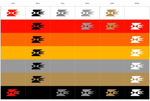
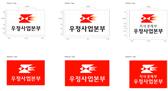
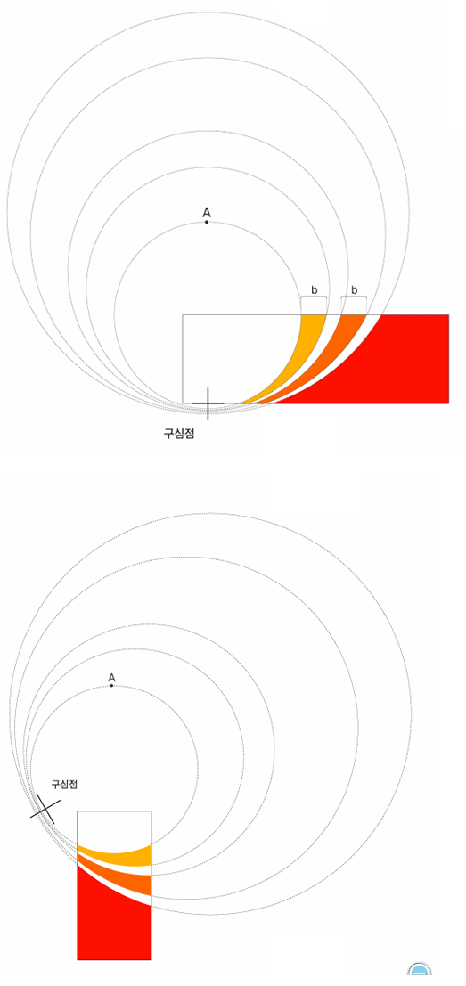
The rest of the identity is fairly formulaic and repetitive, which is not bad but after going through the 162 pages of the standards manual I was hoping for a little surprise here or there. Everything hinges on the 'Harmony Line' background pattern of concentric circles, which is a decent device and provides a good contrast against the angularity of the icon, but the same sentiment applies. Too much of the same. The choice of Myriad for the corporate typeface is frugal (it's probably installed in all government computers) but ultimately bland, and its italics have never been the most fetching. In the end, though, this seems like a perfectly suited system for proper deployment at a large scale.

No comments:
Post a Comment