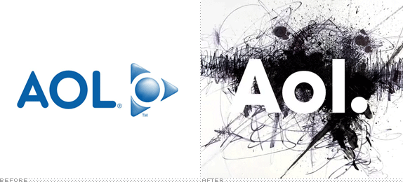
Malpractice in blogging isn't telling lies or being inflammatory or defamatory. It's being late. Some blog, somewhere will be there first and drag your late traffic away. It's not every day that Gawker, the Huffington Post, the New York Times, and Fast Company, among other mainstream news sources cover an identity redesign before we do but such was the case with yesterday's news of the new identity for AOL designed by every designer's favorite hate piñata, Wolff Olins. For what it's worth, I was up at my usual 5:30 am yesterday with this news in my lap and I decided against putting it up immediately, patiently waiting for some additional material solely distributed to our loyal readers. The gamble didn't quite pay off, at least not yet; I might have something new later in the day, but I know you are all very much ready for this.
First, however, the basic premise of what we are looking at: After making the announcement in May of this year, this upcoming December 10, 2009 AOL will become independent from Time Warner, nine years after the two merged to create one of the largest entertainment companies in the world. In that span of nine years, the online world that AOL ruled at the turn of the century, is a completely different organism, populated by people for whom AOL is a punch-line, or a sad reminder that they paid $10 to see You've Got Mail, or, most probably, people that have never used AOL at all. This, in some sort of perverse way, is actually the perfect opportunity for AOL to reinvent and position itself as some sort of content catalyst for a new generation of users that either have forgotten about the legacy of AOL or are hearing about it for the first time. But I am getting ahead of myself. Let's turn to the press release that sets up AOL as a content-driven organization — let's not forget they own web juggernauts like TMZ and Engadget — and puts its executives already at the the defensive before anyone has even offended them:
AOL today previewed its new brand identity for its future as an independent company committed to creating the world's most simple and stimulating content and online experiences.A brand video introducing the 'reveal' concept of the logo.
The new AOL brand identity is a simple, confident logotype, revealed by ever-changing images. It's one consistent logo with countless ways to reveal. The new brand identity will be fully unveiled on December 10, when AOL common stock begins trading on the New York Stock Exchange.
"Our new identity is uniquely dynamic. Our business is focused on creating world-class experiences for consumers and AOL is centered on creative and talented people — employees, partners, and advertisers. We have a clear strategy that we are passionate about and we plan on standing behind the AOL brand as we take the company into the next decade,' said Tim Armstrong, Chairman and Chief Executive Officer of AOL.
[Emphasis above mine]
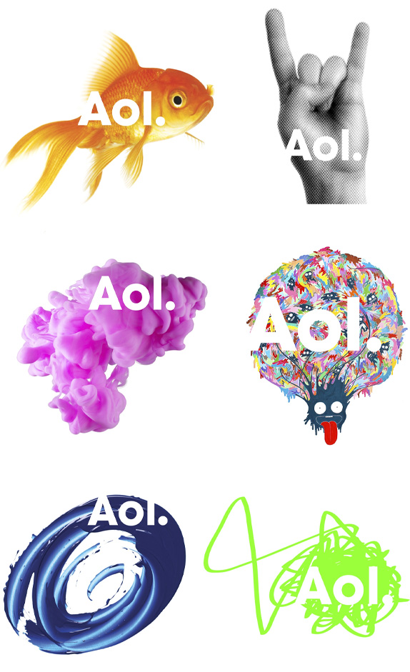
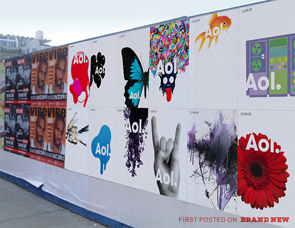
The logo can be revealed through anything, from a goldfish to any number of swirls.

Brand New Photoshops so that you don't have to: Here is the typography isolated.
So there you have the essence of it: No more uppercase 'AOL' now it's title case 'Aol.' with a period; the period serves to establish AOL's content structure as in Aol.Classifieds or Aol.Personals; it's bare bones sans serif typography; and it's a bunch of wild card images/objects/whathaveyous that stand behind in order to reveal the logo. Unfortunately this is prime for easy hating as the buzz around the blogs and news outlets has already proven. Truth be told, the way the unveiling was handled, AOL and Wolff Olins got what they deserved, which is rather unfortunate. In most cases you can judge an identity simply by looking at the logo, as it is the root from which the rest of the identity has to bloom but in this case, releasing randomly selected images that look really goofy as a viral JPEG, does not help establish the AOL logo as a root that must spread across a whole jungle. Yes, I'll stop with the gardening metaphors.
I am guessing that on December 10, the AOL universe will be flipped on its head and its main web site and content sites will be transformed to showcase the new identity. Without this backdrop, the logo unveiling is premature. Consider our recent MSN.com post: The majority of the comments hated the logo but acknowledged that the web site was a vast improvement; even if the logo was a fail, the reboot demanded more careful consideration. Yesterday's AOL announcement of a look that is revolutionary for them served mostly as a reminder of the dullness that AOL is trying to make us forget.
I am probably one of the sole cheerleaders of Wolff Olins — Wacom notwithstanding — and their weird ways, and I have to say that this is a strong identity hindered by a weak start. As the motion work above shows, the logo is simply a foggy window to what lies behind it, and when executed correctly it can be fairly arresting. The static logos are timid and too random — although the goldfish is a nice to nod to founder Michael Wolff — and I really hope there is more behind the curtain that we haven't seen. If AOL is committed to shedding not just its Time Warner shares but also its public perception as a web dinosaur then this identity can do it for them. It might take a few years for it to stick but, perhaps foolishly, I do believe in it.
The biggest problem I have with the identity is that, maybe unknowingly, AOL has set itself up for an endless barrage of visual mockery. Anyone with Arial on their machine will be more than happy to slap an 'Aol.' on whatever they find funny or demeaning. I don't find the below particularly funny (except the Peanut Butter Jelly Time banana) and I am not trying to be immature but when you are a media giant, vulnerable to an endless array of criticism, you have to be careful what ammunition you give your haters.

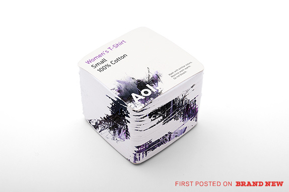
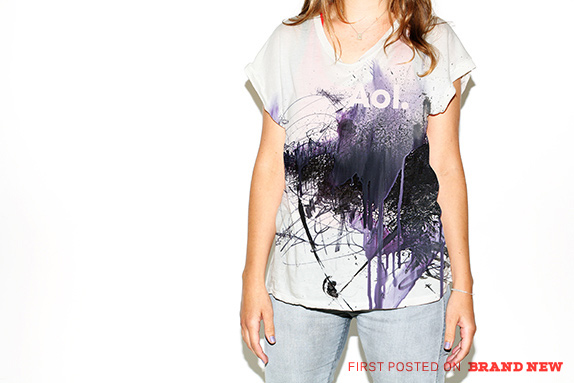
UPDATE 01: Here are some proof-of-concept images with the new identity. Thank you, you know who.
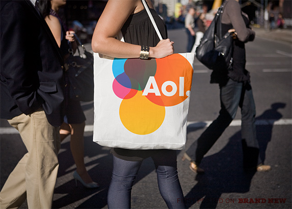
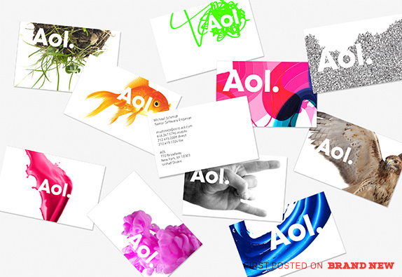
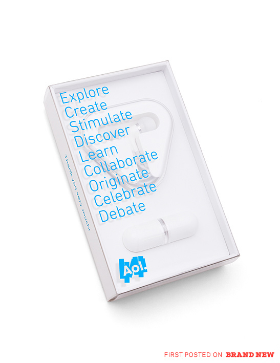
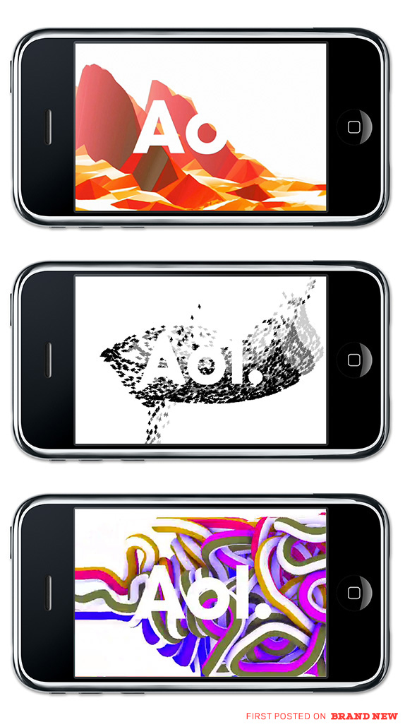
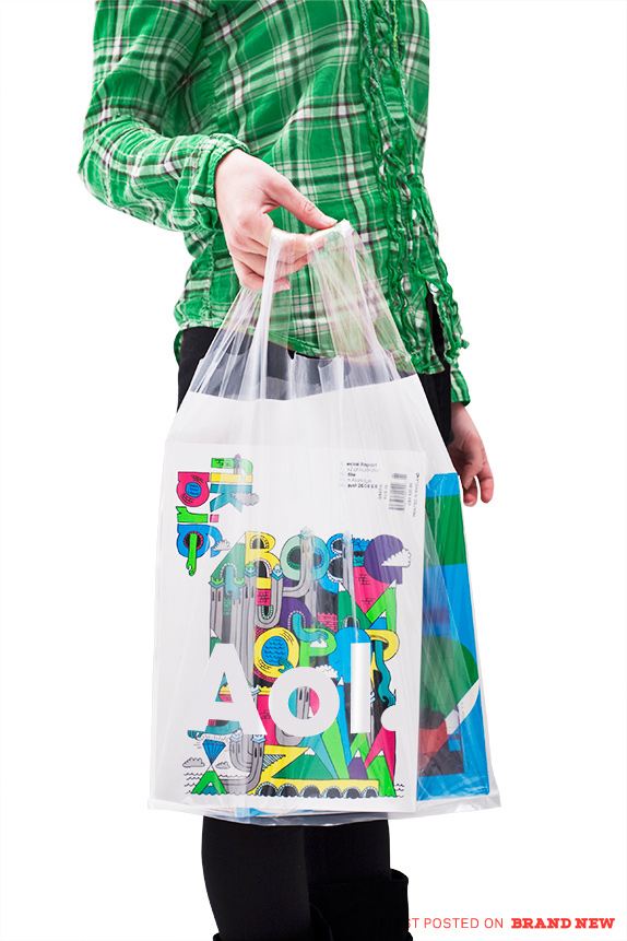
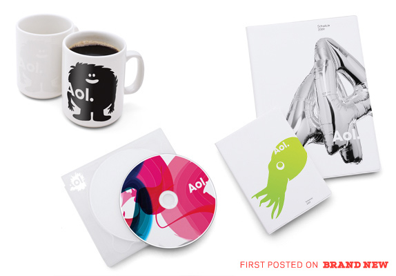
Thanks to everyone for the tip.
Don't forget to cast your vote about this post online

No comments:
Post a Comment