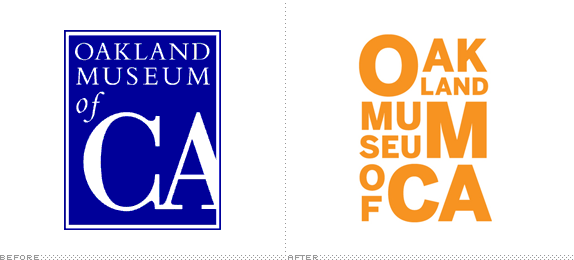
Part of a $58 million dollar renovation, the Oakland Museum of California — which "brings together collections of art, history and natural science under one roof to tell the extraordinary stories of California and its people" — will re-open in May of 2010 with a renovated and expanded building designed by Mark Cavagnero Associates. The initiative, which will create more exhibition space and update the infrastructure to support more new media work, hopes to boost museum participation by 50% and help to revitalize the Oakland cultural scene. A new identity was introduced earlier this month.

There is a clear world of difference between these visual identities. The former places the emphasis on the state abbreviation, most certainly stressing the heritage of much of the noteworthy collection — including items like gold-rush era Levi's, Greatful Dead posters and Native American baskets. The idea of the new logo is strong but the execution feels like it was forced through a 1990s Microsoft Office product. The new identity shifts the identity away from being heavily california-handed, likely to shake off some of its cal-centirc reputation, and plays its acronym notes by drawing out "OMCA". While the visual approach is somewhat reminiscent of Scher's Public Theatre work, the letterpress approach to the composition is well handled and provides some added tension to the new/old aesthetic.
Thanks to Deirdre Spencer for the tip.
Don't forget to cast your vote about this post online


No comments:
Post a Comment