
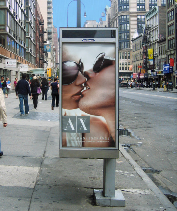
Established in 1991 with a store in the heart of Soho in New York City, Armani Exchange (AX) provides clothes that "define a new dress code with a collection that takes its cue from urban lifestyle and music culture." In other words, really expensive jeans and white v-neck shirts among other swanky clothing. AX today has 165 stores worldwide and can be found in upscale department stores like Bloomingdale's, Saks Fifth Avenue, and Neiman Marcus. Like the rest of the Armani empire — which, by the way, had revenues of 1,620 million Euros (US$2,354 million) in 2008 — AX has sported a Bodoniesque wordmark that has become fairly recognizable yet at the same time inundated by the fashion industry's preference of Didones (also called Moderns). This Winter, AX will begin rolling out a revised wordmark created by Chermayeff & Geismar, led by partner Sagi Haviv.
Chermayeff & Geismar's design team inverted the logo, so instead of dark letters on a light background with a dividing line, the A and X are in white, sitting in two dark boxes with the slash now implied by the space between them. The firm also redrew the A and X to make the thick diagonal strokes parallel and to accentuate the contrast between the think and thick lines of the letters.
— Press Release
![]()
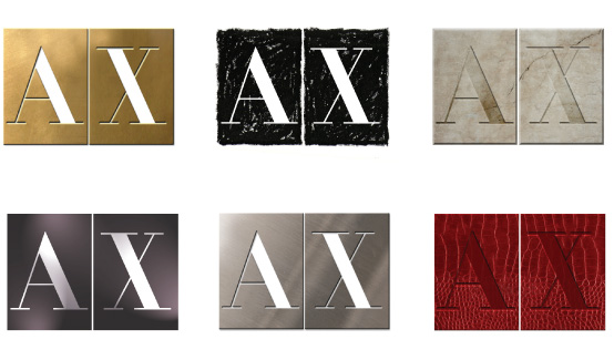
More than a complete redesign that might dispose of built equity, this approach allows AX to appear mostly unchanged but still able to look revitalized. Kind of like a good haircut, where it's still the same basic structure but something makes you do a double-take and reconsider what you are looking at. The old logo had bracketed serifs — meaning there was a slight curve where the serifs met the diagonal lines — which made it look a little softer and the new, unbracketed serifs add a touch of toughness and even a feel of classicism. I also prefer the less elongated letterforms and the new implied slash, all bundled together in a nicely tight package.

The redesign will probably go unnoticed by the majority of consumers, but eighteen years with the same logo could potentially start to hurt the image of a brand that must stay with the times, and this subtle make-over is a perfect segue for another couple of decades.
Don't forget to cast your vote about this post online
No comments:
Post a Comment