
COP15, the United Nations Climate Change Conference, is almost over here in Copenhagen, Denmark. With international politicians, police escorts, demonstrations, hotels fully booked and a lot of international press, the summit brings together top political leaders from across the world — and depending on the result of the meeting — could be one of the most important political events in history. The purpose of COP15 is to come up with a plan for solving the climate change problems in the world, starting today. This can only be done if everyone works together. I am all for the conference, and hoping for an ambitious plan, my only fear is that politicians, also having profit and other things than the climate on their agenda will not act quickly enough, and might not want to go to the radical measures that may be needed. But I guess that's a whole other story, let's talk identity.
The COP15 identity is the result of a logo competition held by the Ministry of Foreign Affairs of Denmark. It's created by two very inspiring Danish designers, Troels Faber and Jacob Wildschiødtz, working under the name nr2154. The identity was chosen out of maybe 70, or more, designs (including one of mine).
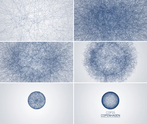
![]()
'The winning proposal is a striking and at the same time both simple and complex symbol. Simple because the symbol is a stylized globe. Complex because the visual expression allows for a host of interpretations.'
— Comments from the Jury
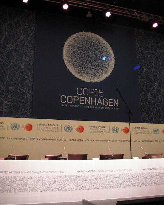
Surely, among the entries, there were other good interpretations of the globe combined with climate change effects, however, this one has an added layer of details and meaning by being constructed from a 'random' network of lines. Each line represents a nation in the UN, and the picture as a whole is supposed to give the look of something going towards either unrest or balance. I like the story as it is showing the realities, unrest vs/ balance, without being a melting globe/globe on fire, or anything doomsday-ish like it. At the same time the symbol is also showing the solution: all nations coming together. It reminds me of the Facebook application Friendwheel, which is not a bad source of inspiration.
The clean blue look, taken from the blue planet works well, and I guess this also gives a bit of hope that our globe won't end up becoming burning red hot. The type used looks like an adjusted Foundry Monoline and supports the thin lines with its light weight. My concern when I first saw the logo and type was that it was too detailed, the complexity of the thin lines and the very delicate type used could cause problems. Since then it was changed just slightly, and I think it actually works really well, the symbol even works online and is (almost) decipherable as a favicon.
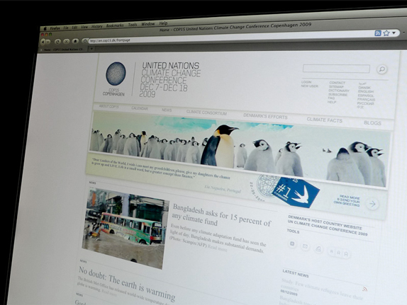
Image source for this and all images below.
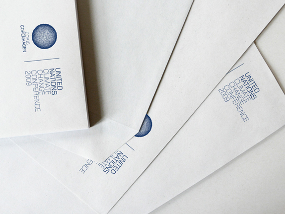
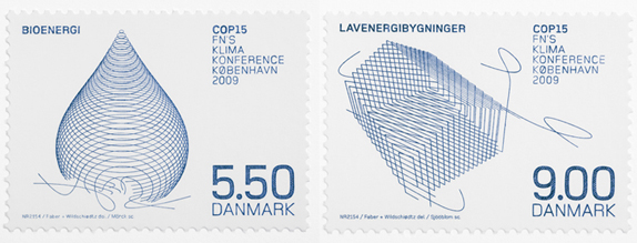
The overall look is a nice twist on the very minimal Danish design tradition with all the details visible up close and the simplicity of the globe, seen from afar. What I really like about the identity is — in spite of the very fragile visual elements (the lines, the cool blue and the light type) — that a whole unique look has been created; it is flexible and the look can be maintained even though the symbol is changed and the text is in Danish, as seen below on these very nice stamps with green energy illustrations instead of the normal globe symbol.
The identity even features its own sound and animation (in collaboration with shiftcontrol): I really like the depth and the truly thin lines of the symbol in the animation.
agency Goodmorning Technology. His focus lies on strong conceptual ideas in identity and packaging design. He is also a freelance teacher at the School of Visual Communication. Poulsen is a Brand New International Correspondent.
Don't forget to cast your vote about this post online
No comments:
Post a Comment