
Three years after it was selected as the host city of the XXII Olympic Winter Games and five years before it becomes the center of global attention, the city of Sochi, Russia unveiled the identity for the 2014 Olympic Winter Games, created by the Moscow office of Interbrand — who, I'm told, in the Olympic spirit brought in five designers from Interbrand offices around the world to work on the identity.
'sochi2014.ru' is the first Olympic emblem that also forms a web address, creating a 'digital' Games logo. It has been designed to actively encourage dialogue between Russians, nations and winter sports fans — particularly youth — facilitated by Sochi 2014's online platforms.
The '.ru' component is Russia's web-domain address and signifies that Sochi 2014 is an Olympic Winter Games hosted by a whole nation, as well as the Black Sea sub-tropical city of Sochi. The introduction of a 21st Century emblem for a digital generation reflects how the 2014 Olympic Winter Games will be accessed through PC screens, PDAs, mobile phones, televisions and other devices, in line with ever-improving internet reach, increased bandwidth and the adoption of new technologies. This can help young people to experience sport for the first time, with a view to active participation and long-term engagement with sport and Olympism.
As a key component of the new Sochi 2014 emblem, the Olympic rings sit large and in colour to leave no doubt that this is a symbol of progress for the Olympic Movement. The opportunity to change the colours and inner-design of the rest of the emblem encourages people to express themselves, with some anticipated to transform it using traditional images, while others will take an ultra-modern approach. The mirror of 'Sochi' and '2014' reflects that Sochi is the meeting point between the sea and the mountains.
Behind the Brand
![]()
If all the above sounds familiar, it's because of its similarity to the theory behind the 2012 London Summer Olympic Games of a logo that can be owned by all, seen on every conceivable surface that flickers, and aimed at the young folks. Which is all fine but there is something just not exciting at all about this new identity. The addition of the Russian top-level domain, .ru, is actually very interesting and daring, not so much for Interbrand but for the International Olympic Committee, as it is indeed a first in Olympic identity design, and for an organization that puts such a stronghold on its identities, it is quite commendable that they allowed a new verbal and visual element be added. Let's just hope it doesn't start a trend, otherwise be ready for Rio2016.br.
It's kind of strange to see an Olympic identity without some sort of icon, especially for a Winter edition, where snowflakes are the norm. As a wordmark, Sochi2014 isn't exactly, well, Olympic. It doesn't feel dynamic or exciting. It is nicely done and I like the mirror of effect of 'hi / 14' but in an effort to keep things aligned, the '2' is too condensed and if mirroring was the idea, it looks disconnected from the 's' above it. The outlined '.ru' is downright ugly unfortunately and dilutes the idea of the domain becoming part of the name. As I understand it, the 'sochi2014' wordmark can contain different images within it, again, not too different from what the London 2012 identity proposes. But no applications on that have been released.
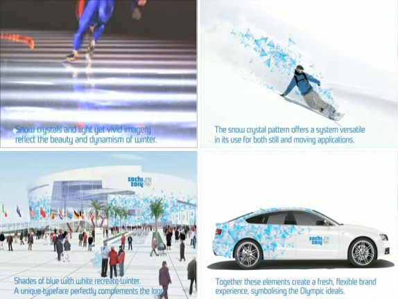
Stills from brand presentation video.
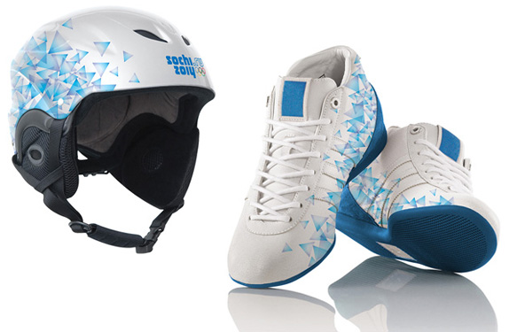
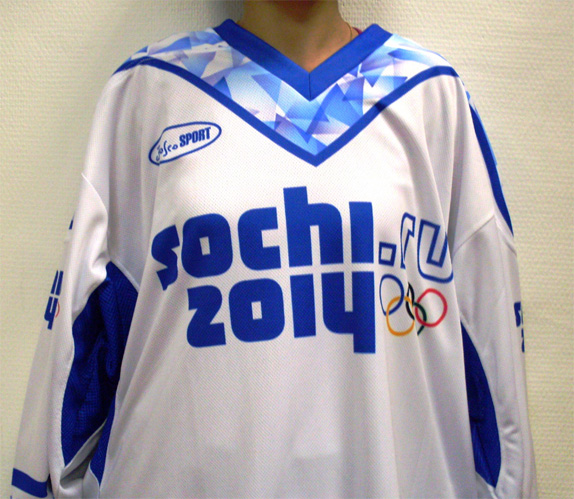
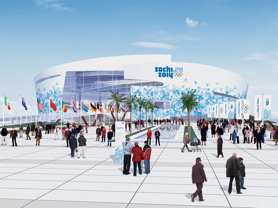
The secondary design element of the identity are the 'Snow Crystals' which are sprinkled like visual fairy dust on everything. The crystals are nice and create a pretty texture but after one, two and one hundred applications it will get very boring. This is where an expandable palette of elements like the one developed for the 2010 Vancouver Winter Games comes handy. Overall, the Sochi 2014 identity is radical in premise but in execution it's as safe as it gets.

All images from Sochi 2014 Winter Games' Flickr.
Thanks to Alexandr Zalutskiy for the tip.
Don't forget to cast your vote about this post online

No comments:
Post a Comment