
When we talk about 'one of the biggest companies in the world' or 'one of the leaders in their industry' or any other claim to the top spot in anything here in Brand New it's all relatively, well, relative. Especially when you compare anything to Pfizer, the leading-number-one-biggest-you-name-it player in the pharmaceutical industry. According to their 2008 financial report, the revenue for that year was $48.3 billion. They also produce two of the most popular and well known pills in the market: Lipitor and Viagra, among many others. Needless to say anything further, Pfizer is big. Last week, rather quietly, Pfizer launched a new web site and introduced a revision to its 18-year-old oval logo, which was designed in 1991 by Enterprise IG (now The Brand Union). The new logo and comprehensive identity program has been designed by Siegel+Gale.
The 'Pfizer oval' was introduced in 1991. Over time, a great deal of equity was built in that logo, and it is widely recognized around the world. But today, Pfizer is a different company. It's changed through global growth, numerous acquisitions, entry into new therapeutic areas, and development of life-changing medicines. The new logo keeps much of the existing equity, but with the brightened color, approachable typeface, and tilted oval it signals positive change and forward momentum and asks people to take a fresh look at Pfizer because it is not the same company it was in 1991.
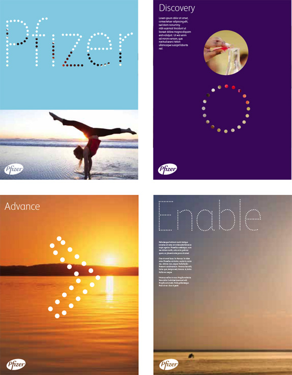
In addition to an updated logo, their new visual system also helps to signify this shift. The new dotted display typeface, illustration style, and bright multi-color palette work to communicate their larger vision of advancing better health for all people around the world.
— From Siegel+Gale
![]()
The new logo features redrawn typography, a color gradient and a tilted oval. 'Big deal' I'm sure some of you will exclaim questioning why even change at all. Siegel+Gale presented various redesigns to Pfizer but ultimately the decision was made to not stray far from the existing logo. 'The designers,' is the obvious retort, 'should have pushed the client to do something new.' Well, folks, you don't push a $48 billion company to adopt a new logo just because designing new logos is fun. Instead, this is one of the most underrated challenges in the identity industry: to revitalize a company through a new identity strategy that doesn't rely on a shiny new thing front and center.
![]()
![]()
But let's talk about what Siegel+Gale has decided to put front and center. The new logo is a great improvement on the old one. Instead of a semi serif, the new typography is a sans serif which makes it feel more contemporary. My favorite detail of the new type is the italic "e" that adds a lot of softness to the mark. The "z" is a little wobbly on its diagonal line but it works. And, overall, I like that there is less contrast between the thick and the thins, so the logo will hold up better when sized down on the back of a medicine box. The gradient… I guess, why not. I'm not a fan, and as the 1-color logos above show, it's not necessary. I also like the tilted oval, it's less symmetric and adds a bit of movement.
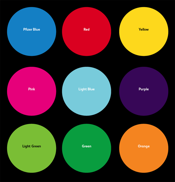
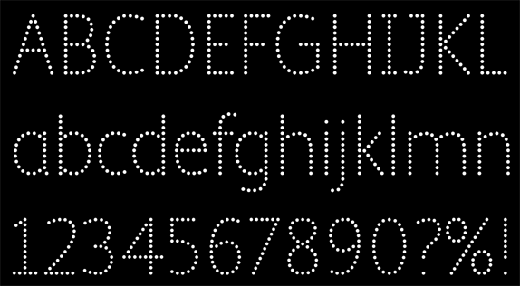
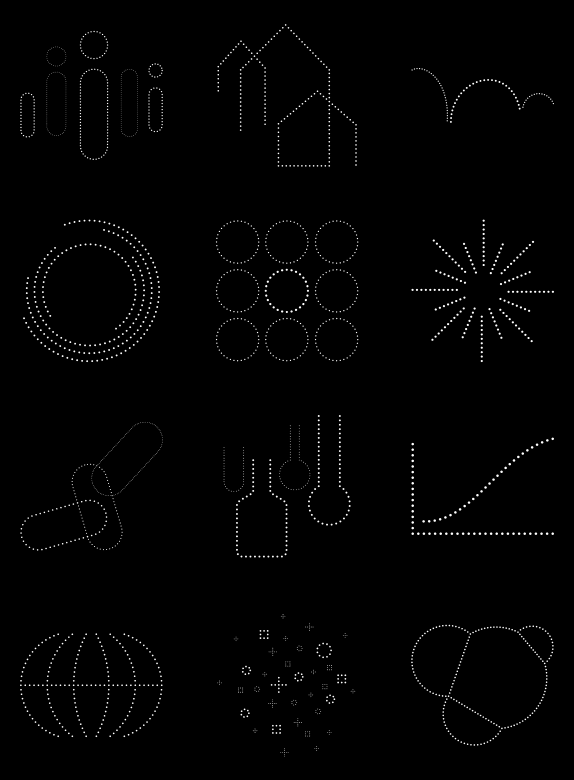
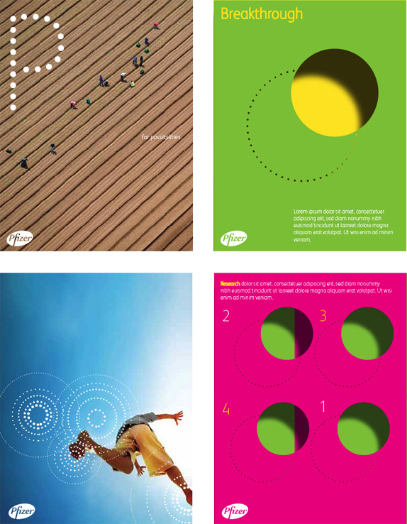
The logo might pass unnoticed by most viewers but the new identity applications probably will not. Siegel+Gale has put together a kit that allows Pfizer to deploy a variety of looks and messages. The first element is a dot typeface used for display purposes; it's nothing too fancy, but in the context of Big Pharma it's pretty out there. Following the dot appliqué is a set of moody illustrations that are at once scientific and playful. Add in a vibrant color palette and you have a recipe for real potential as the applications below — which are proof-of-concept and not final executions — demonstrate. With a few more hours of development the two designs underneath and to the right (green and pink backgrounds) would make Lester Beall and Ladislav Sutnar proud. This is not an easy project and the result is as uplifting as Pfizer's magic blue pills.
Don't forget to cast your vote about this post online

No comments:
Post a Comment