
In 2007, the 35-year-old Norwegian company Statoil merged with the oil and gas division of the 102-year-old Norsk Hydro, to form StatoilHydro, an energy and oil company with presence in 40 countries focusing on the production of oil as well as the consumer distribution of oil through various gas stations — with different brand names, some of them still named Statoil — around the world. Today, as it prepares to become a stronger global player, StatoilHydro officially went back to the Statoil name and adopted its new identity designed by Scandinavian Design Group. I emphasized 'officially,' because the logo and name changed had actually been announced back in April of this year but the web site had not yet implemented the new logo.
" Our new logo, the star, is inspired by the starry skies of the north. It symbolizes our highest aspirations: continued focus on the Norwegian continental shelf, international growth, and active and targeted work to develop effective new energy solutions," Reidar Gjœrum, Senior vice president Corporate communication in Statoil explains.
'Along the way we carried out thorough research among the world's 100 largest energy companies. We found most to be quite conservative in their descriptive symbols and communications. We wanted to differentiate ourselves by making a courageous decision. It's important that we stand out in an international arena and stay faithful to our desire to lead the way,' he continues.
'By choosing the magenta-coloured star as our new symbol, we make explicit our origins and our desire to cross new frontiers on our journey forward. We're also making a clear statement that the world can still look towards the north to discover future energy solutions.'
— Press Release
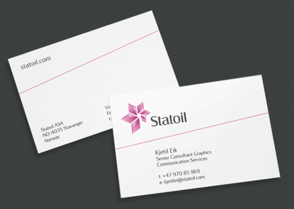
Image source.
Even though I am not 100% convinced by the final execution I do think this is a very strong identity with an even stronger rationale and story behind it. It is just not a gratuitous abstract symbol and the color is not just a random choice. The color alone is such a bold move, going where few corporations are willing to go these days and it's surprising how well the logo looks in both white and black, although it looks best against the latter, emphasizing the star concept. The icon, of course, loses a lot of its strength when rendered flat as seen in the uniform below, becoming more of a leafy shape. The typography is nice and interesting, a kind of evolved Rotis that balances seriousness with friendliness better than any rounded sans serif can. Overall, this is a great update of a brand with plenty of history. Some application images below and more can be found here.
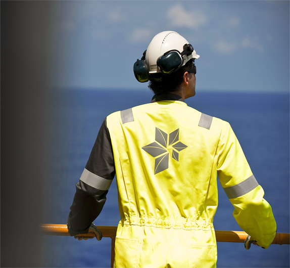
Image source.
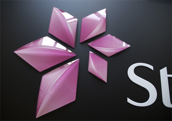
Image source.
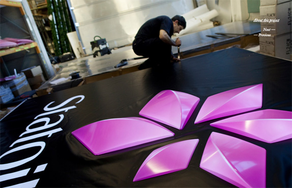
Image source.
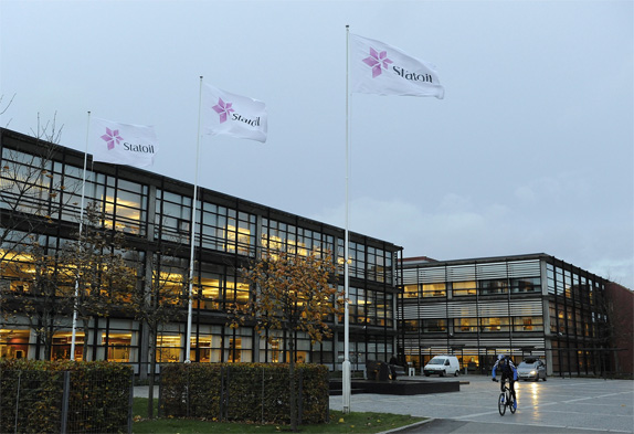
Image source.
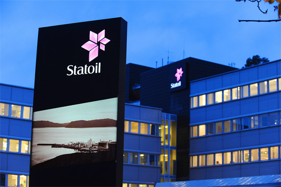
Image source.
Thanks to Alexander Strand Kristensen and Martin Deutsch for today's tip.
Don't forget to cast your vote about this post online
No comments:
Post a Comment