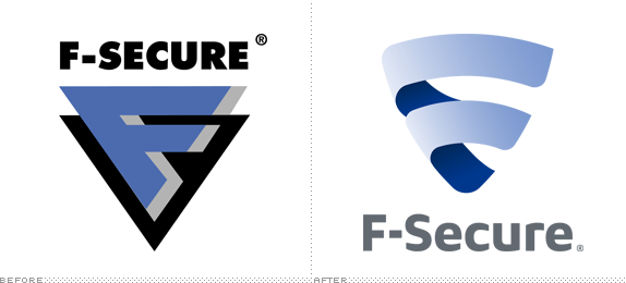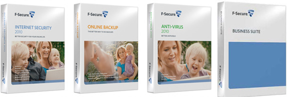
Three years after its founding as Data Fellows in 1988, this Finnish company based in Helsinki launched its first antivirus product in 1991. Refining their products all through the decade, it changed its name to the more intimidating name of F-Secure and has become an important player in the development of computer and mobile device protection and antivirus products. This past September, it launched a new identity.

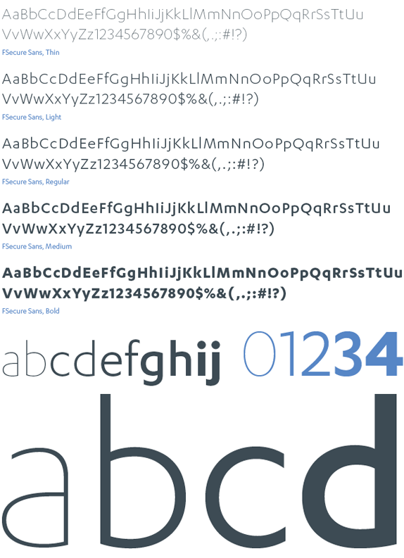
Other than this light blog post, there isn't much information to go on but, what's certain, is that the old superhero logo had to go, even more so when all big corporations are going with softer identities. And, in that regard, this logo is a success: instead of the harsh, pointy and dangerous corners of the old icon is a ribbon-like "F" that might as well be used to wrap the computer up in a pretty package and hand it to data miners; and instead of good ol' Futura Extra Bold is a new, custom type family called F-Secure Sans that is described — in the identity guidelines [PDF] — as a "modern sans design, forward-looking but not futuristic, precise but not cold and geometric, consistent but not soulless," aka soft and rounded.

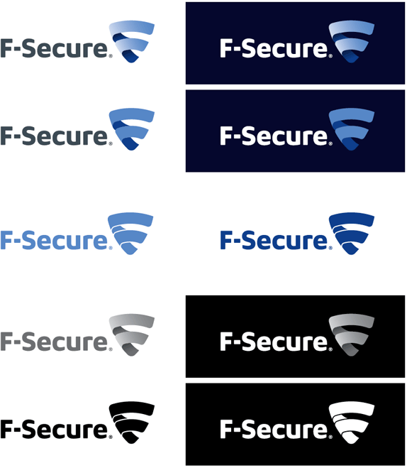
The overall identity is actually not bad, it does have a nice feel to it but, at least for me, it's hard to get past the awkwardness of the icon. It's almost there but the way the ribbon curves does not feel natural. The way the top corners on the right are squared and the bottom rounded but both corners on the left side are rounded is too inconsistent and how the bottom part of the stem is drawn feels too forced. The logo looks rather nice in full color on top of the dark blue background but then you see the 1-color application and it looks clunky at best. The type family is nice, an interesting cross between Dax and Gill Sans that does elevate the whole project.


Thanks to Lauri Haavisto for the tip.
Don't forget to cast your vote about this post online

No comments:
Post a Comment