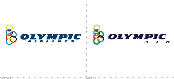
Olympic Airlines, once the national airline of Greece, has recently been sold by the Greek government to a private investment group. The new logo and name (now shortened in the 1980s fashion to Olympic Air) are supposed to signal a change in the company's culture and offering. To that end the company has held a grand logo contest in the Olympic tradition of competition. Read on to see who took home the silver and bronze.

These two runners up received 4,992 and 2,472 votes respectively; the winning logo received 11,652 votes
At this point, logo contests are about as novel as air travel itself. If anyone has an excuse to put one on I suppose it's a company with 'Olympic' in the name. What makes this contest unique though — and the result so underwhelming — is that it's really more of a refinement contest. It's one thing for a company to invite their customers to help shape the future of a brand. But can you really expect a crowd of people to refine something? Would you hold a contest to restore a painting? Here's the criteria, direct from the source:
[The Olympic Air logo] Should retain the circle motif used in the old Olympic logo.
Could be designed using any font and any colors.
Should 'give a nod' to the old logo, showing the development as well as the tradition of the airline.
Should be flexible and recognizable.
Should be modern, without being extreme.
Should not show its age.
Should be usable in all media, and in color as well as in black and white.
Not much to go by. Branding (the art and science behind logo development) is often more complicated than it seems. A project like Olympic Air raises a lot of important questions. As noted in the brief, the new logo must signal the precise amount of change (i.e., this is the same company you know and trust, but now we are different and better). It should respect or at least consider the company's brand equities and ensure legible reproduction across a range of media. Most importantly perhaps, the mark needs to be considered in the context of a larger system (how is it expressed on the web site? what does the livery look like?). These are hard issues to settle in a contest setting.
The winning logo designer and proud recipient of €20,000, Panos Triantafyllopoulos (aided by art director Aris Papathanasiou), had this to say about his work,
For the design of Olympic Air's logo, we chose the difficult path of updating the existing one. We did so not only with respect to the company's history but also to its future prospects. Letter by letter, we designed a more aerodynamic, modern version of the logo in deep blue. We replaced the black ring color with a dark blue and added the green color that is prevalent in Greek nature. We instilled depth and shine to the colors and surrounded them with a silver metallic outline.
The new design manages to retain the Olympic rings and definitely gives a 'nod' to the original logo. Is it modern without being extreme? I guess. Is it easier to produce than the previous mark? Not really. Then again, when people vote for a logo online they don't typically take those considerations into account. All said, the logo update turned out OK. The letterforms seem to be drawn and kerned a little better. The top serifs have been applied more consistently from letter to letter than the previous ones. The wordmark does seem a little leaner and more 'aerodynamic.' The introduction of green is an interesting choice. The rest (the letterform shading, the shadows in the rings, the blue shift and the tracking of the word 'AIR') is mostly competent, if forgettable. As it turns out, Olympic Air now uses the negative version of the logo with flat-shaded rings on their web site. This seems to erase much of what differentiated the new mark from the old one--something that could have been mitigated if the designer played a larger role in the process. Will people look at the new home page and realize the brand has changed? Only time will tell.

Detail of the letterform treatment
Ultimately, it's hard to grade this logo without the benefit of solid criteria. It was created in a vacuum without, I assume, any meaningful communication between the client and the designer. The result is a superficial update that seems to represent change for change's sake. Good PR, lackluster branding.
Thanks to Nicholas Yatromanolakis for the tip and to Alexandros Plakidas for translation assistance.
Don't forget to cast your vote about this post online


No comments:
Post a Comment