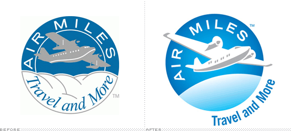
'Air Miles' seems such a loose term that any airline could own and have little chance at being its own brand. Which just goes to show that I'm neither Canadian nor good at accruing miles. Air Miles is a very popular reward program in Canada where everyday purchases made at or with participating products or services add up to coveted, well, air miles for some much desired traveling. According to this article, two thirds of Canadian households participate in the Air Miles program. That's a lot. While Canada seems to be the most successful Air Miles, the program (and brand) runs independently in other parts of the world, like the UK, Spain and the Netherlands. The company isn't that old, it was established in the mid 1980s, but its logo, and specifically the plane in its logo, looks like, indeed, it has been flying all this time.

Between the rackety-looking plane and the italic serif on a curve, the old logo was looking seriously dated but it clearly had equity and resonance with customers. Toronto based Ove Design did a nice job of evolving the logo into something more contemporary and fresh. The plane looks more aerodynamic and stable, the "AIR MILES" typography is more refined and the tag line, even though it remains a little awkward, is a better rendition. The glow in the sky and the globe give it a nice, uplifting vibe too — and since the logo lives on 4-color plastic cards, the web and other full color applications I have no issues with the gradients, and still, I'm sure this logo would reduce great to a 1- or 2-color application. Overall, a crisp, rewarding evolution.
Thanks to John Godfrey for first tip.
Don't forget to cast your vote about this post online


No comments:
Post a Comment