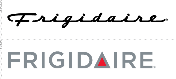
The Frigidaire brand celebrated its 90th anniversary in 2006. Still a leader today in the 'white goods' (major household appliances), the company currently offers a line of appliances which include refrigerators, freezers, dishwashers, washing machines, dryers, microwaves, air conditioners, and both gas and electric stoves.
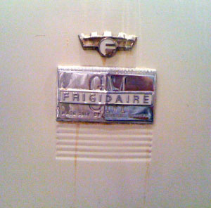
Early crown logo embedded with 'F'.
The very first electric refrigerator was introduced in 1913, but in 1915, designer Alfred Mellowes created a new version and in 1916 he founded the Guardian Frigerator Company to manufacture his invention. Each refrigerator was handmade, and took over a week to assemble. Consequently, in less than two years his company had lost over $30,000 and was nearly bankrupt. Entrepreneur William C. Durant, the founder of General Motors, saw the potential of Mellowes' creation and bought the company in 1918. He immediately renamed the firm Frigidaire. It was at that time that the original crown logo with the embedded 'F' was created, but shortly after the acquisition, Durant commissioned a typographic variation which was more in line with the style being used for the General Motors logo. In addition, the phrase 'Product of General Motors' was added to the mark.

Introduction of the script logo in 1955.
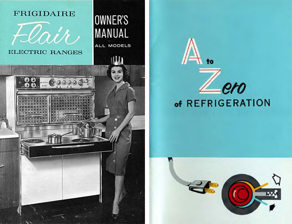
Samples of Frigidaire and GM brochures. A PDF of the A to Zero of Refrigeration can be found in all its retro glory here.
In 1955, General Motors eliminated the crown and created a script identity that existed until GM sold the company to Westinghouse in 1979. Until that time the company created numerous manuals and brochures, but after the acquisition, the Frigidaire mark all but disappeared.

1986 crown logo, above. Other logos, years unknown, below.

In 1986, Westinghouse became a subsidiary of Sweden's Electrolux, and Frigidaire was reintroduced and repositioned as a premium brand featuring European styling and high-performance features; it was at this time that the first stainless steel offerings were introduced. Under the direction of longtime Electrolux executive Hans G. Backman, Frigidaire underwent a visual makeover as well, which included a new crown logo.

Hello again, script logo.
In 2001, in an effort to celebrate the heritage of the Frigidaire brand while introducing an entirely new line of products, Electrolux took the logical step of bringing back a version of the original logo. And in 2006 the logo was once again redesigned to commemorate the company's 90th anniversary. Most recently, Frigidaire underwent yet another logo redesign. According to their press materials:
'Frigidaire will unveil a boldfaced new logo and look to celebrate the introduction of 250 new appliances with specific time-saving features engineered to help mothers spend less time doing routine housework and more time doing what they love. The appliance leader stands behind its claim, offering a 'More Me-Time' Guarantee: moms will save a minimum of eight hours a month by using a combination of select Frigidaire time-saving appliances or they can return them for a refund of their purchase price.'
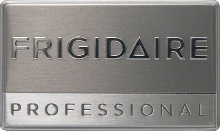
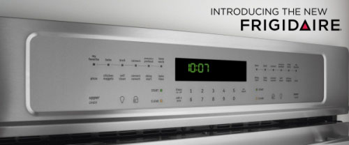
New logo applications.
Sadly, the new logo is bereft of both the script typography and the crown; it now features a fairly derivative triangle tucked into the letterforms in place of the letter 'a.' The triangle icon has been seen many, many times before, two examples that quickly come to mind are the Bass Ale identity and the Silence=Death logo for the organization Act Up.
What is saddest still is viewing the logo in color. The placement of the red triangle results in breaking the word Frigidaire into two separate words: Frigid and Ire. Given that these products are specifically marketed to moms, this messaging system is likely not going to appeal to anyone.
Thanks to Alex Nardi for the tip.
Don't forget to cast your vote about this post online


No comments:
Post a Comment