
Originally owned by the state when it launched in 1987, New Zealand's Telecom became a private organization in 1990 and has grown to become the leading telecommunications provider in New Zealand and has made a strong move into the Australian market as well. With 7,000 employees in New Zealand and another 1,600 in Australia, Telecom operates five separate customer-facing businesses that handle everything from internet service to phone lines to corporate services and is looking to make a bigger impression on all of its customers' with a new identity launched this past October 16 with a flashy light show at Auckland's Ferry Building.
'We've been speaking to customers who were strongly in favour of this new direction because of the freshness and commitment to change the new brand represents. So over the next few months you'll see changes to our stores, websites, communications and advertising,' says Alan Gourdie, CEO Telecom Retail.
'The brand is designed to be less about us and more about our customers. Where previously it stood for telecommunications services, wires and networks, it now reflects New Zealanders doing what inspires them, and doing it on their terms,' says Mr Gourdie.
— Press Release
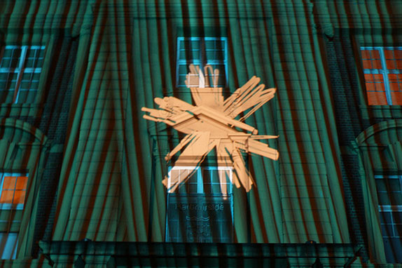
Telecom's Night Lights event at Auckland's Ferry Building. Photo by Flickr user Creative Ashish.
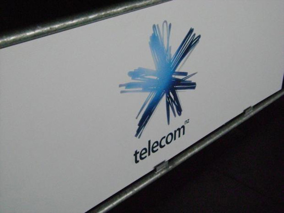
Some sort of holding thingie, holding the logo. Photo by PCWorld Forum user pcuserwinvista.
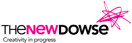
Identity for Dowse, also by Designworks.
The new logo has been designed by Auckland based Designworks, who also designed the identity for Telecom's XT Network. Designworks also created the identity for Dowse that is also a scribble, see above. I only mention this early on because I think the scribble-as-logo is an idea everyone has at the sketching phase but you just kind of chug it as lame or acknowledge that it has been done before. And it doesn't seem like Telecom even knows what to make of it; in the light show above, the logo falls like snowflakes but on their Facebook page they tepidly invite fans to tell them what their spark is because '[our new logo] kind of looks like a spark.' There is apparently a video that better explains the brand and brings the identity to life but it has been pulled from YouTube. (You can see a screen grab here.)
I could have probably lived with the scribbled spark if it were flat and one-color but, oh no, let's go ahead and add some gradients and some soft glows around the edges for no real reason because, let's face it, it does not look cool. The typography is even more uninspired, I can really think of no other sans serif that looks more boring than this — you all might hate Gotham but at the very least you can admit that it would have been a better choice than this. I'm always amazed when large corporations opt for poorly executed work. Maybe this spark will fade away soon.
Thanks to Matthew Buchanan for first tip.
Don't forget to cast your vote about this post online
No comments:
Post a Comment