
Established in 1984 in Delft, the Netherlands, Exact serves over 100,000 customers with business software and solutions, employing over 2,400 employees in 40 countries. (I'm not in the business software and solution software, but isn't 2,400 people too many? I digress.) To celebrate its 25th anniversary, Exact introduced a new logo designed by Brussels based Duval Guillaume.
Exact also launches a new logo consisting of the Exact word mark preceded by an 'equal' sign, expressing the belief that Exact co-exists with its customers and the value that's being created through this collaboration. The tagline 'Exact. And it all comes together.' reflects the spirit of what Exact brings to its customers: the added value that comes with its integrated solutions and cornerstones proposition. It also expresses a feeling of comfort and ease, and that in the end, things will be fine.
Clemens Riedl, Exact's Marketing Director, says: 'With the new visual identity we are getting much closer to the entrepreneurial world we serve and are now able to communicate globally in a consistent way.'
— Press Release
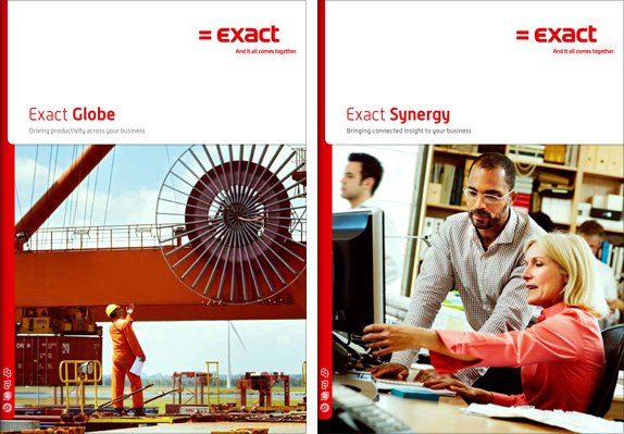
Brochure cover samples.
It may be a strange way to describe this, but I was quite charmed by the new logo and how unapologetic it is about being Old School Tech. What's funny is that the old logo, set in Serpentine (which was designed in 1972), looked like it was trying to appear as hardcore, 1980s tech. The new logo feels like it's trying to appear as hardcore, 1990s tech, lagging almost a decade behind in the aesthetics of today's logos. And, lo and behold, it's actually refreshing. The typography isn't quite sophisticated but its pairing with the equal sign turns it into a very smart, and sophisticated, concept. The weights of all the elements are nicely balanced too, and all the corners are well rounded for safety and friendliness. But perhaps my favorite feature of the new identity is the small range of icons (below) that are as chunky as the logo and help the whole identity feel just slightly more contemporary.
![]()
Icon set.
Thanks to Tako Bruinsma for the tip.
Don't forget to cast your vote about this post online

No comments:
Post a Comment