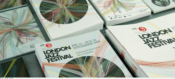
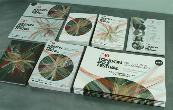
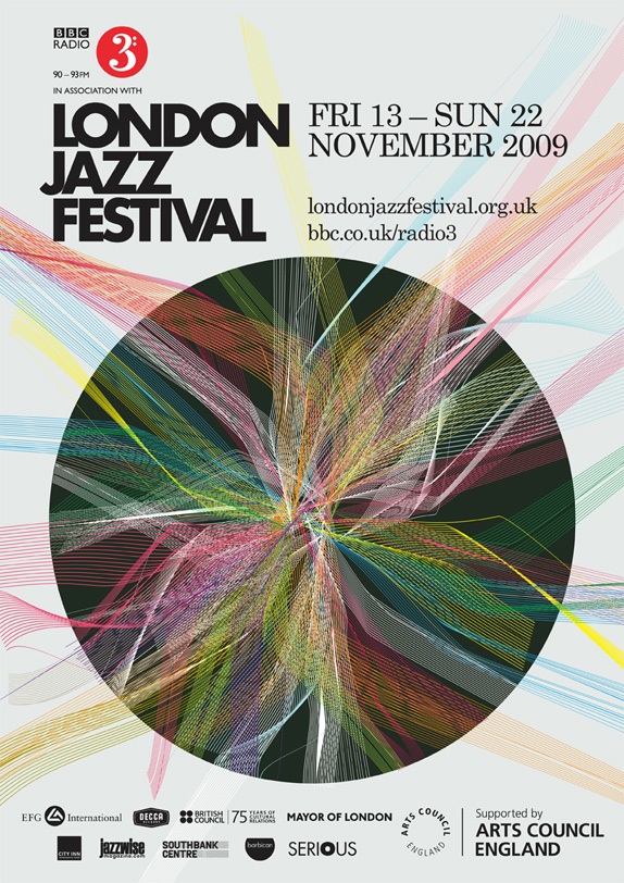
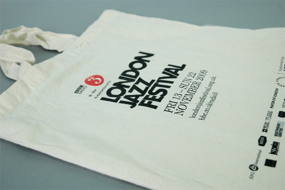
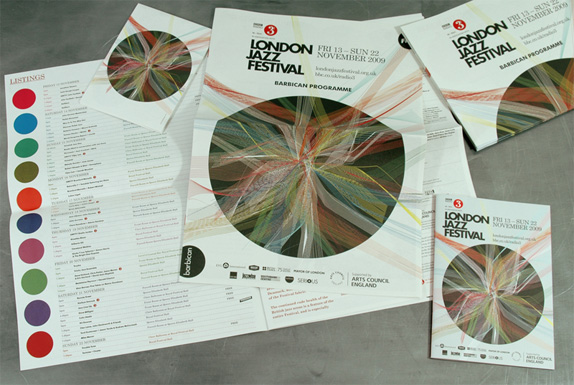
Now in its seventeenth year, the London Jazz Festival (LJF) has grown from a showcase of local talent to a world-class event spanning ten days of what are surely life-affirming sounds. There are a couple of reasons why we are turning our attention to the LJF today. The first is that, well, it's a striking identity job by London based IWANT Design, who created what amounts to a visualization of the various sounds and energy emanating from the festival. The second is that I first saw this work right around the time we were covering scribble-heavy identities like Telecom and Burnley and my first thought was that this is how a scribble-heavy identity is supposed to be made. It's not only a graphic feast but it serves a conceptual purpose that fits the mood and audience of the festival, and is not just some randomly generated scribbles that happen to look like fun.
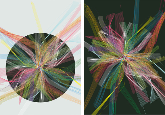
Main and alternate illustrations, above.
Thanks to Eye for first coverage.
Don't forget to cast your vote about this post online


No comments:
Post a Comment