
In retrospect I should have originally approached Trollbäck + Company for further details on the new Art Directors Club identity. I typically do but, for whatever reason, I skipped that part of the process. To make things right — especially since the comments were very, let's say, spirited — and to give the identity the fair overview it deserves (just as the rest of everything we show here) this is a follow-up showing the complete identity system. Whether this makes the logo more palatable or not is, of course, up for discussion. Jakob Trollbäck has shared with us a PDF of the full presentation — of which there excerpts below — and some rationale for their work.
It is cool that there is such a fiery debate about the new identity for the Art Directors Club. It shows that people care, and that is all I care about. It is rare that our work stirs up this much negative emotion. In all honesty, it is very possible that I, too, would have been disappointed if all I had seen was some modified Franklin in a pink bar. However, I'm not sure that I would have used THAT many uppercase words. Being angry somehow always fail to make me happy.
There is fortunately quite a bit more to the new brand than a little bit of type in a rectangle. You can see most of the system in the PDF. The Art Directors Club is hosting over 100 creative events every year. Few people are aware of this because, in the name of creativity, we have always allowed every event to have their own identity. In doing this, we were unfortunately missing an opportunity to build a larger awareness of the club and the wide range of events we are hosting. We have a unique space for events, shows and networking, and the club is deeply embedded in the creative community. How do you condense all this into a logo?
We realized that we had to create a flexible system with a branding element that could be added to every imaginable design across all media. The big challenge was to communicate the brand clearly without forcing the individual creative expressions in a particular direction. The larger and dynamic context that the new logotype is part of gives the club great flexibility to apply its mark. In a way, it may be more appropriate to think of the logo as a label than a traditional mark. Mentally, it becomes a framing device, a wrapper.
The old logo, regardless of its nice history, was often difficult to use and frequently disappeared in the design. It often seemed to emulate a watermark. In addition, its historic personality would often be at odds with the creative concepts from the designers that make all the really amazing posters and invitations for the club. We wanted the brand to bold and full of energy but still not dominate the many compositions, present and future, that it has to live in.
I'm proud of the system. We had a stellar team working pro-bono for many months and could publish volumes about the project. You don't have to like it, but I hope that after seeing the full system you can at least respect the effort. Lastly, can I point out that unlike most of our other logos, for example TNT and AMC, there is not a single trace of Helvetica in it? I really thought that this might gain us some new friends. I can be so naïve!
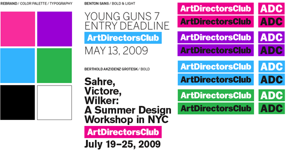
Basic identity elements.
The logo has 'Elasticity: As long as the boundaries are not violated, you can pimp it out.'
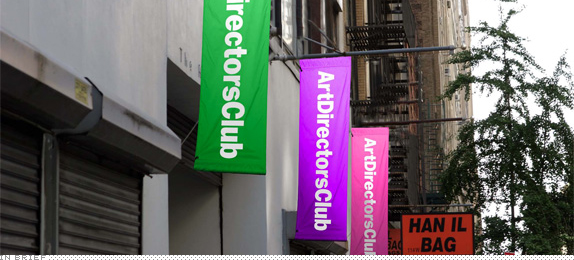
Logo placement.
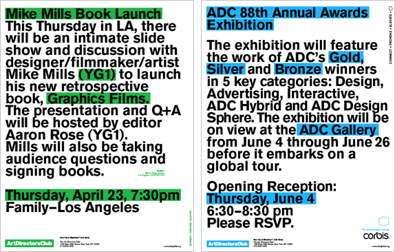
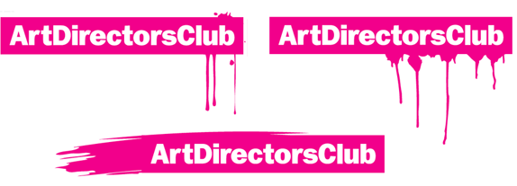
'Highlighter' styling for communications.
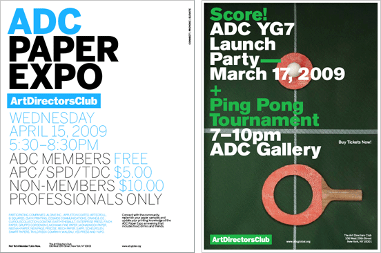
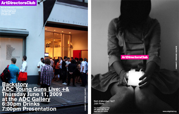
Ads.
Don't forget to cast your vote about this post online

No comments:
Post a Comment