So, wow, the Art Gallery of Alberta building in Edmonton, Alberta is weird. I don't mean to dumb down my critiques with such a thoughtful opening statement but sometimes you just have to go with your gut reactions. Since I'm not an architecture critic I may be missing something from this 41-year-old building designed by Don Bittorf, but the best I can equate it to is this is to Frank Gehry what Arial is to Helvetica. But I'll better stick to identity criticism. Last week, the Art Gallery of Alberta announced a new logo designed by Edmonton based Vision Creative Inc. to accompany its new acronym, AGA, and the imminent re-opening of the gallery in January of 2010 as it finishes an ambitious, 85,000-square-foot renovation by Los Angeles based Randall Stout Architects.
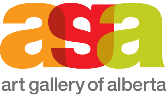
The new logo is the acronym for the Art Gallery of Alberta, AGA, presented as overlapping letters of vivid tones of orange, red and green. The logo is made up of three identical elements: a trio of lower case 'a' characters with one inverted to become a 'g.' This simple shift creates a new entity that encourages new ways of looking and connecting.
"Our vibrant logo reflects the personality and direction of the new AGA. By using themes of surprise, openness, innovation and connection, it reinforces our renewed commitment to bringing together art, people and ideas," says Gilles Hébert, AGA Executive Director.
— Press Release

I have to admit that I'm almost jealous of the typographic concept. It's simple and clever. Unfortunately, the execution leaves a lot to be desired. In today's identity environment I can not understand why anyone would want to use Helvetica, it is such an outdated typeface that it looks painfully out of place in any contemporary institution, organization or product. But let's assume I am the only who thinks that and that Helvetica is fine in theory; the resulting acronym could have been so much better rendered with custom lettering or something less ubiquitous. The colors could have also been more vibrant or at least better paired so that the overlaps didn't come out so dull. This could have benefited from one or two more rounds of graphic exploration and it would have been more stellar.
Thanks to Mike Berson for the tip.
Don't forget to cast your vote about this post online


No comments:
Post a Comment