
Few places in New York have the undivided reverence of its inhabitants as the Stephen A. Schwarzman Building on 5th Avenue and 42nd Street: The New York Public Library (NYPL). From its grand foyer, to its inspiring reading room, to its secluded microfilm archives, to any of its special collection rooms, nearly everyone who has visited has a favorite space they can quickly bend your ear about. But the NYPL is more than just one building flanked by two massive lions — named Fortitude and Patience — it is a network of 86 physical libraries in the Bronx, Manhattan, and Staten Island as well as an online network housed at the Digital Library that is constantly growing with web friendly content. From signage, to print materials, to web applications the NYPL has had a proper identity implementation over the years, but its previous logo, with its intricate drawing, had its own set of implementation problems and last week the Library introduced a new logo for the first time in at least twenty-five years.
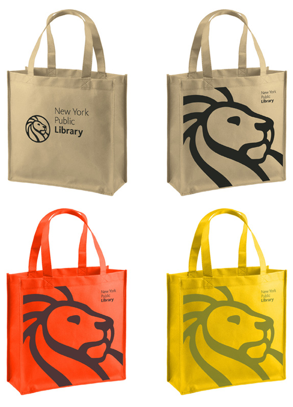
Eco-friendly tote bags.
Designed in-house under the guidance of the NYPL's Art Director, Marc Blaustein, the design of the new identity is the result of a process over the period of a year that explored, as Blaustein shared, 'dozens of concepts, hundreds of drawings' and surely handfuls of meetings. Two elements that were a given from the beginning were the lion and the newly adopted house font, FF Kievit. Doing the logo in-house means that the identity came at no cost for the library or the city's complainers tax-payers. Blaustein and his team's two main challenges were:
1) Updating the design to meet the practical requirements of a contemporary logo, that would not degrade at small sizes or on the web, and
2) to promote effective messaging in line with today's Library and NYPL's new mission statement.
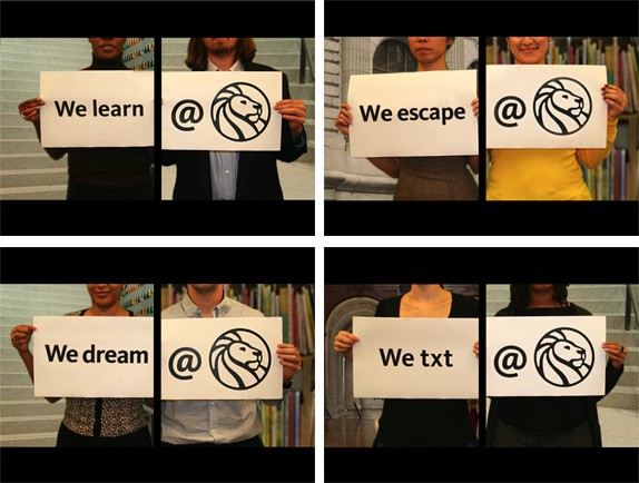
Stills from promotional video shown through smart phones during the launch event of the logo.
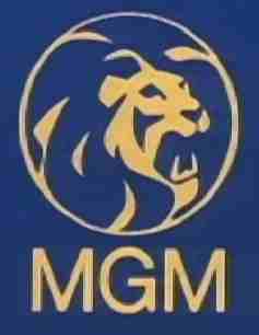
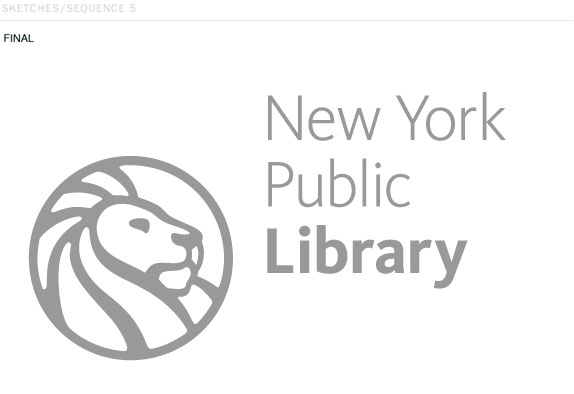
The old logo was fine, it portrayed a traditional institution in an elegant, proud manner, but as you can see from the opening image at the top, the icon and typography reduced poorly. [Click here for a bigger view of the old logo]. On the new logo, the most easily discussed feature is the new lion icon: Is it too fat? is it too mane-y? Is it sad? Does he have a receding hairline? Does he look like Simba or this old MGM logo? Yes/No, it can go either way. I personally think this is a very successful rendition that keeps the look of pride the old lion had and creates a new icon that will look striking whether it's on a coffee mug or a web banner. The typography is a major improvement over the old one, especially as it helps shed any traces of antiquity and gives the NYPL an immediate contemporary look. Pining for the old logo has been the most common response to this evolution but it would be the same as pining for the Library to not have swept its floors, updated its collections or launched a web site in the last twenty-five years.
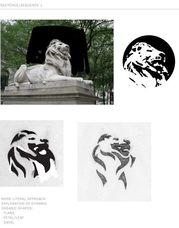
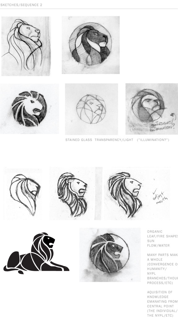
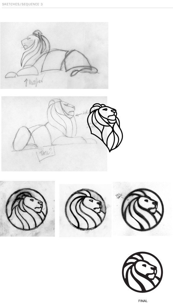
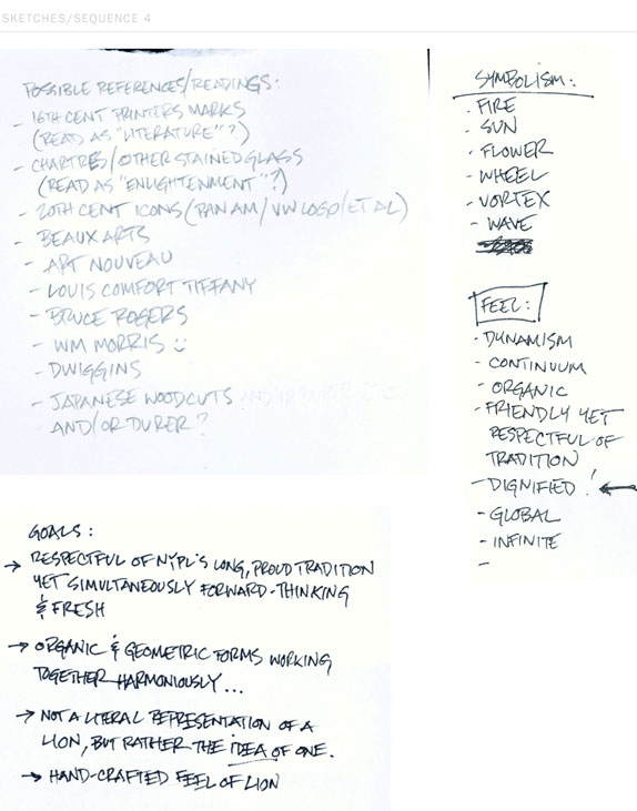
Below are a few sketches for your enjoyment.
Thanks to Erik Botsford for first tip.
Don't forget to cast your vote about this post online

No comments:
Post a Comment