
The sweeping consolidation of banks worldwide continues with the merger of Germany's second and third largest financial institutions: Commerzbank and Dresdner Bank. The new entity, to be named Commerzbank, has enlisted the talented, local and proven (though Erik-Spiekermann-less) design firm Meta to perform the brand alchemy. For all to see, the result is clean, rational and undeniably German.
The reasons to redesign were many. Both companies have recently received state-funded assistance. And there's usually a desire after a merger to present a unified face that draws, in some way, from the histories and qualities of the individual entities. The new Commerzbank mentioned this in their press release:
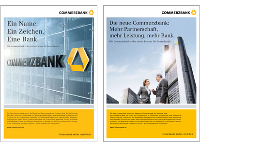
The traditional Commerzbank brand is repositioning itself as a new Commerzbank through the merger of Commerzbank and Dresdner Bank. The new brand incorporates the strengths of the two traditional brands and serves as a symbol of "Growing Together." Commerzbank aims to be the "house bank" for private and corporate customers in Germany, synonymous with long-term partnerships and outstanding service.
Proud of the redesign, Commerzbank has also posted a wealth of materials about their new brand. The following frames are from a video produced to illustrate the delicate, thoughtful process of creating a new brand. The detail they show is refreshing and the content is surprisingly universal.
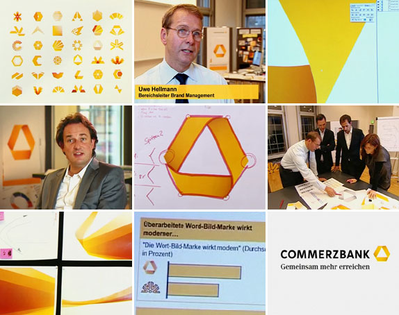
Stills from the Commerzbank brand video.
Though narrated in German, anyone remotely involved with the world of branding will know exactly what's going on here. You have the usual suspects: a creative director with long hair and a suit with no tie, the twenty-something designer hunched in front of her mac wearing a yellow (of course!) sweater and a trendy scarf. The design stages are everything you would expect. Analyze every shape in between the Dresdner mark and Commerzbank mark. Develop systems around the most promising marks. Take the selected design and agonize over the color, shape and typography. How does the wordmark lockup with the symbol? Make sure it tests well. I love the bottom middle-frame. You don't need to know German to know what that market research question asked!
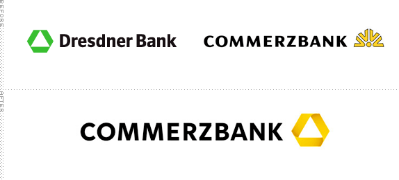
Merger Roulette: the new brand is a hybrid of traits from the original two.
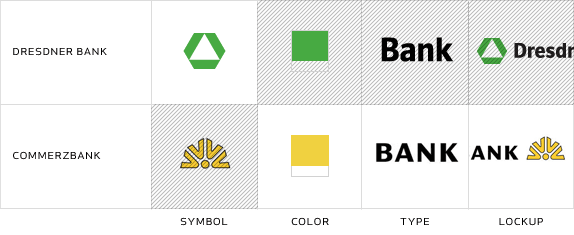
The new logo takes the symbol from Dresdner and leans heavily on Commerzbank for the rest. The resulting brand is very well put together. The wordmark is still in all caps, but the type appears to be customized Avenir Next, thoughtfully condensed to take up less space and help the nascent symbol stand out. The new type is a marked improvement over the wide Optima used before. I love how the left side of the triangle fits perfectly with the geometry of the K.
![]()
The previous symbol for Commerzbank was called the "quatre vents," or "four winds" and it reflected the "strategic cooperation with partner institutions in Europe" and conveyed "the cosmopolitan dynamism of the bank." The new mark which they refer to as a ribbon, predictably connects "customers, employees and investors." The new logo "reflects dynamics, continuity and stability." The way the curves fold into the sharp corners seems a little awkward and abrupt to me. Of course, the smaller it gets, the less I mind. The added dimensionality of the mobius effect seems a little friendly for a bank but that is offset by the simple--almost austere--system of collateral.
Companies merge frequently and the urge to retain everything from those brands or change nothing at all can be irresistible. The new Commerzbank brand, through its restrained execution and meaningful implementation, may convince their customers they are changed for the better.
Thanks to Dirk Haard for the tip.
Don't forget to cast your vote about this post online

No comments:
Post a Comment