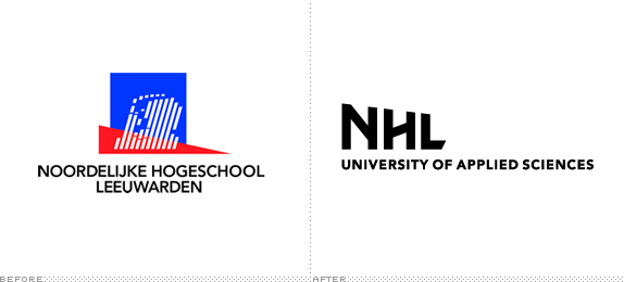
Starting with the 2009/2010 school year, the Northern Hogeschool Leeuwarden in The Netherlands — a 10,000-student, medium-sized university specializing in applied sciences — will be known as NHL University, and will soon be occupying a new, fancy and diagonally-inclined building designed by Dutch architect Herman Hertzberger. For the university's new era, Amsterdam based koeweiden postma designed a new identity inspired by the building.
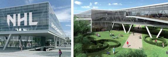
New campus designed by Herman Hertzberger.
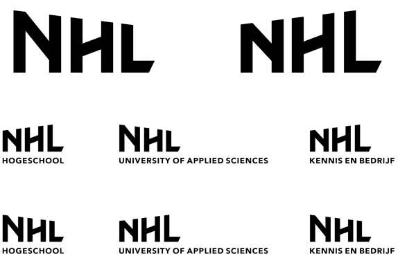
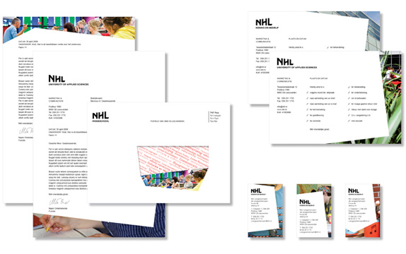
Luckily, the new identity doesn't just show a reduced, black and white version of the building, but instead it takes its cues from the building's lines and structure, all fairly evident in the sturdy and dynamic NHL acronym, which comes in two orientations. I wonder if five, seven or fifteen different perspectives of the acronym would have been more interesting, or just overkill? Maybe a little of both. The identity then expands in its applications by offering a wide range of colors as well as a very interesting family of typefaces that I would have probably never put together myself but look fairly convincing once applied. And to add a little visual excitement, there is a grid from which semi-random shapes can be constructed and used as holding forms or just background patterns. The overall effect is a nice combination of serious and playful, helping NHL University feel like a twenty-first century institution.
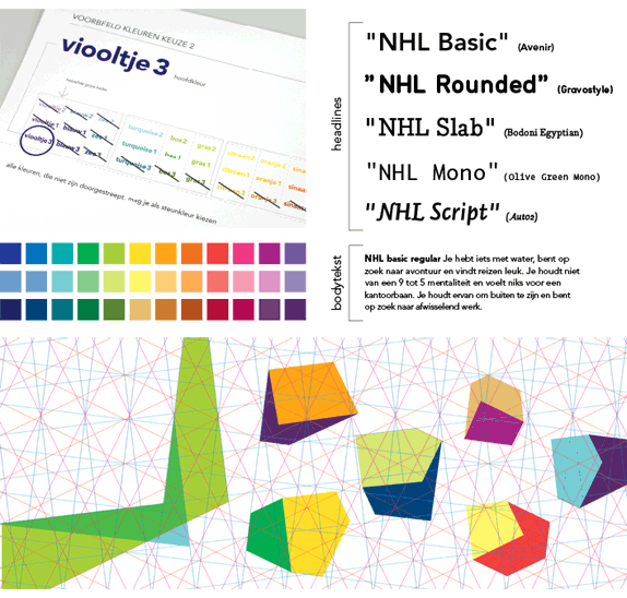
Identity elements: a family of colors, typefaces and angled shapes (based on the diagonal lines of the building).

Don't forget to cast your vote about this post online


No comments:
Post a Comment