
It's a rhetorical question since I am assuming thousands of people do but, seriously, does someone use msn.com anymore? With so many cooler and more efficient ways to access the online world, MSN has for a long time felt caught in 1999, both aesthetically and technologically, heck even philosophically. I'll admit that I really like the MSN butterfly from the beginning when it was introduced in 2000 and in TV ads it had a lovely animation. But in the twenty-first century I don't recall ever visiting MSN willingly. Not that that's about change anytime soon but at least if I do, the new scenery won't be as dreadful as it used to be, at least in the design of the web site. The new logo, well, that's another story….
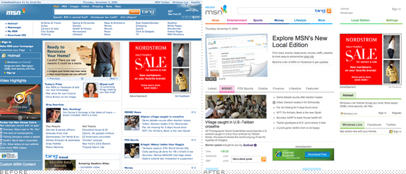
As I mentioned, I had a soft spot for the old butterfly, it had the right balance of real proportions and colorful abstraction. The new butterfly is all abstraction, and not the good kind. The wings have stopped looking like wings and instead look like what you would see if you stared at a lava lamp really close. The old type treatment was strong and, despite its simplicity, it was oddly instantly recognizable. The new one suffers from Bing syndrome: It wants to be cool and modern but it suffers from complete lack of typographic decency. In this case, the whole is not so bad, but the parts are. Specifically the stems in the "m" and "n" which are ridiculously short. Why in the world are they so short? Because they look cool? No. Because it's hip to be different? No. Because…? No. No and no. And the smaller you make the logo the stranger those things look. Perhaps it's a predisposition to be mean to any visual execution coming from Microsoft but they sure make it easy to be so.
Thanks to Jenny Lam for first tip.
Don't forget to cast your vote about this post online
No comments:
Post a Comment