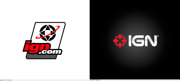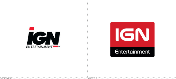
Every month more than 14 million unique individuals generate over 231 million pageviews at ign.com (IGN, or Imagine Games Network for long), and a chest-hair-raising amount of those individuals are, you guessed it, men, 86% of them. They are under 30 years old and, somehow, manage to pull in an average of $68,000 a year in income. That, my friends, is a devoted following — with money to spend. IGN provides a haven of video game news, reviews, previews and message boards for every platform, Xbox, Playstation, Wii and more. IGN takes its namesake from its parent company, IGN Entertainment (featuring a cool new web site), which also owns AskMen and Rotten Tomatoes, and in turn, it is owned by another major media player, News Corporation. Earlier this week, IGN Entertainment announced a new logo for its popular website and also refreshed its corporate image.

There isn't much information about the new identity, but the whole change is fairly clear. As in the old pair of logos — which shared an ugly kinship in their bold, sans serif italics — the new logos share a visual trait, now in the form of the wordmark being used in both, with IGN using the directional pad of remote controls as its icon. The new wordmark isn't revolutionary, as it fits perfectly in the video game category, futuristic and edgy, so it works effortlessly. The evolution on the IGN logo is pretty remarkable, as the old one was a disparate jumble of cliches and poor visual solutions with its 1990s swoosh and stroke. Whether this is all your cup of tea or not, it's hard to deny how perfectly suited it is to the audience.
Thanks to Deron Bennett for the tip.
Don't forget to cast your vote about this post online


No comments:
Post a Comment