
Let me first volunteer that I've tried to convince Armin to send us to these destination locations but the only Brisbane I've seen is here in California, which wouldn't make it too thrilling. This particular branding is for Brisbane in Australia — which would be so more exciting — and is developed specifically by Brisbane Marketing, which is a subsidiary of the Brisbane City Council. This identity takes the place of the Brisbane Marketing's previous mark, but it doesn't do away with it completely…
![]()
Brisbane Marketing has taken their previous Brisbane identity and relegated it to hang on their organization's shingle. This previous identity was designed in 2003 by Minale Bryce Design Strategy (Seen in their current state at Minale Tattersfield), and from what previous Minale Bryce Director Jack Bryce tells us, it was a bit controversial at the time — referred to in the press as "blob" and "splat" and not in a Nickelodeon-good way. Indeed, that logomark did look a bit like the green cousin of Cingular's Jack was hit in the busy Brisbane streets. And to be clear, this identity is not going away, but rather appears as the mark associated with 'Brisbane Marketing' (and in doing so, making way for a separate destination logo). This marketing logo can be seen in some of the marketing examples below and those provided in the style guide [free registration required].
To make this even more confusing, there is the affordance for locking up the marketing organization logo (blob) with the Brisbane City Council logo (clock tower) — and the latter with the destination logo — but never the destination logo with the marketing logo (blob). So, We've got a clock tower and their resident blob which all help to promote Australia's eastern-most big city.
![]()
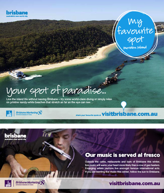
The new destination design (we've got a request out for design credits) takes a more conservative approach with its lowercase, multicolor wordmark. It's type, it's straightforward and sturdy, and it's not terribly memorable. Supporting the new brand, the site for Brisbane Marketing maintains a rather extensive public set of Brand Tools. There are the standard set of elements (positioning, attributes, pyramid, etc) as well as an interesting distillation of a description for Brisbane, boiling down a 420-word statement to 250 words, then 120 words, and finally 70.
Brisbane. Positive and forward thinking, generous and optimistic.
We lead the world in infrastructure, health, biotechnology and education and our subtropical climate and sunny disposition is ideal for nurturing and inspiring creativity.
Brisbane is clean, green, friendly, tolerant and multicultural, creative, collaborative and liveable. It's this openminded and globally responsible attitude that enables us to maintain a balance between progress and sustainability.
Welcome to Brisbane, Australia's new world city.
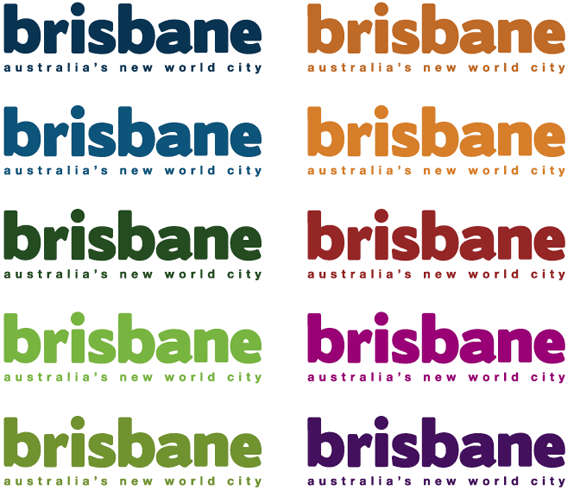
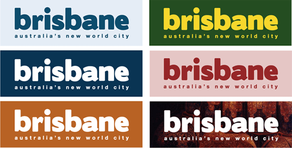
If the marketing blob was as outspoken and playful as youth, the new identity is soft-spoken and more grown up. Grown up much in the way the modifier 'it's happening' has buttoned up into the tagline 'Australia's new world city'. This is a maturity from an adolescent marketing identity into destination adulthood, and while this brand can now sit quietly in a room with other similar, adult brands without saying too much, the conversation might be kind of dull.
Thanks to Jack Bryce for the tip.
Don't forget to cast your vote about this post online

No comments:
Post a Comment