
We've all had our cases of personal disappointment when a logo redesign fails to properly reflect a brand that we love. It hurts for a while, we complain, sometimes it leads to change (Tropicana), but most of the time, we're forced to get used to it and move on. This one will be hard to forget. Nothing hits harder than a boring logo of your own beloved city, failing in both concept and execution.
Like many cities, the historic wealth of Philadelphia directly translates into the city's wealth because of tourism. With that in mind, it's understandable if marketers require the logo to reference its history, regardless of how fascinating the city may be in its present day. That said, Philadelphia's history does not start and end with the Liberty Bell. Any visiting tourist knows all the other historic must-sees like Betsy Ross's house, Independence Hall, and Penn's Landing. Conceptually, the choice of using the Bell could not be more uninspiring and obvious. It's uninspiring because choosing one icon means intentionally choosing not to showcase the actual abundance of Philadelphia's history. It's a drawing of a bell and nothing more. Stars with swooshes in red white and blue would be more inspiring than this. While we're on obviousness, it's no surprise that the logo is a consequence of design-by-committee. Sixty-five people to be exact. Oh, and even more obviously, it was done for free. Like many other things in Philly, this project had all the familiar symptoms in place to ensure impending failure.
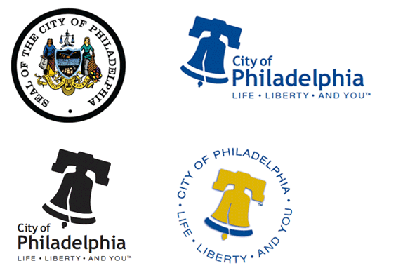
The still-used city seal, with alternate colors and layouts of the new logo.
Designed by the Star Group, this logo sports the drably default, designed-for-web font, Trebuchet MS. The tagline-turn-itemized-list, with bullets instead of commas, is set in Helvetica Extended. It's all done in good design fun without regard to the awkward stand-out of 'And You'. On top of that, there's no evidence of any other brand materials besides the style guide [PDF], which includes laughable glossy web versions of the logo, and an unexplained round alternate with a drop shadow. Granted, the choice of Trebuchet was thoughtful for its accessibility, any division of the city could easily create their own department logo if they had a PC. Still, the execution of the remaining typography is amateur at best.
Of course, no patriotic logo voted on by committee would exist without red and blue. That unexpected mustard yellow, however, gets one point for originality. The bell's tilt brings to mind those one-sided, designer-as-bitch dialogues brought on by a director of some sort. 'It's just not popping enough for me. What if you turn it a little, like it was ringing? More. More. Too much, go back. Stop right there! Now THAT's cutting edge. They're going to love this. You're such a wizard in Adobe.' This is all evidenced by the fact that the red clapper is glued to the middle of the bell. If it were designed with the rotation in mind, the clapper would hang straight down as gravity dictates. Also, it doesn't take a bell expert to notice that the wooden hold at the top of the bell will physically never tilt that way.
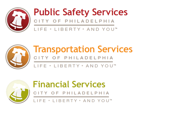
Web versions of sector logos, exactly as they appear in the style guide.
Besides the technical problems with the drawing, the bigger issue is that this logo fails to deliver any emotional or cultural connection. For rebranding a city, these connections are paramount. Without it, we're left with the same old brand image that any big city suffers from; a festering stew of corruption, bureaucracy, and half-assed government initiatives. And that's exactly what this logo is a reminder of. Hey, at least it cost us nothing.
Don't forget to cast your vote about this post online

No comments:
Post a Comment