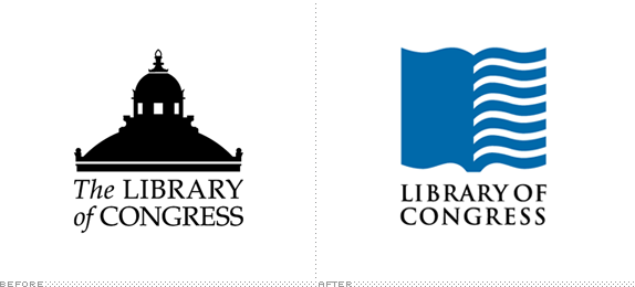
It's quite uplifting, in an Internet kind of way, that one of the most progressive, enriching and engaging content-driven web sites belongs to a 200-year-old American Government institution, the Library of Congress (LOC). In case you have never been, start at the Digital Collections landing page and click, just click — see you back here tomorrow. The LOC, founded in 1800, "is the largest library in the world, with nearly 142 million items on approximately 650 miles of bookshelves. The collections include more than 32 million books and other print materials, 3 million recordings, 12.5 million photographs, 5.3 million maps, 5.6 million pieces of sheet music and 62 million manuscripts." Housed in Washington, D.C. across three buildings, the LOC is open to the public — 1.6 million annually — making its books available for reading on site only. Needless to say, the LOC is an important cultural institution, and its old logo, depicting the dome of the Thomas Jefferson Building barely did it justice.
Since its founding in 1800 the Library had developed numerous graphic depictions of itself (usually centered around images of the building that houses it) that emphasized its historical nature but did not convey its essential meaning, nor make it seem relevant today. Chermayeff & Geismar's solution had to accomplish all three.
The logo was designed by Principal partner Sagi Haviv and project managed by Tom Geismar who has a long standing relationship with the LOC, having designed the Freud, Thomas Jefferson Library and Lewis and Clark exhibitions for them. Haviv's design solved this complex problem with a simple depiction of a book that takes the form of a waving flag. The bold modern form coupled with the timeless concept is a startlingly poetic illustration of what it means to be the official library of the United States.
— Chermayeff & Geismar Press Release
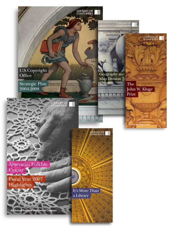
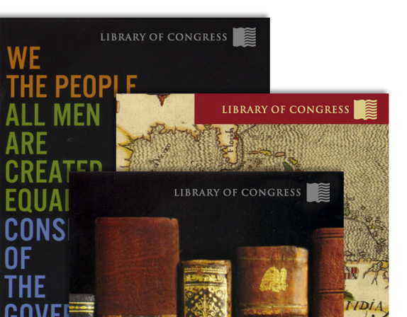
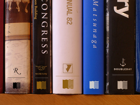
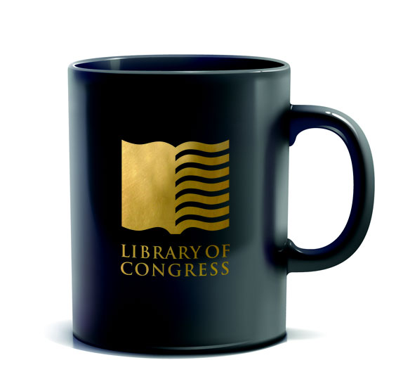
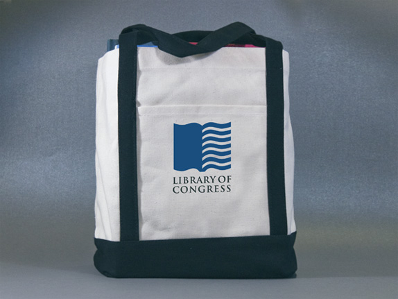
Designed by Chermayeff & Geismar, the new logo is simple and, well, American: An open book with the flag's recognizable stripes. (I wouldn't doubt that at some point a version was presented with stars on the left page.) More than the simplicity and effectiveness of this new logo, what I most appreciate is what it represents. That logos don't have to be literal and uninspired, like the previous one, and with a little bit of thinking, they can be conceptual, evocative and memorable. It's also nice to be reminded that a good icon can still be created in the second decade of the 2000s. My only complaint about it is the typography. Trajan. Why? It's overused, it's not that pretty and any sense of typographic history or tradition it may have once had has been diluted by dozens of bad movie posters. The only reason I can think it was selected is that it's a bundled font, more easily accessible to most LOC staffers than some obscure typeface. Yet, it was a missed opportunity to introduce a typeface as elegant and well thought out as the icon. A few applications of the logo below, and an animation that gives the logo yet another layer of meaning.
Don't forget to cast your vote about this post online

No comments:
Post a Comment