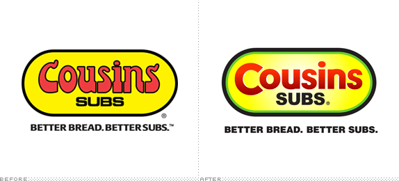
Milwaukee-based Cousins Subs was established in 1972 when two cousins, originally from Atlantic City, introduced the Midwest to the Eastern-style subs they had enjoyed back home. From the beginning, the pair were committed to delivering quality sandwiches made with the best ingredients available. Of the company's 150 locations, 128 of them are located in the state of Wisconsin. Having grown up in Milwaukee, it has always been one of my favorite sub shops. In my opinion, the ingredients and the bread really are better than the competition's — the logo is another story.
[Ed.'s Note: While we typically pass on smaller regional brands, we received a significant amount of e-mails about this redesign and we are very proud to be able to please our devoted Wisconsin readership! — AV]

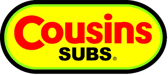
Detail of logo without gradients.
I have many memories of the brand from childhood. I especially liked how the sandwiches were finished off with oregano seasoning, they were wrapped in white butcher paper and taped shut with plain-old masking tape (not sure if they still are today). I also remember that logo, in use for about the last twenty years. I clearly remember not liking it. But it was one of those situations where it's all you've ever known and it was so bad, it was good — or at least, it was familiar.
I was intrigued when I found out it had been updated by Welke Group, a Milwaukee agency. Unfortunately, there's not a lot of information available regarding the objectives of the project, but a recent article by a Milwaukee newspaper points to an obvious need for modernization and better legibility.

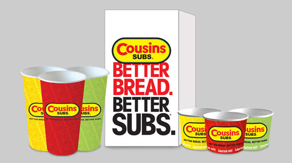
Redesigned packaging.
Initially I expected something more drastic, but after giving it some thought, I'm glad they didn't completely change the logo. They were smart to keep the original "sub" shape and I like that it's been shortened slightly. The slightly thickened rule is an appropriate weight for the shape and while I'm not a fan of radial gradients, it creates a subtle roundness to what was previously a flat yellow pill. The original color scheme has been brightened considerably with an updated red and the addition of green. The new type appears to be a variation on Neutra Text Bold, Gotham, Avenir, Nobel and a number of other geometric typefaces. The oversized "C" interacts nicely with the the "o" while enabling the entire name to rest comfortably inside the capsule shape. However, I don't like how the space between the terminal and the bowl has been filled on the "u" and "n" — a gesture that just doesn't seem necessary. Also, the "s" letterforms are an atrocity. Finally, I really wish they hadn't vertically squished the word "SUBS".

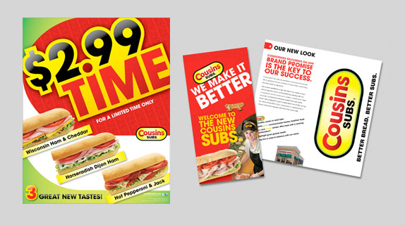
Window cling and brand brochure.
Other than butchering the type in a few places, I think this is a nice update because I still recognize the brand I've known my whole life. It's kind of like having a good friend with a bad sense of style who got a makeover — and no longer being afraid to be seen with them in public.
Thanks to Preston Knapp for first tip.
Chris Weiss is an art director and designer at Go East, a communications design agency in St. Paul, Minnesota. With over 10 years experience, Chris has developed creative solutions for a variety of clients including Travelers, Post-it, Thinsulate Insulation, Scotch and Select Comfort.

No comments:
Post a Comment