
Based in Philadelphia, the Pew Center for Arts & Heritage is a collective of seven grant-making initiatives dedicated to supporting local artists and heritage organizations. Originally, each initiative had its own logo, lacking any consistency with the others. Because of that, there was no indication that it was part of a greater entity. Another problem was the absence of an umbrella logo for the Pew Center. The challenge for London-based johnson banks was to solve a rather specific client brief.
Although they wanted at one level to present themselves as a unified 'Pew Center,' they still wanted to show that they worked across dance, exhibitions, arts fellowships, theatre, management, heritage and music, all within the Philadelphia area.
— johnsonbanks case study
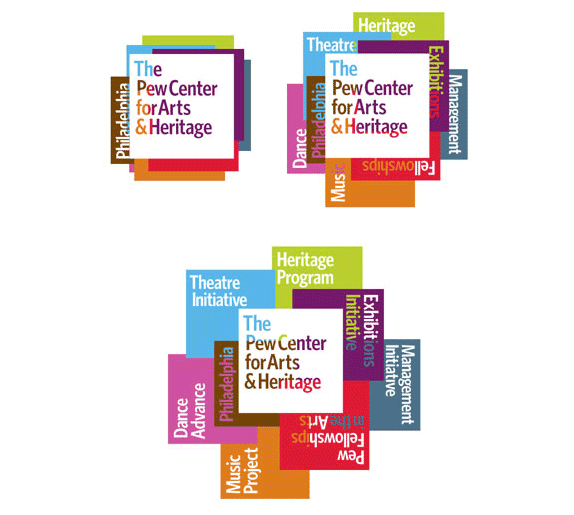
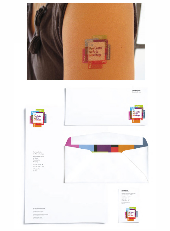
Glancing at the Pew Center's web site — as its civilian audience will experience it, and not presented in a case study — you might think the logo to be the white square, and that the other words and colors were designed purely for the website's navigation. Checking johnsonbanks' project description proves otherwise. This megalith of a logo includes the organization's full name, the seven initiatives, the word 'Philadelphia', and a mammoth palette of eight colors. Designed to adapt to different situations, the primary logo system has three forms, each with varying scale and detail. The largest holds a record-breaking 25 words.
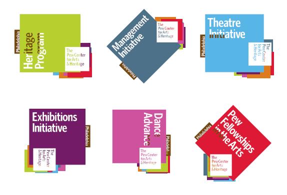
Deeper in the system are treatments designed to push individual initiatives. Each maintains the typeface, 8-color standard, the word "Philadelphia", and a tiny "The Pew Center for Arts & Heritage." It's unclear whether these are meant to be the official logos for the initiative. If so, they certainly won't work at small sizes. Other than that, the designs show just how recognizeable and flexible the "colored cards" concept can be.
A minimal sans-in-square logo isn't particularly groundbreaking for an art institution. What makes these logos worth noting is the ironic use of that solution — where the bombardment of simplicity creates a clutter that's hard to miss. Aesthetically, it isn't the most beautiful, nor the most interesting thing. A family of icons representing the initiatives would've been simpler to manage than type. Accusations of bad design decisions about scalability and printability are certainly expected and valid. In the end, though, it's those risky decisions that make the logo stand out. Most importantly, the design tends to the client's need of a flexible system that reflects the relationship of an organization and its constituents.
Kosal Sen is the founder of Philatype, and an art director at Sides Media where he spends most of his time on interactive design. He is the Philadelphia correspondent for Brand New.
No comments:
Post a Comment