
With 1.6 million affiliated merchants, Visanet, one of the largest electronic payments networks in the world and the biggest in Brazil, and owned by three banks — Bradesco, Banco do Brasil and Santander, which happen to be competitors — anounced last Novemeber a new name: Cielo. The reason behind this change is that on June 2010 in Brazil Visanet will have multiple credit card brand marks in its portfolio. In other words, Visanet will start dealing Visa and MasterCard, so there could be a confusion if it was still called VisaNet.
TV ad by Young & Rubicam.
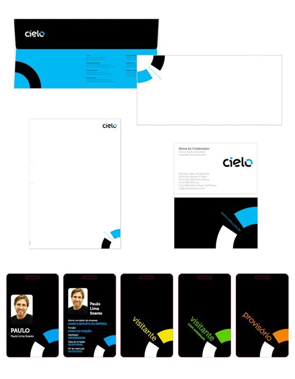
The launch of the new brand was widely reported in various media, including massive insertions on prime time network television. A website of the brand was also created in which they present their values, mission, the basis that support it and its brand promise ('To make it possible'), along with graphic material such as stationery, badges and folders in which they show a summary of the brand's essence.
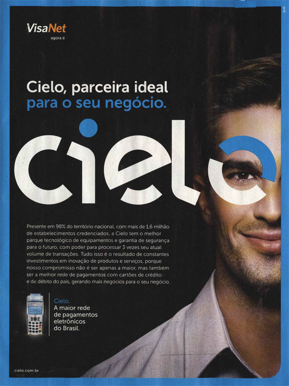
Newspaper ad. Thanks to Gabriel Villa for the image.
The project was carried out by FutureBrand Sao Paulo. The advertising agency that won the competition to make the campaign was Young & Rubicam Brasil, owned by entrepreneur and television host Roberto Justus (a Brazilian humble version of Donald Trump).
The word 'cielo' doesn't mean anything in Portuguese, but it does mean 'sky' in Spanish. So either the naming didn't take into account that Brazilians hate it when foreigners think they speak Spanish or it was created with the support of a Brazilian polyglot, hoping everyone would find the meaning themselves because of the South Cone brotherhood (which is quite strong actually, when it's not about soccer).
The logo has a few remaining knots, weird endings and uneven widths. Nonetheless the logo as a whole is very adequate. It has personality and appears to be unique, not ordinary compared to the world of credit cards. The visual universe ends up getting a little dull. It uses the letter 'o' as an ornament, and bleeding off the page. In badges, the main color (cyan) may be swapped by orange, green or yellow, depending on the category. The choice of the typographic family Museo (some of its weights and styles available for free download and largely used in other places, like The Dieline logo) was very adequate, since the logo and the family share common aspects, such as the unusual circular and extended letters.
Generically speaking, Cielo stands out for the authenticity of the brand and, despite the lack of refinement in the logo, the sum of its parts is well presented.
Régis Frias is a Web Designer and Project Manager working in São Paulo, Brazil. He is owner of the interaction design agency Índice. He is an international correspondent for Brand New.
No comments:
Post a Comment