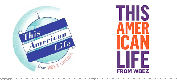
This American Life, the mesmerizing, hour-long NPR radio program and podcast about nothing and everything unveiled their new identity earlier this month. It will soon grace everything from podcast icons to tote bags (and hopefully book spines given the vertical nature of the lockup). The show, which is produced in Chicago and recorded in Manhattan, is hosted by the incomparable Ira Glass.
This American Life sprung from humble beginnings in 1995 (the inaugural budget was approximately $250,000 for the year) but is now carried by over 500 affiliates to 1.7 million eager listeners each week. Mr. Glass's best quality is his preternatural ability to seem impartial while exuding energy and passion about divisive topics--anything from healthcare to terrorism. He is, like the show, smart, literate and understated--things to keep in mind when evaluating the new identity's success.
The show recently posted a blurb on its Facebook page:
You may have noticed our new This American Life logo […] by the talented folks over at Number 17, who have made logos for all sorts of famous places like Saturday Night Live, 30 Rock, Orbitz and The Daily Beast. We were lucky to have convinced them to slum it with us.
Along with several logos, designed by Number 17, that were not chosen:

Runner-up logos designed by Number 17 explore the notion of dialogue or discourse
Let me first state that I like typographic identities as much as the next designer. There are few better ways to express a logo boldly and memorably. If the old (and inconsistently used) identity seemed appropriate it was at the expense of being vague, nostalgic and a little too quiet. It makes sense that a brand like This American Life would fall into the capable hands of a firm like Number 17. They have made a name for themselves delivering interesting typographic logos to many East Coast broadcast institutions.

Past all-caps, typographic identities by Number 17
This latest effort, however, I find a little puzzling. This (dream) job is well within their comfort zone and yet everything seems arbitrary down to the color choice of orange and purple. For a show that focuses on the commonalities of American lives, why divide 'American' into two words? The first time I read it, I wondered if the new identity was supposed to highlight the phrase, "I Can." It is also the most inconspicuous use of Flama (more specifically, Flama condensed) that I've ever seen. They took a bold, contemporary typeface and used it in such a way that it may as well be Trade Gothic.
By contrast, Number 17's past solutions seem to exhibit so much purpose. 30Rock eloquently captures the Art Deco qualities of Rockefeller Center, while Late Night With Jimmy Fallon expresses the show's off-kilter cool and smartly minimizes the "with." The SNL identity boldly visualizes the way so many actors have screamed the show's iconic name at the beginning of each airing. The identity for This American Life seems to borrow an aesthetic divorced from its original meaning. Even the towering nature of the lockup seems incongruous with the show. I'm curious to see if there's a compelling horizontal lockup for more restrictive applications.
Now, the good news about straightforward typographic identities is that they have the potential to be iconic. They're often simple enough to become imbued with the positive qualities of whatever they signify. One problem with the past identity was that it was too specific (of a place, time, feeling, etc.). I don't doubt the show will continue to be excellent and, in time, the new logo will come to stand for that. It just seems like a missed opportunity for a show that is so easy to like. Hopefully their web site, to be unveiled in the coming weeks, will add some much needed dimension to this American brand.
Thanks to Adam Flanagan for the tip.

No comments:
Post a Comment