
It's no secret that I do not — repeat, do not — enjoy the design stylings of Microsoft. But that's like a 5-year-old saying he or she does not like broccoli, except for the fact that not even with age does the Microsoft taste become acquired. Part of these raging feelings against Microsoft are fostered by their applications that defy user-interface standards of comfort and friendliness. Granted, this is mostly for us, designers, for whom the mere sight of an Excel, Word or PowerPoint file can bring us to our knees, as we struggle to find something as natural as the letter-spacing option. Regardless of what most outsiders see as diva-like apprehension towards these applications, and no matter how much chutzpah Apple or Google bring to their own productivity tools, Microsoft Office — the Trojan Horse bundle of "productivity" suites that includes the aforementioned, plus Outlook, plus nightmares like Publisher — makes the world turn, twenty years after its v1.0 debut. This past December, Microsoft released a Beta version of Microsoft Office 2010, which will replace Office 2007 for PCs and Office 2008 for Macs.
With Office 2010 we've unveiled a new Office brand system. The logo has evolved, moving from the original four colors that signified Word, Excel, PowerPoint and Outlook to a mark that fully embraces the Office orange brand. The logo also completes the evolution from the puzzle pieces last seen in Office XP to a mark that conveys energy, impact, and connection.
Office 2010: Visuals and Branding by the Microsoft Office 2010 Engineering blog
![]()
There isn't much to say about the updated Microsoft Office logo, except that it's not that bad. Or better yet: It could have been worse. The yellow to orange gradient is fairly nice, the typography remains uninspired and the counter space of the logo is well considered. The shading is pretty rudimentary, but it reduces remarkably well. All in all, if they had stopped there, the update would have passed without much harm. But then we come to the application icons…

A sampling of Microsoft Office 2007 (PC) 2008 (Mac) application icons.
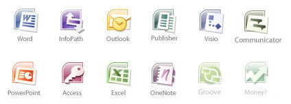
And Microsoft Office 2007 (PC) application icons.
The Office 2008 icons were weird, but at least they tried to introduce a groovy, alien-like visual language, and in their application for Mac OS X in Office 2004 they were surprisingly smooth. And the Office 2007 for PC weren't as offensive. The new icon set, on the other hand is a mess.
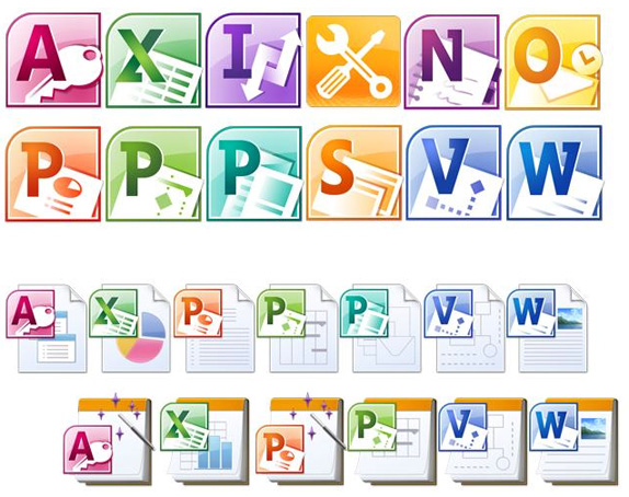
Microsoft Office 2010 (PC and, gulp, Mac?) application icons.
The new icon designs respond to research that informs us that users can more easily associate icons by letter and color than by abstract design. We've adopted an alphabet system to bring a more uniform approach to the wide variety of Office family products.
Office 2010: Visuals and Branding
None of the letters align. The slab serifs are inconsistent and, yes, ugly. And if users can't easily associate 'abstract design' how will they differentiate between the three different 'P' applications with undecipherable illustrations? Granted, the Big Four (Word, Excel, PowerPoint and Outlook) are easily discernible but that's just by luck at this point. From the way all these quoted descriptions make the user interface sound you would think the Microsoft Office designers have really (really) never looked at Apple or Adobe software, or anything with remotely decent taste in visual execution. One of these days, I want to write a positive review on design by Microsoft. Clearly, today's is not that day.
It's not just a pretty picture
Designing and implementing the visuals for Microsoft Office goes beyond the icons and the age old desire simply to 'make it look pretty'. It's about bridging the gap between the familiar and the unknown, conveying and building on a brand, and helping users complete their daily tasks without getting in the way. Hopefully this quick overview has given you a better understanding of the visual refresh you'll see in Microsoft Office 2010.
Office 2010: Visuals and Branding
Thanks to Tim Smith for the tip.
No comments:
Post a Comment