
The Université Sorbonne Nouvelle Paris3 (University of the New Sorbonne Paris3) is one of the premier liberal arts and humanities universities in France, it is located in the literary, intellectual heart of Paris in St. Germain des Prés. Established in 1971, it is one of six universities — it being the third, hence the Paris3 designation — of the famed University of Paris whose origins date back to 1253. The domed 17th century central administration building is a familiar landmark on the Paris skyline and draws almost 20,000 students and academics from around the world to work and study in France. The old logo, created in the early 1970s as a repositioning statement following the May 1968 student protests, has all the characteristics of a ’70s mediocre design, with an incomprehensible combination of an acronym, crayoned go-faster stripes and a pyramid — and when it comes to Parisian pyramids we all first think of I.M. Pei's Pyramide du Louvre. Was there anything else you could add? To anyone outside of the French academic world the name P3 meant absolutely nothing, legibility of both the acronym and the type below was extremely poor to the point where, on the current university web site the name has to be spelled out again in a larger type size and different typeface to compensate for the lack of legibility. So, a redesign has been in order for a long time.
![]()
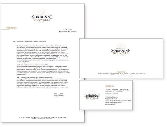
The new brand, launched on the university's 40th anniversary and designed by Paris-based yvydy, to 'reinforce the university's external identity' to quote Marie-Christine Lemardeley, Sorbonne President, is a big improvement in terms of naming, dropping the P3, bringing back the prestigious Sorbonne name and giving it a dominant position within the identity. The symbol, which can be interpreted as representing an amphitheater, the university's domed roof and/or the radiance of knowledge — or a combination of "tradition and modernity" as the yvydy's presentation rather predictably states — is a bit of a compromise solution having neither the history and gravitas of comparable, international institutions like the University of Oxford (founded in the 11th century) or Harvard's classic logotypes, nor the contemporary feel of the University of Sussex's "us" ligature or Musashino University, Japan's "linking thinking" flower-like symbol, that suggests cherry blossom, interconnected molecules or the spark of inspiration.

The solution feels as if we are in a safe, unexciting, classic zone as opposed to pushing boundaries and expressing the quest for knowledge and excellence that a leading world academic establishment should be all about. The colors — grays, black and brown — are bland, the symmetrical layout static and the Université Paris 3 text so small as to perpetuate the legibility issues of the previous logo. At times, on stationary and signage, the amphitheater symbol appears as if it will be embossed or treated in outline which results in it almost disappearing. The Minion Pro Medium typeface is an improvement on the distorted type in the previous logotype, if unexciting. When reversed in 1-color applications the amphitheater symbol is complex and busy.
![]()
Overall, a disappointing creative solution to an exciting challenge for an august institution. I feel that neither the client nor the design firm, pulled out all the stops or were prepared to go all the way with a groundbreaking concept that would tell a real story and speak to the future, innovation and excellence. At a time when the world's universities and learning institutions are competing, intellectually, academically and financially at a global level, this is a missed opportunity, a pity. At the very least, the university did consult its audience, by polling them on the selected option and two more that yvydy created, shown below.
![]()
Two other options that were polled along the selected. Here is how the polls turned out…
Students: first logo 34% / second logo 30% / third logo 36%
Teachers and University staff: first 50% / second 25% / third 25%.
Thanks to French Sorbonne student, Vivian Roldo, for the tip.
No comments:
Post a Comment