
![]()
Established in 1972 the Metro Area Transit, or MAT as more colloquially known, is the local bus system for the city of Omaha, operated by the Omaha Transit Authority, a governmental subdivision of the State of Nebraska. With a look that looked as if it hadn't been updated since 1972, MAT underwent not just a redesign but a renaming too, as Metro, with the help of local firm Oxide Design.
![]()
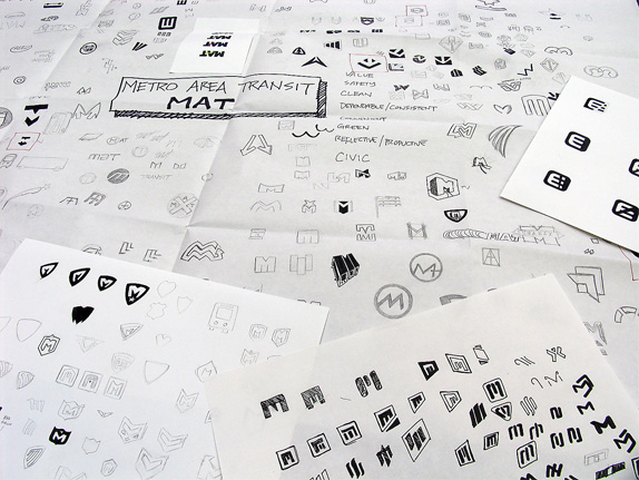
Conversations between Metro's leaders and Oxide led to focus on a new identity that conveyed key words and impressions such as safe, clean dependable/ consistent, convenient, and modern/progressive.
This design work is called a 're-brand' and was deemed necessary by Metro's leaders because the brand of MAT appeared to be outdated. Rather than reflecting an organization current with trends and transportation responsibilities, it implied an establishment entrenched in their old ways. The fresh logo communicates the truth: an organization that is modern and looking to the future.
The new name was recommended to not only signify to the public that something significant is transpiring at Metro, but that Omaha's public transit system is one part of a larger, nationwide whole. It is key for resident and area users to feel Metro is similar to trusted and esteemed systems of similarly-sized or larger cities.
— Press Release (PDF)
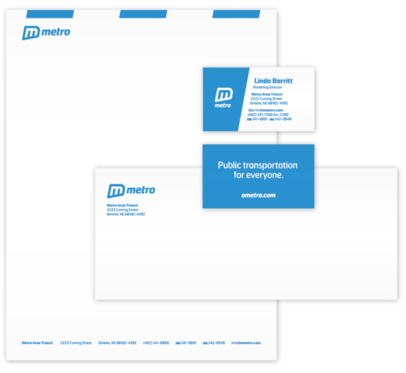
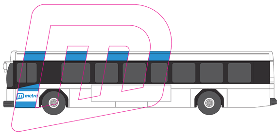
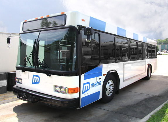
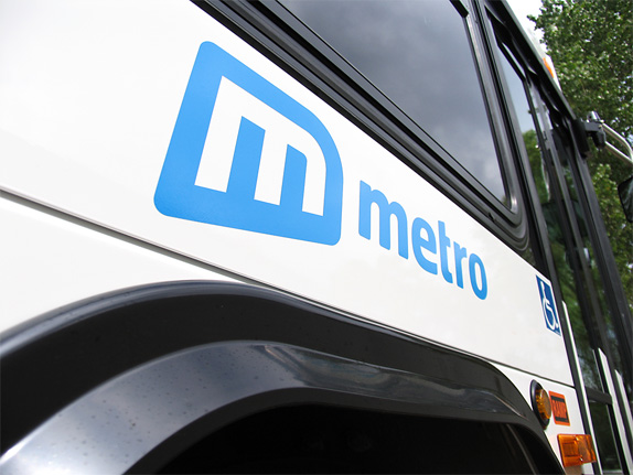
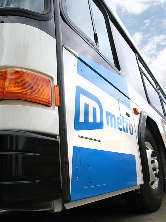
The name change is anything but original, there are dozens of public transportation systems called Metro, but in terms of making the system sound cool and updated within the city limits, it works and it beats the bureaucratic sounding MAT. The logo change, on the other hand, is a major improvement over the previous one and relative to other public transportation system identities it is quite competitive. It's friendly and accessible, while also professional, and, ideal for presentations to board members, it's italic and slanted to convey dynamism and movement. The icon is bold and recognizable and I really like the assymmetry of it but I wonder if the rounded edges of the outer stroke should have been cornered like the inside, but I understand that for friendliness purposes they weren't. The typography is good, I like the condensed approach, and the kerning is spot on. The bus design is simple and smart with the logo being blown up defining the stripes. Overall, this is an excellent redesign that brings the system to the twenty-first century. Lastly, major compliments on doing this as a single color identity, it's budget conscious and frugal without losing quality.
No comments:
Post a Comment