
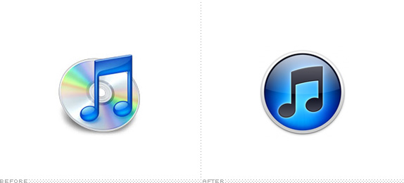
On the 13th of July 1998, Jeff Robbin, Bill Kincaid, and Dave Heller released the first version of SoundJam MP. Two years later, the developers of SoundJam sold their software to Apple, and continued development (in secrecy, as is typical of Apple) of the software for the Cupertino based company. In 2001, iTunes was released and, to this day, Jeff Robbin continues to guide the direction of iTunes under the ever watchful eye of Steve 'boom boom' Jobs. All was going great. That is until the latest update, when they decided to substantially redesign the application icon.
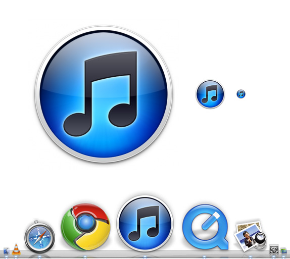
Released last Thursday, the decision to ditch the antiquated Compact "I haven't bought one in 6 years" Disc and focus the icon on the music note, has caused quite the uproar. The new version of the icon seems to be following the standard "more is more" approach of on screen design: drop shadows, glows, bevels, gradients? We got 'em all! Even the much lauded simplicity of Adobe's icon set for the crash-tastic Creative Suite is an illusion — on close inspection there's a gradient, a bevel and a drop shadow spoiling the typographic straightforwardness.
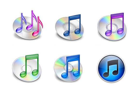
iTunes icons past.
Even way back in 2001, with the first version of iTunes, things were definitely at the 'Fell out of the ugly tree and hit every branch on its way down to landing in a big puddle of ugly sauce' end of the scale. Three music notes, with the squiggly tails, in purple, pink and, errr, purpley-pink, has me wondering if the first iTunes release was a free inclusion with purchase of a Silicon Valley Barbie. On surveying the previous five iTunes icons, one would have to admit, the latest is definitely the best so far, however, that isn't exactly a compliment, either. Of a differing opinion, Joshua Kopac decided to e-mail His Steveness saying the new icon "really sucks," in one of those rare replies to random emails, Mr Jobs was rather pointed "We disagree. Sent from my iPhone". Boom indeed!
Follow @itunes10icon.
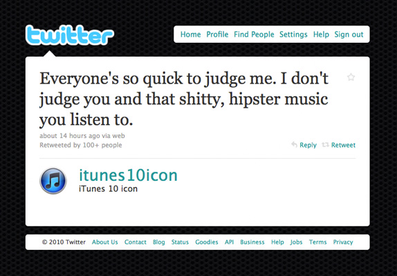
Well the online design community was having none of that and have, in turn, been responding with their own, and more grammatically correct 'We Disagree' retorts (on that point, when did Steve start talking like a monarch?). There's been an outpouring of vitriol on Twitter (and a fake Twitter profile), a facebook page has been set up, but the best so far is from online screen grab sharing slash social networking site Dribbble (yes, it has an extra b). The site is overflowing with designers trying to out-do the considerable design cojones of Apple with their own attempts. Unfortunately these efforts seem to be, in my opinion, creating a different flavour of ugly. These attempts are rife with bevels, glows, shadows and 3D effects — I often found myself wondering aloud, why do they bother? Almost every effort retained the same music note, circular container shape and faux metallic bezel. Below is a snapshot of just some of the efforts — ranging from the incremental tweaks, to the radical revisions and the outright ridiculous (rounded corner square CD anyone?)
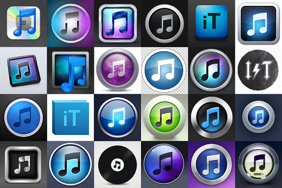
Alternate icons posted through Dribbble. I wouldn't mind the having the AC/DC one...
If forced to offer an opinion on the Photoshop effects, I'd say there's too much, although granted, my starting point is that any is too much. The blues are rather garish and the contrast is way, way too high. The real culprit though, is the rendering of the music note — too cartoon like. Sharpening up some of the angles, losing the curve and slimming down the crossbar and rounds, might help. But in the end, given the company it will keep in the dock, is it really all that bad? Google Chrome looks like a pokemon ball, for goodness sake! Probably the most compelling argument against it is that most of Apple's icons are almost photo-realistic representations, of, well, things. But given iTunes current Swiss Army Knife-like functionality, good luck coming up with an object to represent everything it does. Amongst its Apple siblings, the cartoon-like clip art feel is certainly exacerbated, and the result is to cheapen the look of iTunes — almost as if it's a children's music learning program, and not the world's pre-eminent entertainment content application.
The biggest problem I have, is the iTunes logotype. The crime against typography committed in this instance is almost Bing-like in its proportions. Unfortunately, the theme is repeated in the logo for Apple TV, and is the logical, yet much higher contrast, continuance of the theme established in 1998 with the monochrome version of the Apple logo. These days the logo appears on products as backlit, or as a reflective surface. Graphically a slight glow and gradient effect had alluded to this effect, but was kept suitably dignified and subtle. With iTunes and Apple TV, the volume has been turned up to 11, and something that might almost be acceptable in a simple shape like the Apple logo, simply doesn't work inside the word iTunes 10. Not what you'd hope for from a company run by someone who credits his understanding, and love, of typography as one of the drivers of the early success of the Macintosh.
So much wrong in just one little .png…
These days, Apple is a very, very successful company, recently eclipsing Microsoft's market capitalization to claim the throne of world's largest technology company, largely on the back of products that didn't exist until recently. The pace of change has also outrun the name iTunes. It's this contradiction that bugs me most of all, but has escaped the attention and vitriol — indeed, here's proof positive that designers get far more passionate about color, shadow, highlight and contrast than they ever will with a pesky little detail like naming. All in one package, iTunes activates, backs up and syncs your iPod, iPad and iPhone, it's your interface for music clips, TV shows, movies, apps, games, podcasts, vodcasts, radio and ring tones. Oh and music. And also books! The name "iTunes" simply doesn't cover all this in a convincing way. God help Apple when, and if, they choose to rename it.
No comments:
Post a Comment