Showing posts with label reBranding. Show all posts

Sunday

New Logo, Identity, and Packaging for Martell by Yorgo & Co.


Established in 1715 by Jean Martell in a town none other than Cognac, France, Martell is one of the oldest brands of cognac in the world. Owned by beverage giant Pernod Ricard, Martell offers seven types of cognac — with Cordon Bleu being its flagship product — and is available around the world as a staple of duty-free shops, with its main markets being China, the UK, Malaysia, and the U.S.. Recently, Martell introduced a new identity and packaging designed by Paris-based Yorgo & Co..


When redesigning the identity of Martell, we explored the luxury cognac house’s archives, bringing back details from 300 years of history. We drew a new swift, revived a timeless shield, created exclusive typefaces, and set the global corporate identity brand guidelines.


Logo.


The old logo was fine and could have probably stayed the way it was for another fifty years and no one would have complained but, compared to the new one, it’s easier to see the lack of refinement or distinction it had, looking indistinguishable from many other spirit brands. While the same could be said for the new logo — it doesn’t break any conventions — the attention to detail is more evident and all the graphic gestures are more elegant and display better craft, in particular the new swift (the bird) with the textural lines and a more organic silhouette that doesn’t look like an airplane taking off. The Martell wordmark is nice and the removal of the yellow shadow is welcome. The accompanying typography and shield are also a great improvement that cleans up the fuzziness of the old ones for better reproduction and a classier aesthetic. 


Custom sans typeface, designed by Production Type


(All photos below by Louis David Najar Vasquez.) 


Stationery. 


Business card. 


Envelope. 


The stationery is super tricked out, its production cost can probably cover half a year of your salary. 


Cordon Bleu packaging, before and after. 


Without paying full attention, and even then, I doubt any consumer would notice the change in the packaging which is not necessarily a bad thing. I feel like this change benefits from a non-radical change on the shelf but, like the logo, all the small changes make for a better design. 


Cordon Bleu new box and bottle. 


Line-up.


Cordon Bleu details. 


Boxes. 


Blue Swift details. 


Glasses. 


Serving tray (I think). 


Apron. 


Metal icon on wood. 


Flag. 


Overall, this is a solid evolution that complements and builds upon 300 years’ worth of history and sets it up for continued success without unnecessarily rocking the boat.


By Armin 

Brand New: New Logo and Identity for Optus by Re

Monday

New Logo and Identity for the Academy of Motion Picture Arts and Sciences

New Logo and Identity for the Academy of Motion Picture Arts and Sciences by 180LA


Established in 1927 by 36 industry members, the Academy of Motion Picture Arts and Sciences(AMPAS) is an honorary membership organization dedicated to the advancement of the arts and sciences of motion pictures that now includes over 6,000 members. Mostly known as this ephemeral entity in celebrity acceptance speeches during the Oscars — “I want to thank the Academy, God, my dog, mom and dad, etc.…” — AMPAS engages in numerous education, outreach, preservation and research activities while also managing a library, archive, council, and, set to open in 2017, a museum. Yesterday, the Academy introduced a new identity to unify all of its endeavors, designed by Los Angeles, CA-based 180LA.

New Logo and Identity for the Academy of Motion Picture Arts and Sciences by 180LA

The new logo spotlights the Oscar from above — creating a triangular shape and uniting the “A” of the Academy with our iconic statuette. This design gives the Academy a presence in its own logo for the first time and underscores our efforts to support creative arts and sciences year-round.

the academy logo launch mini site


Shifting the light source on the old and new logos.

Since the Oscars introduce a new variation of its logo with every annual event and the Academy doesn't have a significant visual presence in terms of organizational identity, there isn't a logo you can pinpoint as being the official-not-be-messed-with one. Even the official logo that this one replaces looks like it’s cobbled together from pieces of other events, ready to change at any moment.
Establishing a clear logo, one that doesn't just try to ride the coattails of the Oscars but one that integrates the renown event with the Academy, is a much welcome step. In essence, the new logo is the same as before: the Oscar statue in a holding shape. Now, of course, it’s inside a triangle, which looks like an “A” for “Academy”. Simple and smart. The concept that it was a change of the light source makes it quite clever too. The typography, set in a lot of Futura, with an exaggerated “M” is nice enough.

New Logo and Identity for the Academy of Motion Picture Arts and Sciences by 180LA
Logo as “A”. This might get out of hand.
New Logo and Identity for the Academy of Motion Picture Arts and Sciences by 180LA
Logo for The Oscars.
New Logo and Identity for the Academy of Motion Picture Arts and Sciences by 180LA
Envelope and note card.
New Logo and Identity for the Academy of Motion Picture Arts and Sciences by 180LA
Prototype covers for the Academy’s magazine.
New Logo and Identity for the Academy of Motion Picture Arts and Sciences by 180LA
Cover for what appears to be a presentation book — on the launch website you can click through some of the clippings to see some spreads.
In application, there isn't a lot to see but there is potential in the patterning seen on the envelopes and the “A”-interpretation device seen in the magazine prototypes looks like it could be plenty of fun for all kinds of communications. It reminds me of the Art Paul-era Playboy covers where the bunny was interpreted freely. Overall, a solid redesign with smart thinking behind it.

http://www.underconsideration.com/brandnew/archives/new_logo_and_identity_for_the_academy_of_motion_picture_arts_and_sciences_by_180la.php#.UxQ1wPmSxek

Tuesday

Twitter Redesigns Its Bird in Exceedingly Meaningful New Logo


Embodies 'freedom, hope and limitless possibility'
by Tim Nudd
Did you think Twitter chose a bird as its mascot simply because birds make a tweeting sound? Wrong! "Whether soaring high above the earth to take in a broad view, or flocking with other birds to achieve a common purpose, a bird in flight is the ultimate representation of freedom, hope and limitless possibility," the company said today. What's the occasion for this purple prose? It's the debut of a newly designed official Twitter bird, whose intricately concocted shape is also steeped in meaning, according to theintroductory blog post. "Our new bird grows out of love for ornithology, design within creative constraints, and simple geometry," the company says. "This bird is crafted purely from three sets of overlapping circles—similar to how your networks, interests and ideas connect and intersect with peers and friends." There's also this more esoteric note: "From now on, this bird will be the universally recognizable symbol of Twitter. (Twitter is the bird, the bird is Twitter.)" For an airborne symbol, it's all quite heavy. Fly on, you deeply metaphorical vessels of the sky!

Thursday

Eye Candy, Literally


JouJou Logo, New

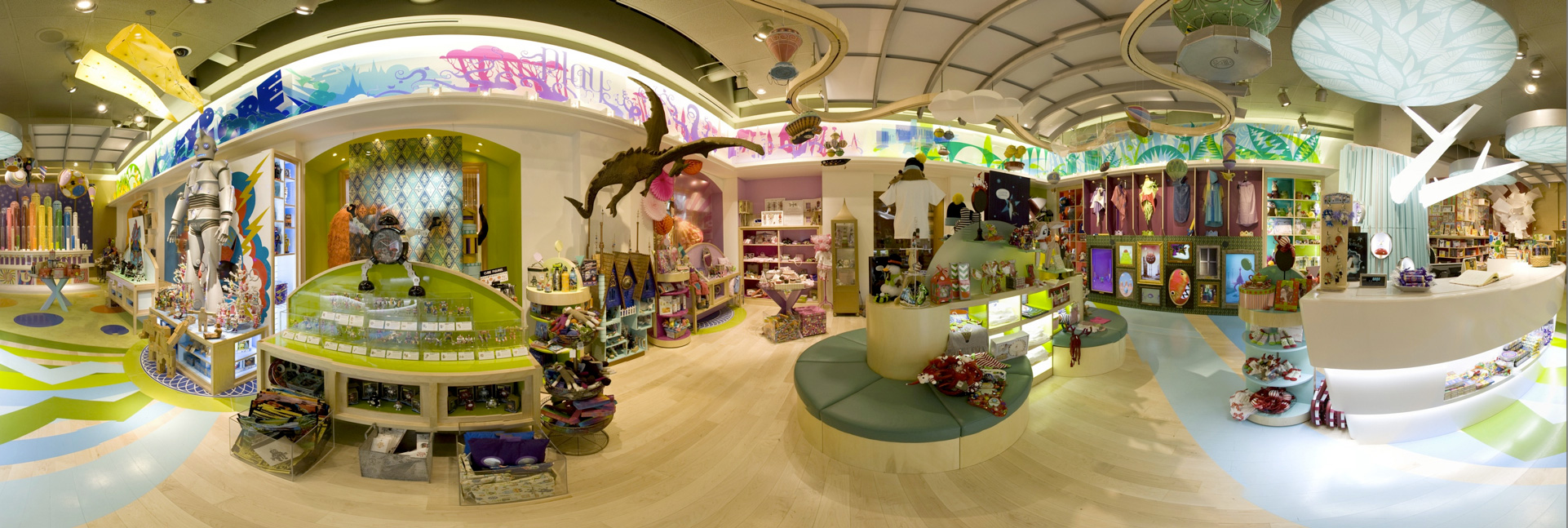
The Grand America is a luxury hotel in Salt Lake City, UT. With 775 rooms, the 24-story hotel is one of the select few to earn the title of AAA Five Diamond Hotel. Apart from fancy rooms with "Murano crystal chandeliers, handcrafted Richelieu furniture, English wool carpets, Carrera Italian marble, and the finest fabrics," the hotel features a handful of high-end stores, including the brand new JouJou: A Curious Boutique for Toys and Treats. Local firm Struck was in charge of developing this whole new little world.
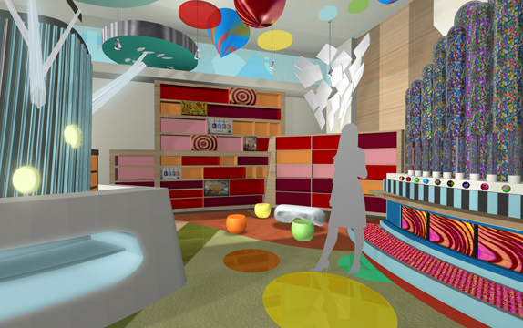
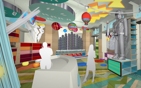
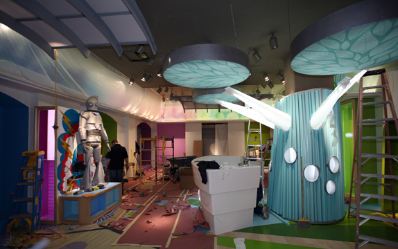
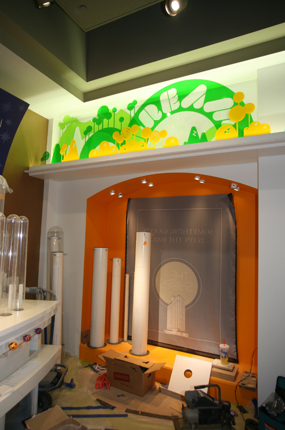
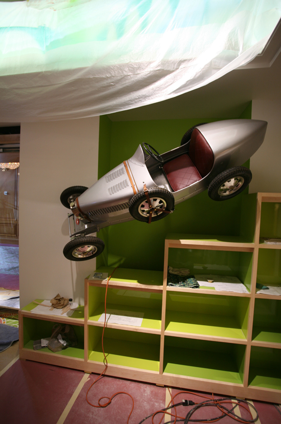
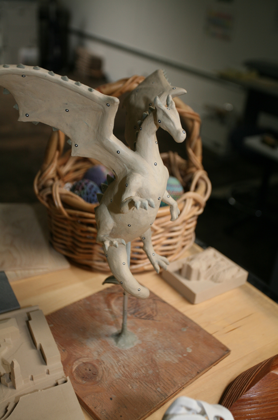
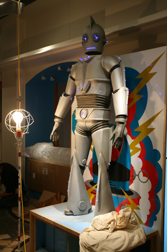
Struck was delighted to rebrand The Grand America Hotel's toy store, we completely embraced the challenge of bringing the environment to life. It's a realm where imagination takes flight — in the playful form of fire-breathing dragons, elusive fairies, robot warriors and peculiar monsters. This haven for child-like curiosity includes a stunning new interior, a full brand identity, promotions, merchandise and packaging. Struck sourced original toys and books and filled it with lavish and rare gifts. The finished location is a magical experience for guests young and old, mixing hand-crafted installations with interactive digital canvases and delicious treats. Contributors included: Struck, Watts Architects, Plastik Banana, Chris DeMuri, The Second Artist and Chase Studio.
Popout

The making of JouJou. I recommend watching this video first before going through the rest of the post.
While I would normally saddle you all with plenty of opinion, there is a lot to see in this post, so I'll keep it to a minimum. This whole project is truly stunning. What I like most about it is that there are no overarching rules or one style that dominates over another. It's the proverbial "throwing on the wall and see what sticks" except that everything has stuck. It's modern, it's baroque, it's digital, it's European, it's fantasy-filled. It's everything any kid could be stimulated by. And for us designers, it's an equal treat.
For detailed information and more how-did-they-do-that? details there is this PDF to satisfy your curiosity.

JouJou
JouJou
Some of the identity assets for use in packaging.
JouJou

Objects in their 2D and 3D renderings.
JouJou

The two fictitious companies that "make" the flying machines.

JouJou
Finished store. Click image for bigger view.
JouJou

Finished store. Click image for bigger view.

Popout
The store includes an interactive wall called Monsterpiece Theater consisting of ten different animated monsters, each contained in their own unique frame and environment. Monsters were designed by Struck and Mister, animated by Plenty.tv and developed by Welikesmall. The rendered monster assets were brought to life using Mac minis, Arduino Uno prototyping boards and the open Frameworks C++ toolkit. Each monster consists of a custom monster application built in openFrameworks, powered by its own Mac mini. Those minis are then paired with an Arduino prototyping board wired to an IR sensor which allows us to temporarily bridge the gap between the digital and physical world when each monster detects and interacts with a human presence.
JouJou

See more on the development of the Monsters at Plenty's website.

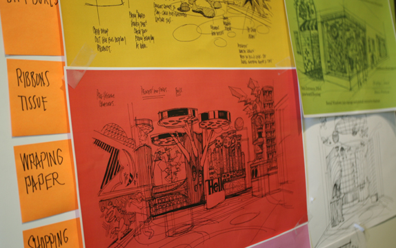
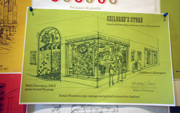
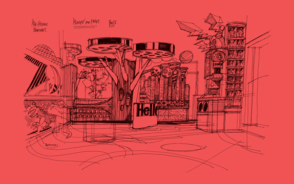
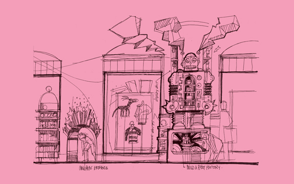
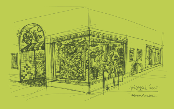
Sketches and Process

Click images for bigger view.
JouJou
JouJouJouJouJouJou
JouJouJouJouJouJou
JouJouJouJouJouJou
JouJouJouJouJouJou
JouJouJouJouJouJou
JouJouJouJouJouJou
JouJou
JouJou

Popout

http://www.underconsideration.com/brandnew/archives/eye_candy_literally.php