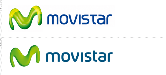
The first time I noticed the Movistar logo was on a trip back to Mexico City a few years ago. After a long plane ride, arriving at smoggy, traffic-laden Mexico City can be almost hallucinogenic, and not in a good way. Printed massively on a billboard I just couldn't understand what that thing was. Sure, it was an 'M' but why was it contorted like that and rendered in what looks like the kind of stuff aliens implant on the people they abduct? Never mind that, who chopped off the top of the 't'? Little did I realize that Movistar is one of the largest mobile service providers in the world, with its strongest presence in Spain where it has over 20 million customers, and it is owned by the Spanish conglomerate Telefónica, which provides phone and mobile service, cable television, owns terra.com, and is the second largest corporation in Spain behind financial giant Grupo Santander. Still, weird.
This past November, Telefónica announced that it would be rebranding all of its consumer offerings under the Movistar name, keeping Telefónica as the corporate name. Phone service will now be Movistar Fija (Movistar Fixed), internet service Movistar Banda Ancha (Movistar High Bandwidth), cable TV Movistar Television, and mobile Movistar Móviles. And to ensure the change goes smoothly Telefónica is proud to say that they will be instituting six Brand Guardians (Brazil, Colombia, Argentina, Mexico, Spain and UK) to look after it. The logo change is not yet reflected on either corporate or consumer web site.

In order to critique this properly it must be accepted that the strange icon has plenty of equity and, despite how unappealing it may be, it does manage to establish Movistar as an edgy, contemporary mobile provider. While it's not an adjective I thought I would use, the new icon is much more sophisticated, resulting in a more believable organic shape that you can actually visualize — I never understood what the lighter shade green on the "shoulders" of the "M" were meant to be, perhaps some odd homage to elbow patches on blazers. The typography is also much improved. The old one had major issues, mostly because it was trying to make all the letters the same width so the "m" was squished and the "v" was too wide and don't even get me started on the "t." The new wordmark follows the contemporary sans serif trend but at least it is all properly resolved and proportioned. As far as evolutions go, this is very solid.
Thanks to Julio Ferro for the tip.
Don't forget to cast your vote about this post online


No comments:
Post a Comment