
Established in 1927 by 36 industry members, the Academy of Motion Picture Arts and Sciences(AMPAS) is an honorary membership organization dedicated to the advancement of the arts and sciences of motion pictures that now includes over 6,000 members. Mostly known as this ephemeral entity in celebrity acceptance speeches during the Oscars — “I want to thank the Academy, God, my dog, mom and dad, etc.…” — AMPAS engages in numerous education, outreach, preservation and research activities while also managing a library, archive, council, and, set to open in 2017, a museum. Yesterday, the Academy introduced a new identity to unify all of its endeavors, designed by Los Angeles, CA-based 180LA.
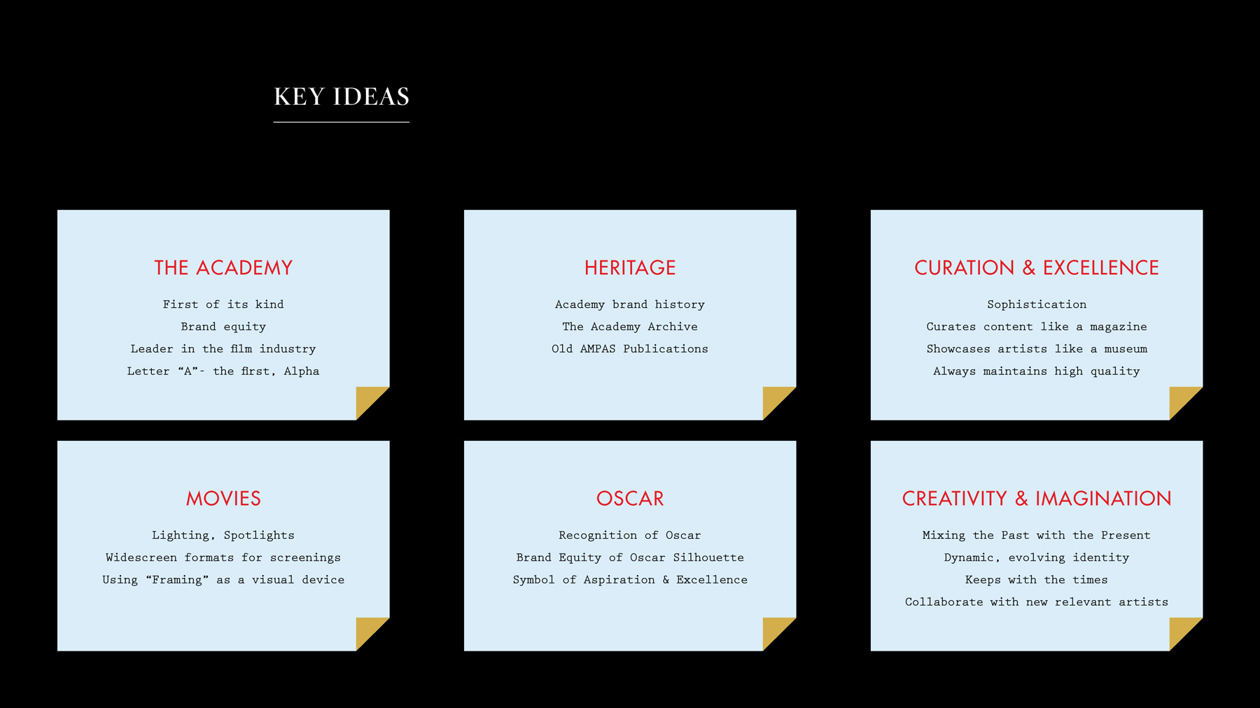
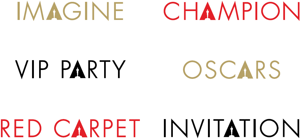
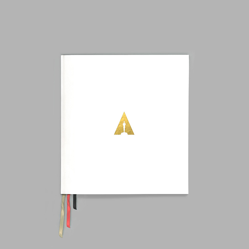
The new logo spotlights the Oscar from above — creating a triangular shape and uniting the “A” of the Academy with our iconic statuette. This design gives the Academy a presence in its own logo for the first time and underscores our efforts to support creative arts and sciences year-round.
the academy logo launch mini site
Shifting the light source on the old and new logos.
Since the Oscars introduce a new variation of its logo with every annual event and the Academy doesn't have a significant visual presence in terms of organizational identity, there isn't a logo you can pinpoint as being the official-not-be-messed-with one. Even the official logo that this one replaces looks like it’s cobbled together from pieces of other events, ready to change at any moment.
Establishing a clear logo, one that doesn't just try to ride the coattails of the Oscars but one that integrates the renown event with the Academy, is a much welcome step. In essence, the new logo is the same as before: the Oscar statue in a holding shape. Now, of course, it’s inside a triangle, which looks like an “A” for “Academy”. Simple and smart. The concept that it was a change of the light source makes it quite clever too. The typography, set in a lot of Futura, with an exaggerated “M” is nice enough.

When someone writes an article he/she maintains the idea of a user in his/her brain that how a user
ReplyDeletecan know it. So that's why this piece of writing is great.
Thanks!
My webpage: motorhomes dealers midlands
thanks :)
DeleteFeeling lovely After seeing your blog.
ReplyDeletesingapore marketing agency
You are welcome
Delete