
Earlier this year, Tata Group, one of the most prolific corporate groups in the world in categories like cars, telecommunications and steel among others, partnered with Japan's NTT DOCOMO, a leading cellular service provider, to introduce a new cellular service in the overcrowded market — more than 350 million existing customers — in India, Tata DOCOMO. To break through the competition, Tata DOCOMO has some pricing tricks like charging per second, rather than per minute and rewarding minimalist text messagers, charging by the character, rather than per message. Built around the brand idea of 'Do,' Tata DOCOMO comes in a colorful identity package designed by Wolff Olins.
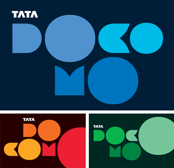
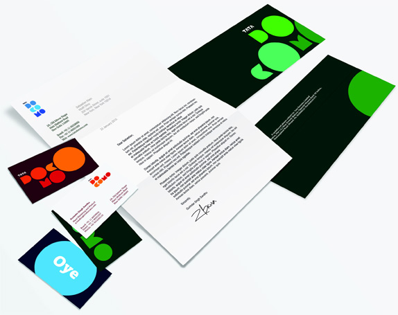
Different color combinations and logo configurations, above. Stationery, below.
The first thing I'll note is that I can't imagine having to bring together two insanely large and complex corporations together to create a new brand that most also represent the brand values of each, and it's nice to see that we didn't get just a mash-up of the two corporate logos. Tata's logo is there and I'm sure that speaks to the familiarity that brand has in India and it allows the Japanese, and I'm assuming less known, brand to become the more playful component.
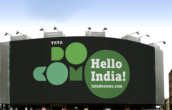
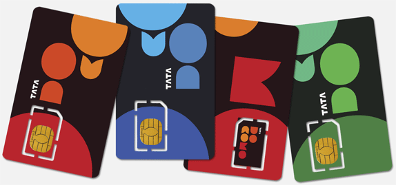
A pretty big billboard, above. A pretty small SIM card, below.
The second thing I'll say is that it's hard to look at this new identity and not think of Pentagram's work for the Museum of Art and Design. I'm not saying Wolff Olins copied them, but in the design realm it's hard to ignore high profile work that precedes this by almost a year. Nonetheless, customers of Tata DOCOMO could probably care less about what a highfalutin museum in New York City has for a logo and as trend-following — chunky geometric letterforms — as this logo is, it probably works perfectly in the market through Tata DOCOMO's brand attitude. And as the animations below show — part of a Diwali Animation Contest — the logo is ripe for co-option by its audience. It's friendly and modular, but more importantly, it has given playful permission to everyone to muck around with it. In good Wolff Olins fashion the identity isn't just the logo but the sum of its parts
Cute cat animation. More videos available here.
Winner of the Diwali Animation Contest, Ramanik Chandrakant Pevekar.
Don't forget to cast your vote about this post online
you have raised very important points which are helpful for me.
ReplyDeleteThanks for sharing.
create a website
You are welcome :)
DeleteRajesh
ReplyDelete